Saturday, May 26, 2012

NYC: ICFF 2012


I was fortunate to be able to spend half a day at ICFF last Saturday in NYC, it was my first time attending the show and I'd definitely go back.   During the couple of hours I was there I didn't get to see all the exhibitors, below is a roundup of my favorites from what I did see (and this was only half the show!).


These stools upholstered with vintage fur were my absolute favorite thing at the show, I wanted to just scoop them up and take them with me.  Unfortunately they were just props at the APPARATUS booth and not actually part of their product line,,,but by the time we finished telling them how much we loved them and had to have them,,they confessed they were going to add them to their collection because they'd had such great response!!!  Aside from the stools, I really love this studio's lighting products which are made from vintage components and found objects, the Cloud chandelier (shown above) with frosted glass orbs and oxidized brass chains was s-t-u-n-n-i-n-g.  I want.


Rattan Caning + Modern Lines.  I love this.  Throne series From Autoban 


I'm always drawn to circles and this glass and marble mosaic from Country Floors caught my eye. I think the grey grout really makes this.


I can't resist a beautiful piece of modern walnut furniture.  The May Credenza had impeccable lines with blackened rolled steel top and I LOVED it.  Miles & May


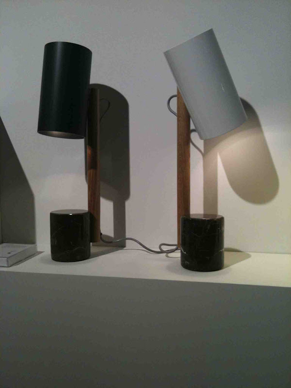
It was fun to meet the guys of Rich Brillant Willing + one dad! (I loved that Charles' dad was helping them out working the booth - he completely sold us on the new walnut table.)  : )  My favorite is the Quart lamp (above) and I'm lovin the new Delta pendant series so much I've just proposed the Delta IV (shown below) to a client.


A great little wood and marble side table from Blu Dot.


For all you HB2 lovers.  This brass devil is From JONATHAN ADLER.


Curiosities, found objects and vintage industrial furniture made this booth popular.  I found the way the objects were mounted on the wall quite interesting.


Indusrial style lamps in a rainbow of colours, the JIELDE booth was truly eye cathching. There's few things I'm drawn to more than an adjustable arm lamp. : )


I love a good grommet, and always need them but they are hard to find.  Impressive collection of sizes and finishes from MOCKETT.


One of the most beautiful light fixtures I've seen in a looong time.  This was a stunner! Brushed brass rods with lily pad shaped, hand formed copper panels with enamel finish.  Designed by Kiln Design Studio for Bespoke Global.


I adore Lindsay Adelman fixtures, they're works of art.  Theirs was a fantastic booth complete with workbench for assembling fixtures during the show.  Sadly they were on lunch break when we stopped by but I would have loved to have watched the process.  One of the things I admire most about Lindsay as an artist is the fact that she shares step by step instructions on her company website, "You Make It", on how to make your own Lindsay Adelman style fixture from off the shelf parts (it's how she started).  If you've never visited the site, its a must see. Lindsay Adelman.


One of the highlights of last years show was till causing a buzz this year, the Scrapwood Wallpaper designed by Piet Hein Eek for NLXL.  I'm not typically one to use 'faux' anything but I'm crazy for this entire collection, with digital technology these are more like photographic murals.  They are so authentic looking even when you touch it you still can't believe its not real, it has huge visual impact.  I also spotted some at the Kips Bay Showhouse the day before (located in a highrise duplex on the Upper West Side). 


Their newest wallpaper colleciton is Concrete by Dutch designer Piet Boon and it was attracting as much attention as the Scrapwood series, and their other newest collection Merci, vintage metal panels. All on display at NLXL's booth.


Hope you enjoyed seeing some of my favorites, believe me this was just a drop in the bucket.  The show is open to the Trade and to the public on separate days, if you ever find yourself in NYC during the International Contemporary Furniture Fair (ICFF) I highly recommend a visit.


Wednesday, May 23, 2012

An Artful Lunch


I was in NYC last week to attend site meetings at my Upper East Side renovation project and to meet up with my good friend Michelle Morelan from A Schematic Life who was visiting from Vancouver.  Michelle and I spent several days together enjoying shopping, dining, theatre, and attending some design events but the highlight of my week was our day trip to Westchester to visit our friend, the incredibly talented artist/illustrator Patricia of PVE Design.

The entire day was a 'pinch me' day of the best kind!  It started off at Grand Central Station (Oh my, I could spend a day in there easily) where we picked up a bottle of chilled proseco and a bundle of bright orange roses before boarding a train for a scenic 35 minute trip along the Hudson river.


The main concourse at Grand Central Station.  Next time, I'm bringing my good camera and spending a lot more time here.  So much to take in...the architecture, the shops, restaurants....I spotted an oyster bar restaurant with Saarinen style tulip tables and chairs. : )


Dahlia's flowers in Grand Central is fantastic, a huge selection of fresh seasonal blooms and the best prices I've seen anywhere.  All bouquets from $5 to $15.  Irresistible.


Michelle and Patricia in Patricia's gorgeous, 'almost complete' new kitchen.  New stools are in the works and a seating area will occupy the spot where I'm taking this photo from.  I LOVED the floor tiles from Walker Zanger which looked like polished concrete and how she's layered them with antique rugs.


Not only did Patricia pick us up at the train station and give us a driving tour of her charming Village full of character homes (seriously I was expecting to see Martha Stewart at any moment!) but she had the most amazing lunch planned for us.  It was all organized ahead so when we arrived we could make lunch together, it was sooo much fun putting together these dishes - honestly this was the most beautiful and delicious dish I have ever eaten.  Its going to be my new go to favorite.


The recipe from my memory; roasted sliced beets, roasted sliced sweet potato, layered napoleon style with goats cheese in between.  Topped with sauteed beet greens, pine nuts in olive oil and a sprinkling of freshly grated nutmeg.  TO DIE FOR.  Plated on vintage blue & white dishes from Copenhagen and set with her wedding silver cutlery.  I promise to get the actual recipe from PVE and post it below.

   After lunch Patricia took us on a tour of the historic Sunnyside estate, home of Washington Irving, located on the Hudson river and just a few minutes from her home.  I purchased a compilation of some of his stories and look forwarding to reading them now especially after being in the room he actually wrote them from.  I wished I had taken photos inside the house, it had a wonderfully simple, timeless kitchen and I was crazy for the various pantries.  An entire walk-in just for cookware and serving ware, another one just for china and crystal.  Sigh.


 "Absolutely Beautiful Things" by Patricia van Essche.


As if she hand't spoiled us enough already, Patricia gave each of us each a box of note cards made from her original artwork.  I love love love these, I'm always so drawn to blue & white so everything about this image grabs me.  This particular painting is called "Absolutely Beautiful Things" and was inspired by the blog of that same title written by Anna Spiro.  What I love most about these cards, is giving them - and telling the recipient all about the card's artist and my friend PVE.  (BTW, If you'd like some of these cards they're available on Etsy or by contacting PVE directly.)

Thank you Patricia for chauffeuring us, for lunch, for the Sunnyside Tour, and especially for the tour of your own beautiful home including your spectacular new studio space (polished concrete floors!!), its absolutely stunning.  It was a thrill for two Interior Designers to hear you describe how your newly designed spaces have had such a transformative impact on your life, to us, that's the true value of great design we wish everyone could experience.  You are a gracious host and a beautiful person in every context of the word.  This visit left me feeling uplifted and inspired in many ways just when I was feeling a need for a boost. 


Saturday, April 14, 2012

Style at Home: Modern Rustic

Style at Home May 2012
Photography:  Donna Griffith, Styling: Margot Austin


I've anticipated the arrival of the May 2012 issue of Style at Home for the better part of one year.  This issue features one of my favorite projects, a rooftop deck in mid-town Toronto, that I worked on in the summer/fall of 2010.  You can read about the design plans here.  The deck, along with the interior of the home was photographed by Style at Home magazine last June and the homeowner and I have been waiting all these months to see the results of that 2 day long photo shoot.  To finally see this space in print, however, was a bittersweet moment for me - It was a sweet thrill to see this project that I had worked on for so many months looking as beautiful as I always envisioned it would on those glossy pages,,,,,,but disappointing to discover that........ alas, there was no mention in the feature of my involvement in the project.  Yikes!  Its a bit crushing to be honest, especially given the work I put into the job, the amount of hours I put into the photo shoot and the pages and pages of source and fact checking I completed.  So I have no idea how that happens (or what to do differently next time?) but what's done is done and is a reminder that with print there are no do-overs!  Regardless, I am beyond excited to see this space published and to share with you the brilliant work of photographer Donna Griffith and stylist Margot Austin (who showed up before the light of dawn to capture these images!!) - thank you both!


Style at Home May 2012
Photography:  Donna Griffith, Styling: Margot Austin


 Style at Home May 2012
Photography:  Donna Griffith, Styling: Margot Austin


For a peak at some of the prep work that went into the shoot check out this post I wrote last summer a few days after the shoot.

Here's a few more photos taken a couple of weeks before the magazine shoot as I was loading in the accessories and the installer was hanging mirrors and lanterns.


Not seen in the photos above is a servery that's located inside and overlooks the deck space (you can see the windows of the servery above), this photo was taken back in the fall of 2010, from outside looking into the servery where Kara (the homeowner) was prepping some flowers. The servery is outfitted with a stainless steel counter with integrated sink, wine fridge and dishware storage. 


Friday, April 6, 2012

NYC Reno: Progress & Boy's Bath


The past couple of months construction on the NYC family reno project has been moving along at a rapid pace.  I've painstakingly overseen the precise placement of plumbing and electrical rough-ins, in some cases we were scrutinizing 1/4 inches.   More recently, over the past two weeks I've overseen the stone tiles being sorted thru, picked-out and installed.  The paint samples are about to go up,,,,kitchen cabinetry is being installed and very quickly, very suddenly it all seems like the entire home is coming together all at once.  Its visible, tangible progress for the clients when all the 'beauty' starts appearing, a major turning point in this long process.

There are 3 bathrooms in this "3 apartments into 1" conversion, however, the tiny footprint of each of the original bathrooms had to remain as is.  These compact size bathrooms consumed an unimaginable amount of time in planning out the details to the precise inch.  On top of that, sourcing vanity/console options that are no larger than 18" and trying to maximize storage when recessing niches or cabinets into the wall space was limited - it was a challenge!

The most challenging of them all for me was the Boy's bathroom.  It's original layout had a tub/shower unit which we would replace with a walkin shower.  What you can't really see clearly in these concept sketches is that the room has quite a few jogs, including a dropped bulkhead in the shower not depicted in here at all.  The clients desire was to do this bathroom in all ceramics or porcelain tile. Not usually my preference especially when the cost of the ceramics or porcelains can be equal to the cost of a marble.  I recommended we do a marble mosaic floor tile paired with a simple ceramic on the walls.  Just that bit of marble would add a luxe edge along with texture and pattern.  I'm not a fan of decorative tile borders and inlays or using a multitude of various tiles in a bathroom for the sake of adding some 'wow'.....an approach I find just too decorative and trendy.  I think the tile should provide the basic bones to the space, evoke the vibe you are going for and add a sense of long lasting quality.  If using a ceramic, I go for timeless white or colour block an entire wall in an accent colour. If you use a natural stone, the statement is simply in the stone itself, no enhancing needed, leave the decorating to the towels, accessories and artwork.  A common exception I make is the use of a contrasting band or pencil liner.


The sketches shown in this post were really really preliminary and done at the concept stage waaay back in August of 2011.  (For this post I've stripped them of dimensions and notes.)  The intent of these was to illustrate to the client how we could use a basic and classic ceramic tile shape but still add some detail.  We considered doing a combination of a dark blue vintage style (handformed, crackle finish) 2" x 8" floor to ceiling wall tile behind the sink and toilet, then tiling the shower walls in white field tile with frame borders in the same blue tile.  Even though they had told me they didn't want 'subway' tiles, they really loved this. (variation of this above and below)


There is a jog in the wall where the shower glass screen is so this provides a natural transition spot to change to a different wall tile inside the shower. A small carrara marble mosaic floor tile is continued thru to the shower floor, the shower sill would be carrara slab, on the wall not visible is a recessed soap niche also made of carrara slab and outside the shower is a full height small storage closet. Completing the space is contemporary plumbing fixtures and vintage style lighting.


One of the most common apprehensions clients have is floor to ceiling wall tile.  I personally don't understand the resistance, especially in a bathroom -  and true to that these homeowners were uncertain about taking the tile all the way to ceiling behind the sink so the final decision was half height.  


Months later when all the final specs and detailed design drawing were completed I can tell you the final design is not like ANY of these concepts!!!  ; )  You'll have to visit again to see sneak peaks of the installation.  You'll see we ended up with a modified version of this last sketch above, except we're going with a different type of sink all together and we're using Select White Thassos marble on the walls. ( The sink and toilet will also be in the reverse location.)


This young boy's bathroom will exude the fresh classic crispness of navy and white. Whatever walls are not clad in white tile, will be coated in a deep navy paint. All the polished chrome will sparkle against it and the white will look extra fresh.  What I love most about this foundation is that navy is such a 'neutral' you can chose from a myriad of accent colours for your accessories be it yellow, purple, green or red.


Check out the full back story and before photo  here.
See the before and after floor plans 
and my concept for the architectural details here.


All Drawings by:  Carol Reed Design


Saturday, March 31, 2012

East Coast - Patina


Nova Scotia always overwhelms me with inspiration, the landscape, the architectural character, the food.  On my recent visit we spent our days road-tripping thru the Annapolis Valley as well as the South Shore travelling a total of 1500 km.   With my camera always on my lap, the days were filled with 'stop the car' moments from beginning to end.  I'm constantly 'gasping' to pullover or turn around or drive down there,,,,,BF's become so used to this that most times I don't have to do anything except flick my camera on and he's already looking for a place to pullover.   With the patience of a saint, he'll happily make a stop as often as I want, usually snapping away with his own camera while he waits for me - he's amassed a huge collection of pictures of me taking pictures at the side of the road!   I'm sure passers by often wonder what I could possibly be so interested in.......

The seaside landscape here truly calls my name -  vast open water, changing skies, long wispy grass, cedar shake buildings,  (especially barns!) and the sculptural rocky shoreline all reflecting that time-worn, weathered patina created by coastal winds, water and sun.  When it comes to architecture there are two distinct palletes you'll see along these coastal communities, distinctly bold colourful hues or,,,, a more natural palette that blends into the surroundings.  Below are a few of my favorite images from this trip, each capturing the characteristics of these elements, from rustic abandoned fishing shacks to modern day masterpieces, the simplicity speaks.  (the resolution sizes have been reduced for ease of posting.)


Somewhere near 


Near Liverpool, Nova Scotia.


Green Bay, Nova Scotia


Peggy's Cove, Nova Scotia


Driving near LaHave, Nova Scotia, from far down the road I recognized this modern residence up high on a peak overlooking the ocean.  Its the work of local Architect Brian MacKay's firm.  I'm a big fan of their work and you'll spot their modern east coast structures all around this area.


Near Broad Cove,  Nova Scotia


Near East Port Medway Nova Scotia

Near Cherry Hill, Nova Scotia


All Photos by:  Carol Reed 

Monday, March 26, 2012

Upload - East Coast Character


Vintage Wallpaper, painted floor boards, gigantic fresh cut blooms


I've been in Nova Scotia for the past several days with my other half looking at properties and touring some really old houses.  Our search for an East Coast abode has us focused primarily on century houses, many we've seen are close to 200 years old and have been in various states of neglect or restoration.   What I love most about these old houses is seeing the original details still in tact whether they're in need of some love or have been lovingly maintained.  I know that in either case, I would never think of getting rid of these character details - I can only envision how interesting it would be to incorporate them with my own aesthetic.   My own personal taste for architectural details runs much more traditional than modern, but I prefer it in a minimal way, simple to a point that leans to utilitarian and paired with more modern furniture and art.   And then sometimes you can't predict what you'll be drawn to, the landing area shown in the top photo totally captivates me, from the sunlight streaming in, the wide painted floor boards to the huge yellow blooms.  But most of all, that vintage wallpaper!  I'm not a fan of flowery wallpaper in general, but I have to admit I'd have a hard time stripping this one down.  Add a great lamp, a comfy reading chaise and a stack of books - perfection.

The same elements that attract me to modern designs are the same elements that attract me to centuries old east coast details and decor.  Clean geometries, simple form, no over embellishments.  When things are so pared down, there's an unpretentious ease.  I love a space that is so simple it enhances your personal collections of books or artwork or collections.   I adore things with aged patina and I appreciate imperfections especially when juxtaposed with crisp and modern.

Here's a glimpse at few of the things that have caught my Iphone while viewing some of these houses, some architectural details, some decor.  Even though these images are from a number of different houses, the character is consistently charming.


Antique door hardware, antique doors painted black, antique brass bed,
wrought iron bed, hand made quilt, brass knob on antique door, painted furniture, collections of family heirlooms


hand made lace bedskirt, 180 year old floorboards with glossy white paint, antique brass cup pulls,
built-in storage with original hardware, original handrails and newel posts, brass faucets


Antique brass bed, original ceiling beams, simple block printed curtains, stacks of wood for fireplaces and furnaces, oversize wood burning fireplaces, antique chairs


The search continues for that perfect combination of location, views and character.  Stay tuned for some more photos from our travels around the coast.


Friday, March 16, 2012

The Kitchen Sink


Most of my projects involve entire whole home renovations where I specify everything for the interior buildout from the bricks in, right down to the kitchen sink.  Most of my clients fall into two categories, they have their hearts set on a large single sink or they don't have an opinion about a kitchen sink at all, usually because they don't cook.  My own personal preference (from many years of experience) is a single wide deep sink.  I enjoy cooking and I cook a lot, typically 6 nights of the week you'll find me cooking in the kitchen.  Of all the dozens and dozens of kitchens I've designed over the past 6 or 7 years I've rarely specified anything other than a single bowl kitchen sink, either farmstyle or undermount, they've almost all been one large sink.

The kitchen shown above is in a client's house I designed in 2007, it features an apron front stainless steel sink, concrete counters and custom cabinetry made from reclaimed barnboards.  (This is a candid photo I took one day years ago while there for a meeting.  It seems like a lifetime ago, this was before Iphone's existed,,,,and before I blogged or tweeted.)

In many situations I find double bowl sinks impractical, overall they require a larger cabinet size, they eat up a lot of counter space, and the divider in the middle is permanent - you simply don't have the option of soaking large pans or oversize cookware.  With a single bowl sink,,,,they're typically not as wide as a standard double bowl sink but I love that you have the flexibility of soaking large items whenever you want.  You can still use it to wash small or delicate things as you normally would.   A lot of people struggle with this concept, how do you wash and rinse in one large sink?  Well, when it comes to washing, I typically take the largest bowl or pot that needs washing, rinse it out, fill it with hot soapy water and use it to wash everything else in.  I keep a small dish strainer inside one side of the sink for rinsing and drying.  Occassionally I use the counter for drying items, but usually I can contain it all in the sink.  The top photo is a perfect example,,,,when I arrived at my client's house that afternoon she was soaking some large baking pans in the sink, so you can see her dish rack on the counter while she was putting these things away - typically the rack sits inside her sink.  This isn't a dish rack specifically made for her sink, but they are available.


When I specify sinks I like to also order accessories specifically for that sink.  If I'm having the sink custom made, I'll find a series that is compatible with my custom size as close as possible.  The selections above are just a sampling of the variety of options to chose from.


Double bowl sinks or sink and a half, usually require a 36" wide sink cabinet.  Many times I'm working with limited space and a 36" sink cabinet just isn't practical, I'd rather go with a smaller sink cabinet and have that extra 6" or so for a bank of drawers beside the sink, ie; an 18"set of drawers vs a 12".  I'm not a fan or irregular shaped sinks with funky curves or angles, I like them clean lined and simple.   It can be challenging to find simple double sinks to fit a 27-30"cabinet which is another reason I often use a single.  You can easily find large single bowl sinks from 18" to 24"wide, and if you really search you may find a 27".  When I want the largest single sink I can possibly fit in my sink cabinet, I have them custom made.  I've had stainless steel sinks custom made for most kitchens I've designed, this allows me to maximize the sink to whatever size I want and ensure it works with the cabinet I've specified.  (I don't recommend this for DIY'ers.)

If you're shopping for or considering a single bowl sink for your own kitchen here are some great tips to keep in mind:

  • know the exact inside dimensions of your cabinet not just the outside dimensions
  • refer to the actual sink size not just the overall size which includes the mounting rim
  • the lower the guage stainless steel the thicker and sturdier the steel, 16g is stronger than 18g.  18 is standard, 16 is even better, avoid 20g for a kitchen sink.
  • keep drain location in mind if you're also using a garburator, anything other than centre may impede your garbutor/drain hookup inside your cabinet
  • the tighter the radius the more of a 'pro' look you will get but the almost square corners can require more attention to cleaning
  • the smallest radius for the corners of a stainless steel sink is called "Zero Radius"
  • a 5/8" radius will still give you that rectangular look and ease of cleaning
  • go for 9" or 10" deep sink for pro style function
  • its key to utilize sink accessories to maximize the efficiency of a single sink, use bottom grids, dish drainers, dish racks and integrated cutting boards to optimize the sink interior
  • a side spray or pulldown spray faucet is great for using the large sink to wash small dogs or large vases
  • make sure when determining your sink's location for the countertop cutout that you leave adquate counter space behind the sink for your faucet and faucet handle clearance.


Its always a major milestone for me when the kitchen sink finally gets installed on a project, its the moment the space becomes a *functioning* kitchen and indicates final completion is just days away, not months!  Currently on my project board, I have an upcoming single kitchen sink install in the NYC project, and we were measuring down to the 1/8" of an inch for that one!  For another out of town project I've just drawn up the details for a stainless custom sink and a half configuration,,,,,ready to be sent off to the fabricators.   The anticipation of both these installs has me excited to see these sinks in their newly finished homes very soon!!


All photos and room design:   Carol Reed


Related Posts Plugin for WordPress, Blogger...