Showing posts with label bathrooms. Show all posts

Sunday, May 12, 2013

Stoney Lake Cottage: Bathroom #1 Progress


Here's a sneak peek  of one of several bathrooms in the Stonely Lake cottage project that are undergoing a light renovation.  The objective was to work with the existing elements as much as possible but give the entire bathroom a fresh new cottage style.   Its actually one of my favorite things to do - to explore the potential of existing space without completely gutting it and starting from scratch.  It is possible to transform an interior by implementing some straightforward changes.


Before - Existing Bathroom

The modifications for this bathroom involved replacing the ceramic tile floor with a wide plank knotty pine.  The existing solid pine vanity was great quality and in excellent condition but we replaced the synthetic countertop with new quartz counter, new hardware, added a new sink and faucet, and new lighting.  In addition to the new chrome fixtures the wall tile was removed and replaced with beadboard wainscotting with built-in mirror.  On the opposite wall to the sink I replaced the shiny brass towel bars with a row of chrome towel hooks.  A navy blue wall paint above the crisp white beadboard creates a classic cottage scheme.  To complete the bathroom we'll add colourful striped towels, a graphic area rug, and polished chrome and ribbed glass vanity accessories.


After - Bathroom in progress


This is just one of 4 bathroom remodels that are nearing completion in the cottage and getting ready for their first summer season.  I'm looking forwarding to sharing some after photos of the other spaces here in the coming months.


Friday, April 6, 2012

NYC Reno: Progress & Boy's Bath


The past couple of months construction on the NYC family reno project has been moving along at a rapid pace.  I've painstakingly overseen the precise placement of plumbing and electrical rough-ins, in some cases we were scrutinizing 1/4 inches.   More recently, over the past two weeks I've overseen the stone tiles being sorted thru, picked-out and installed.  The paint samples are about to go up,,,,kitchen cabinetry is being installed and very quickly, very suddenly it all seems like the entire home is coming together all at once.  Its visible, tangible progress for the clients when all the 'beauty' starts appearing, a major turning point in this long process.

There are 3 bathrooms in this "3 apartments into 1" conversion, however, the tiny footprint of each of the original bathrooms had to remain as is.  These compact size bathrooms consumed an unimaginable amount of time in planning out the details to the precise inch.  On top of that, sourcing vanity/console options that are no larger than 18" and trying to maximize storage when recessing niches or cabinets into the wall space was limited - it was a challenge!

The most challenging of them all for me was the Boy's bathroom.  It's original layout had a tub/shower unit which we would replace with a walkin shower.  What you can't really see clearly in these concept sketches is that the room has quite a few jogs, including a dropped bulkhead in the shower not depicted in here at all.  The clients desire was to do this bathroom in all ceramics or porcelain tile. Not usually my preference especially when the cost of the ceramics or porcelains can be equal to the cost of a marble.  I recommended we do a marble mosaic floor tile paired with a simple ceramic on the walls.  Just that bit of marble would add a luxe edge along with texture and pattern.  I'm not a fan of decorative tile borders and inlays or using a multitude of various tiles in a bathroom for the sake of adding some 'wow'.....an approach I find just too decorative and trendy.  I think the tile should provide the basic bones to the space, evoke the vibe you are going for and add a sense of long lasting quality.  If using a ceramic, I go for timeless white or colour block an entire wall in an accent colour. If you use a natural stone, the statement is simply in the stone itself, no enhancing needed, leave the decorating to the towels, accessories and artwork.  A common exception I make is the use of a contrasting band or pencil liner.


The sketches shown in this post were really really preliminary and done at the concept stage waaay back in August of 2011.  (For this post I've stripped them of dimensions and notes.)  The intent of these was to illustrate to the client how we could use a basic and classic ceramic tile shape but still add some detail.  We considered doing a combination of a dark blue vintage style (handformed, crackle finish) 2" x 8" floor to ceiling wall tile behind the sink and toilet, then tiling the shower walls in white field tile with frame borders in the same blue tile.  Even though they had told me they didn't want 'subway' tiles, they really loved this. (variation of this above and below)


There is a jog in the wall where the shower glass screen is so this provides a natural transition spot to change to a different wall tile inside the shower. A small carrara marble mosaic floor tile is continued thru to the shower floor, the shower sill would be carrara slab, on the wall not visible is a recessed soap niche also made of carrara slab and outside the shower is a full height small storage closet. Completing the space is contemporary plumbing fixtures and vintage style lighting.


One of the most common apprehensions clients have is floor to ceiling wall tile.  I personally don't understand the resistance, especially in a bathroom -  and true to that these homeowners were uncertain about taking the tile all the way to ceiling behind the sink so the final decision was half height.  


Months later when all the final specs and detailed design drawing were completed I can tell you the final design is not like ANY of these concepts!!!  ; )  You'll have to visit again to see sneak peaks of the installation.  You'll see we ended up with a modified version of this last sketch above, except we're going with a different type of sink all together and we're using Select White Thassos marble on the walls. ( The sink and toilet will also be in the reverse location.)


This young boy's bathroom will exude the fresh classic crispness of navy and white. Whatever walls are not clad in white tile, will be coated in a deep navy paint. All the polished chrome will sparkle against it and the white will look extra fresh.  What I love most about this foundation is that navy is such a 'neutral' you can chose from a myriad of accent colours for your accessories be it yellow, purple, green or red.


Check out the full back story and before photo  here.
See the before and after floor plans 
and my concept for the architectural details here.


All Drawings by:  Carol Reed Design


Saturday, April 9, 2011

70's Bungalow: Progress 2


The tile work is almost finished and the hardwood has just started to be installed.  The finish carpenter is on site prepping doors and getting ready to install the base mouldings and door casings.  And the custom kitchen cabinetry arrives this week for installation,,,,,,I'm sooooo excited to see it!!!   I stopped by the job site earlier today to drop some more paint samples off for the Master Bedroom and was thrilled with the progress since I was there earlier in the week and since my last progress post.   The travertine tile has gone up on the Living Room fireplace wall and I LOOOOOVE it (above photo).


The guest bathroom tile is just about ready to be grouted, they have to just finish off adding a Caesarstone jamb around the inside of the window, you can see a small piece of it on the window sill now that the tiler was using as a spacer.  The grid line effect will disappear once the grout is applied.


You can just see a glimpse of the honed travertine floor tile.


Honed calacatta floor tiles in the master ensuite and paint draw downs on the wall.  Wall tile goes up on Monday (where you see the black backer board).  You can check out the design sketches and finish boards for the bathrooms here.


The powder room has polished calacatta floor tiles and I can tell you the wall paint, is NOT going to be the bottom sample : ).


The natural walnut floors were installed in the kitchen and family room yesterday, here's a look at the range wall which is ready for the cabinets and appliances.  I love how the space is flooded with daylight.  For over six months now I've had a clear vision of what this kitchen will look like when its complete but if you want a 'sneak peek' you can check out the kitchen design plans here.


A view into the kitchen from the family room.  If you look close you can see a couple of paint draw downs on the left wall inside the kitchen,,,and I'm happy to say the perfect shade of white has been selected (we'll be painting all the main living areas and hallways white).  Although I have to say, the primer the painter used on this job is the nicest colour of white primer I've ever seen, I would be perfectly happy with that as the wall colour it was really that good - I'll definitely be getting the name of it.


Another view into the kitchen from the family room at the back of the house, I love how you can see the Living room's travertine fireplace in background.


Details make the difference.


My favorite thing on the entire project,,,,are these walnut veneer doors.  They arrived earlier this week and the wood veneer is simply stunning!!!!  Even now in their unfinished state you can see the sheer beauty of the walnut grain, its like a work of art.   This character and depth of colour will be accentuated even more when the clear top coats are applied.  What you're seeing here is only the top half of the door, there's four doors altogether, bookmatched, and they'll be hung in pairs on the two closets in the front hall.


Stay tuned for lots more progress updates in the days and weeks ahead.


All Photos:   Carol Reed


Friday, January 28, 2011

70's Bungalow: Bathroom Designs


Room design and renderring by Carol Reed Interior Design


The new floor plan for The 70's Bungalow redesign has 2 bathroom ensuites and 1 powder room on the main floor (check out the before and after floor plans here, and the kitchen redesign plans here).  The master ensuite and the guest room ensuite were designed with similar concepts but slightly different material selections.  Each of the bathrooms would have custom wood vanities, solid stone tile flooring and solid slab counter tops.   

I allocated the majority of the bathroom budgets into the floors, vanity and countertops.  Everything else in the rooms would be non-custom, have simple contemporary lines and be basic white or polished chrome.  I'm not a fan of mixing a lot of different tiles in one space, or using trendy tiles,  these looks get dated pretty fast - I prefer to stick with classic natural stones and simple white ceramics, playing up the different shapes, sizes and finishes (honed, polished etc) for interest.


Master Ensuite room design and renderring by Carol Reed Interior Design.

For the master ensuite I designed a floating zebrano wood double vanity that would have 7 drawers, a solid calacatta marble countertop with a tall backsplash and shower jambs to match.  The wood grain of the vanity would run horizontally to play up the contemporary lines of house.  The floor would be clad with one tile, a 12 x 24 honed calacatta, no borders, no inlays.  The beauty of this natural stone's colouration and veining is a feature on its own. The large walk-in shower will be clad in a long narrow white ceramic tile installed in a stacked pattern (not as shown in the renderring), evoking a very modern feel.  The white ceramic walls and white marble floors will showcase the gorgeous zebrano wood.  The bit of non-tiled wall space there is will be painted a deep warm grey for rich dramatic contrast, this was added to the concept sketch later on as the paint colours were selected.


Site sample board for Master Ensuite bathroom.

In addition to a full set of construction drawings, site samples boards are prepared for the contractor - they don't need to be pretty,,,just factual.  Above is the site board for the Master Ensuite material finishes.  Sometimes I'll include photos of the faucets and light fixtures too but this time it wasn't necessary. Final wall paint colour will be selected on site after sampling 2 or 3 draw downs on the primed walls.


Guest Bathroom design and rendering by Carol Reed Interior Design.


The guest bathroom is small but accommodates a standard size tub and a 30" vanity.  The vanity had to be designed to go all the way to the floor, concealing the plumbing (that would come up thru the floor). The custom cabinet would be made from riff cut white oak stained a golden caramel colour.  The countertop will be solid quartz material in white, the same white as the slim narrow rectangular ceramic tiles that will surround the tub, including the tub front and continue across the entire vanity wall.  The floor will be finished with Blue Ocean vein cut travertine in an offset stack pattern which will really play up the horizontal lines in the tile.  The walls will be painted a warm taupey grey. The guest bathroom will have a custom made shower curtain instead of the glass screen illustrated above, and only 1 pendant fixture instead of two.


Site sample Board for guest bathroom.


Using only one tile on the floor and one tile on the walls is a great way to stretch your budget dollars,,,and I think it maintains a clean modern look.  Using a ceramic on the walls, and tiling only the shower or tub walls, instead of all the walls is also another big cost saver.  To maximize a bathroom budget, keep the walls simple and get that luxe high end look by investing in stone flooring and solid countertops.

The renderings above were drawn in the early stages of the design development and it was thru these sketches that the client was able to decide on the room layout and all of the design details.  Subsequently some very minor changes and modifications have been made to the bathroom design since these sketches were prepared but the overall design concept remains the same.


Last week I was out at the supplier's warehouse looking thru their current stock and tagging the orders for both of these rooms and some other areas in the house (talk about being a kid in a candy store!!).  The tiler is scheduled to start in approximately 2 weeks and the vanities are in production,,,I'm so excited to see these designs evolve to the next stage.


IDS 2011

If you're in Toronto this weekend you don't want to miss the Interior Design Show at the Metro Toronto Convention Centre.   I'll be at the IDC Canada booth on Saturday between 1 and 4pm participating in their Design Dilemma Consultions providing free 15 minute consultations to show attendees.   If you do go and happen to see me, please stop and say hi!

Saturday, October 9, 2010

Modern Log Home - Guest Bath


Guest Bathroom design concept.


Last month I took a road trip to visit a clients weekend cabin located in a popular resort town a few hours north of the city (skiing, golfing, boating etc).  The homeowners are clients of mine who I've been working with for the past several years renovating their home in the city.  They purchased a weekend property earlier this year, its a chink log cabin that was built about 20 years ago.  A chink log cabin has squared logs instead of round and are stacked horizontally with a mortar bed (chink) in between the logs.  The logs used for this type of construction are weather equally on all sides so the exterior and interior look the same, in this case the builder used pine logs that had been weathered for 5 years and aged to a beautiful heather grey.  On the second floor where the guest bathroom is, the log walls are only about 3 feet high, as a result visually this creates a horizontal wainscotting effect.  In the guest bathroom, all the walls outside the room have this log feature but inside the bathroom there are only 2 of these log walls, you can see one of them in the photo below. 


Interior log wall of Guest Bathroom.


Now that my clients own the cabin they want to update the interior to reflect their personality and lifestyle, starting with the colonial 'knotty pine' kitchen and bathrooms.  They're a young family who are drawn to character homes but love simplistic modern style interiors and especially anything that's vintage 60's and 70's.  Knowing their style, I have to admit I was pretty EXCITED at the idea of mixing this modern aesthetic with the log cabin structure,,,,,,the interior would be a cool mix of rustic + vintage + modern + industrial - whatever you wanna call it (I hate trying to labell a style) it'll be a personalize mix that can only be called 'their' style.

For some bathrooms I design I'll spend a lot of time on the details, custom designing a vanity and mirror, I may spend hours searching for just the right marble or stone,,,searching thru batches of warehouse inventories to find just the right lot of tile or the perfect slab, and I'll order that 'perfect' light fixture, and faucets and statement tub,,,,,hoping they'll arrive within the next month or two.  But for some bathrooms I design, like this one,,,,,its all about simple design with ready-made and in stock.  These are the projects I really like to share on the blog because I think more readers can relate to these types of renovations.   My objective for this bathroom was to come up with a design plan using materials that were readily available thru local building stores up north and/or products that my clients could simply purchase off the shelf and bring them to the cabin on a weekend visit. The contractor was already standing-by, ready to go he was just waiting for the design plans.  So with no time to waste (literally!) here's what I came up with... 


Keeping in mind there are weathered grey logs on two walls and no windows, I wanted to use lots of white to keep it bright, modern and really showoff the wood.  To me, nothing beats the simplicity of white subway and hex tile, the grey grout will give it a vintage vibe and an entire tiled wall simplifies all the angles.  I proposed installing the subway tile vertically to enhance the vertical lines to offset the low ceilings.  A ready-made floating vanity in high gloss white is a modern contrast to the weathered grey logs, with 2 drawers its also super functional.  Because I wanted the vanity to go wall to wall, I've asked the contractor to make a cubby shelf at the one end.  A new glass enclosed shower with ready-made carrara marble jambs will replace the tiny old one piece insert.  I suggested an industrial style cage light painted in a fun bold colour like a tourquoise blue or bold yellow,,,with towels to match.  The large round steel rimmed mirror, numbered towel sets and chevron bathmat are fun graphic elements. 


A slightly different twist on the same concept, here I suggested an entire wall (the vanity/shower wall) be clad in the multi-toned glass mosaic with the rest of the shower wall tiled in the white subway and a light grey floor tile.  I've seen this glass mosaic at Lowes and HD so its readily available and not super expensive.  I like modern graphic of the small 3/4"x3/4" and all the various tones of grey and white which I thought added interest and compliments the wide stripe effect of the grey logs, both visible from outside the bathroom too.  Although this is probably my favorite of the two options,,,they opted to go for the white subway tile, installed in the typical horizontal fashion (I tried!).  I then sketched a quick 3D for them to illustrate the shower stall glass detail and how everything all worked with the slope ceiling.


A couple of days after the design plan was finished I did a quick scouting trip for some lighting and came across this awesome outdoor fixture that I thought would be perfect for the bathroom, especially with a silver base bulb.  I love the industrial style of this fixture and at only $45 I think they're a steal!  The homeowners loved it so much they've bought several of them to use in the other bathrooms too.  Now let's see if I can convince them to paint at least one of them yellow. : )


The old bathroom was torn out about 2 weeks ago and the contractor is already about halfway finished building this new one, he'll soon be ready for the glass and the countertop to be templated which are the only things not ready-made or off the shelf but will give the entire bathroom a custom look. Once this is done I'm not quite sure yet if he'll be moving on to the new design plans I've done for Master Bedroom Ensuite,,,,, or the kitchen, but I'll keep you posted!


HAPPY THANKSGIVING!


Thursday, July 22, 2010

After: E-Design Bathroom Project Part 2


One of the most exciting parts about E-Design projects is when I receive those long awaited 'after' photos from clients.  Handing a project off to someone else to takeover fills you with lots of anticipation (and anxiety!).  A couple of months ago I received one of those Christmas like emails from an e-design client who had just completed her newly renovated bathroom.  It was soo exciting to hear from her as I knew she had proceeded full-on with the renovations following my design plans so I couldn't wait to see the results.  To check out a few of her 'after' photos along with some of the before pics and my design plans for the space, you can go here.

When I saw the first after photos of the space, I was speechless,,,you really had to see the befores, this transformation was dramatic but the fact that she implemented the entire renovation so successfully from my E-Design plans was such a thrill for me.  She and her family had lived in the house for 25 years and had never taken on any renovations or upgrades,  until now they had only dreamed about them ...so she was brought to tears when she saw the finished bathroom for the first time.  Since the house was located in Toronto I couldn't resist the opportunity to visit in person and take some of my own photos, so a couple of weeks ago I arranged to meet this client face to face and see her home in person for the first time.  Camera and flowers in hand of course!


Its hard to describe what it felt like to walk into this space, because its like I had already been there - its surreal to see what had been a very vivid image in my head for so long, now right there in front of me, yet I hadn't been part of the physical transformation process.   I hadn't seen it evolve so this visit was a role reversal, it was the designer experiencing the 'reveal' not the homeowner.  The fact that someone else who I'd never met had so literally brought the vision that was in my head to reality was overwhelming.  And as corny as it sounds, the space itself,,,really was breathtaking, I actually gasped, the photos truly don't do it justice.  If I could only capture that 'feeling' on camera or find the words to convey it.....


The house is a heritage home so the goal was to give the space some classic traditional character but with a contemporary edge.  But it was most important that the space wasn't done in cool greys or blues or too white.  There were splurges, saves, and great buys. The floor was the definitely one of the splurges.  A basketweave mosaic marble, simply laid with no borders or inlays.  Classic and timeless.  I loved the varying shades of warm greys.


The old brick chimney wall was clad in drywall and surface applied panel moulding was added to create a wainscotting effect around the entire bathroom.  Simple crown moulding and baseboards complete the trimwork.


Another splurge, a custom designed vanity with plenty of deep drawers provides tons of room for each family member to conveniently stash all their products.  The sink was offset to maximize the counterspace.


The biggest objective for the redesign was to create a separate tub and shower.  It was intentional that all the plumbing fixtures have simple clean lines and be contemporary.  I think this works well in an otherwise traditional space and keeps it from looking dated.  You can see the plumbing fixtures have rectilinear lines.  One decision the homeowner made was opting for an undermount sink as opposed to a sink that had a 3" lip around it the same as the tub....but I think this option works just as well especially because of the shape.  I normally provide 2 options when making selections for a client and either one is meant to work equally well.


I think its important to point out that aside from the fresh hydrangeas on the vanity (its all I could find - why is there no selection of fresh flowers in June???) and the potted orchid on the tub deck (my gift),,,,this is exactly the way the bathroom looked when I arrived that day.  I was impressed how well her artwork fit in.


This moravian star fixture from Home Depot was a great 'save' and one of her favorite things in the bathroom.  You'll also notice in some of the shots the ceiling is painted a soft pale blue.  A beautiful detail that I often do in bathrooms.


One of the key finds was this sleek soaker tub by Duravit, and surpisingly it was a great buy too at less than $700.  Because the existing window was so low to the floor this tub with its low profile fit perfectly without having to make any alterations to the window.  Its clean lines are gorgeous looking and the homeowners all rave how comfortable it is, even the men!


The front of the tub was paneled with the same moulding detail as the walls and finished off with a simple shoemould at the bottom.  The marble tub deck and vanity counter were finished with a rectilinear profile to maintain that contemporary edge.


On the inside of the shower, on the back of the half wall is a built-in soap niche which contains all the products and keeps them out of view.  Hooks are a must in any bathroom that's used by men or children, they simply won't use towels bars!


When I design showerstalls I always specify solid slab thresholds and jambs.  One of the reasons I often use carrerra marble in bathrooms is because you can find ready-made marble jambs instock at any building centre in one of two materials, carrerra and jura beige.  If you go with one of these it means you save the expense and time of having to get jambs custom fabricated from some other material.  I prefer classic carrarra so I'll chose counters and tiles that will work with that.  Then, splurge on a frameless glass shower enclosure.


The rectangular lines continue in the shower fittings, and the classic white subway tile (another 'save') was installed with a light grey grout to add more character.  In general the minimal use of tile in the room is a big cost savings.  I love the sparkle of polished chrome fixtures, and they'll also cost you a lot less than polished nickel.


A luxurious rainshower head.


The rectangular shape is continued on the vanity drawer fronts and hardware.


This is the view standing in the doorway....


I hope you can see why I was so excited to share these after photos.  I'm thrilled that my client is happy, in fact she tells me "its the most beautiful bathroom I've ever been in" and its been such a joy to use.  How amazing is it that its had such a positive and uplifting effect on her and her family's everday living!  

Next she's going to tackle her 25 year old kitchen which she plans to overhaul next summer.  I'm about halfway thru the design planning for it and I can tell you its going to be as dramatic of a change as the bathroom was.....  

If you have a space that your planning on renovating but don't have any design plans, check out the E-Design services available on my e-design site thedesignshop where you can also see more of this bathroom redesign project in the Gallery.


All Photos:  Carol Reed

Friday, May 14, 2010

Archives: Family Bathroom


This family bathroom I designed 3 years ago,,,installation was completed about 2-1/2 years ago,,,and these photos were taken back in the fall of 2009.  We've added some more accessories since this picture was taken (its true, a room is never done!).  The project was a back to the bricks complete gut and reno, I designed and specified everything in this bathroom right down to the custom vanity and window coverings.  To this day it remains one of my favorite bathrooms..... but I wish I could capture the etheral 'feeling' of this room on camera.  There's something about the natural light and the colours and the materials, I find the combination is so serene and calming. 

Happy Weekend!


All Photos:  Carol Reed


Friday, April 9, 2010

Before & After: E-Design Bathroom Project


I received a wonderful surprise in my inbox this week from a client who I had done some work for last September.  Much to my excitement, she had emailed me some 'After' photos!!   I love to see photo updates from my clients, but these particular photos were exceptionally exciting.   This time, this wasn't the usual full-service design project where I was involved from beginning to end, spending much of my time on site and seeing the progress along the way etc..,,,,,,in fact it was quite the opposite -  this client came to me thru my e-design website, thedesignshop.ca.  Which means I've never met this client in person or ever stepped foot in her house, although I feel like I have.   So I was beyond thrilled to see this bathroom transformation thru the photos she sent me. (wait til you see the 'befores'!!)

thedesignshop.ca is a website I launched a little less than one year ago - its an affordable and accessible way to receive a comprehensive design plan, prepared by a professional Interior Designer then delivered right to your in-box.  The entire process takes about 3 - 4 weeks and is suitable for those who live outside the Toronto area and/or those seeking design advice but are willing to do some of leg work themselves.  In this case, the homeowner ordered a Bathroom Redesign for the main bathroom in her victorian rowhouse located in a historical neighborhood in Toronto.  When she ordered the e-design service, she emailed me a site measure of her bathroom, photos, and all of her requirements.  In return I asked her to complete detailed surveys relating to the house, her lifestyle, and her preferences and then she sent them all back to me along with a few inspiration photos of bathrooms or elements that she was drawn to.  With all that information in hand,,,,,I was able to re-design her bathroom and deliver a comprehensive design plan to her complete with all the relevant information she would need to purchase all the products and hire a contractor to build her new bathroom.   After sending her the completed e-design package last fall, I knew I had hit the target when she replied telling me how happy she was "when i opened up the attachment and immediately saw the moravian star fixture I knew you had captured my idea of a dream bathroom".  Soon afterwards she sent me an update saying she had hired a contractor and they were looking forward to starting the reno in January.  Aside from one question about the size of the vanity drawers (her contractor thought they would be too big?) I havn't heard from her again...............until this week.  And - its all done!

But before I show you the after's,,,,you really need to see the before's to appreciate what a dramatic transformation this was.


The Before's......

Sink Vanity with hollywood lights


Tub/Shower enclosure with cedar clad walls


Wall to the left of the window with brick chimney wall and cedar cladding

The last time the bathroom was 'done' was in the early 80's, and with all that cedar cladding and the hollywood lights, the homeowner described this style as 'Sauna Chic'.  It was the main bathroom in the house for her and her husband and two adult sons, their only other bathroom was a 2pc in the basement.   The great features about the room were that it had good high ceilings and a wonderful big window with  a gorgeous view of a leafy backyard garden.  


The Inspiration.....

A collection of images that illustrate various elements and design details to be used as reference for the new bathroom design.


 She loved the charming timeless character and warm colours of this traditional bathroom.  I proposed either a panel moulding wainscott detail or a painted beadboard wainscott which would work equally as well.


She loved the understated and simple lines of this classically inspired bathroom with its contemporary styled plumbing fixtures and furniture style vanity. Also high on her wish list were clean lined vessel sinks and single lever faucets.


She loved all the traditional details here but wanted something warmer in colour for the walls. 


The Design Plans....
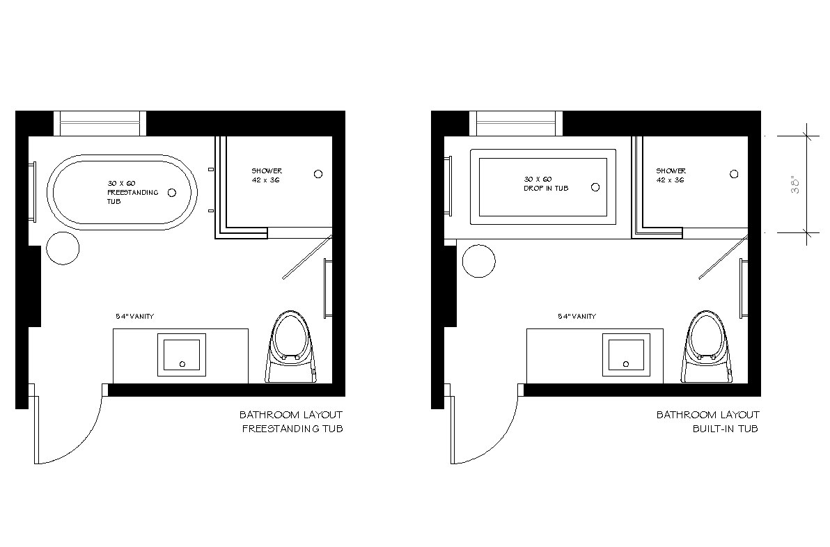
First I emailed her two preliminary layout options for incorporating a separate tub and shower which was the main objective, but the toilet and vanity locations remained the same.  She decided to go with a drop-in style tub with a tub deck and skirted front.  So the rest of the design plans were developed from there.


The final floor plan.


This is the Elevation at the window wall showing the new tub surround and seperate shower.  The tub selection was key as we needed to find one that was low enough to be installed under the existing window and one that had simple clean lines.  This new model from Duravit fit the bill perfectly!


This side elevation shows the half wall with glass between the tub and shower.  The paneled wainscotting and crown moulding added that traditional character to the room.


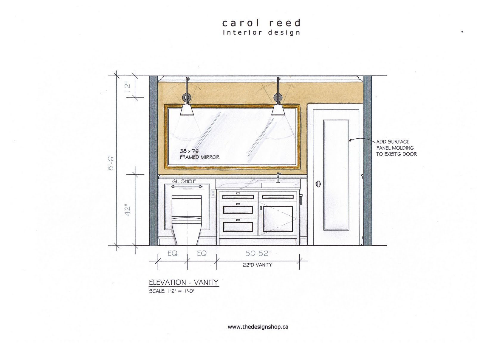
I had provided her with 3 options for the vanity wall, one option had a smaller mirror over a centre sink with scones on either side and a storage cabinet over the toilet, she had a hard time deciding as she really liked both, but in the end, she opted for this option with the large mirror and lighting above. 

In addition to all the drawings above, I also provided her with a list and photos of all recommended plumbing fixtures, light fixtures, hardware, mouldings, tile, window treatments and accessory selections along with sources and approximate costs.  You can see more images of this e-design package on thedesignshop.ca website sample gallery here.


The After's.....

The email I received from my client this week along with the 'after' photos was quite a surprise.  I received a short note from her along with some photos.  It was eloquent, and precise just like I imagine she is. "my bathroom has been complete for two weeks and I must say its the most beautiful bathroom I've ever seen. When the mirror was put up I had tears in my eyes..."


I proposed both a vessel style sink option and an undercounter mount,,,,,along with two faucet options of either a single lever or widespread.  I was surprised to see she didn't go with the vessel style sink, but I think this looks great too!


I also provided several ligh fixture options.  Often this decision is determined by what's available for when you need it, especially when you need two of them.  You can see on the design board (2nd photo from top) that not everything illustrated there is seen in the after photos, however, the final choices made were from alternate options provided in the design package, so there is always flexibility of choice offered to the client.


Well what can I say but - so beautiful!  Even without any professional styling or photography, the bathroom looks stunning.  These photos were taken just the other day and the bathroom has only been complete for 2 weeks so I imagine she'll be adding a few more accessories or artwork in the future.  I can't begin to describe how impressed I am with the results and congratulate her on doing such a stellar job!!   To realize what this homeowner accomplished - implementing this project on her own with a set of plans and written instructions is inspiring.  I think these images speak volumes to the importance and value of investing in a good design plan, but then again, this client is an Academic by profession so she was wise enough to recognize that! ; )

Since this house is located in Toronto, I'm making plans to visit in person before the end of next month so I can take some of my own after photos.  I'm looking forward to meeting this client in person and she's looking foward to relaxing for a bit, pampering herself in her new bathroom and getting ready to start her next e-design renovation project......the kitchen! 


Related Posts Plugin for WordPress, Blogger...