Thursday, September 23, 2010

Almost Afters: Gail's New Fireplace


Last Friday I attended my last official site meeting for Gail's Kitchen and Family Room renovation.  I started working on this project on Dec.11th, 2009 so its been a looong process seeing this new space evolve from paper to reality week after week.  This last meeting represented what I call substantial completion, meaning the construction is considered complete, and the homeowner moves back into her new space!!!  The crew packs up all their things and they move-on to another job site, returning as needed to finish off any outstanding small items.

When I was at the house early that morning, the guys were doing some final paint touch-ups, I didn't have the opportunity to take any 'after' shots because they were just about to start the big clean-up but I'll be back for a follow-up visit very soon.   One of my FAVORITE things in the space was the new family room fireplace and last week was the very first time I had seen it.  The fireplace itself is a new clean face model gas unit by Napoleon.  Since my previous visit the new surround and mantle had been installed so it was a bit of a 'reveal' moment for me when I walked in, and when I saw it there, I just stopped in my tracks and gasped! : )  The design concept for the fireplace had changed several times over the past couple of months....


Here are a couple of initial concepts,,,in each I had envisioned antique or reclaimed wood being used for the mantle.  It was an awkward space, to the immediate right was a window to the immediate left is a half wall with stairs to the basement and the fireplace wall is also the only wall in the room for the tv.


A short time later we discovered a stash of antique wood boards in the homeowners garage (located in an income property they own across the street).  Of course I went crazy over them and asked the contractor to make us a rolling door from the boards and.......if there was enough material I also wanted to use it for the fireplace mantle.


Then about a month later,,,,,the coppersmith visited the house to do a site measure for the new custom copper hood canopy I had designed.  He brought a few samples for me to review and as soon as I saw them I asked if he could also make the fireplace surround out of the same copper.  No problem he said (Oh I love to hear that!!!) so I sent him a sketch with dimensions....


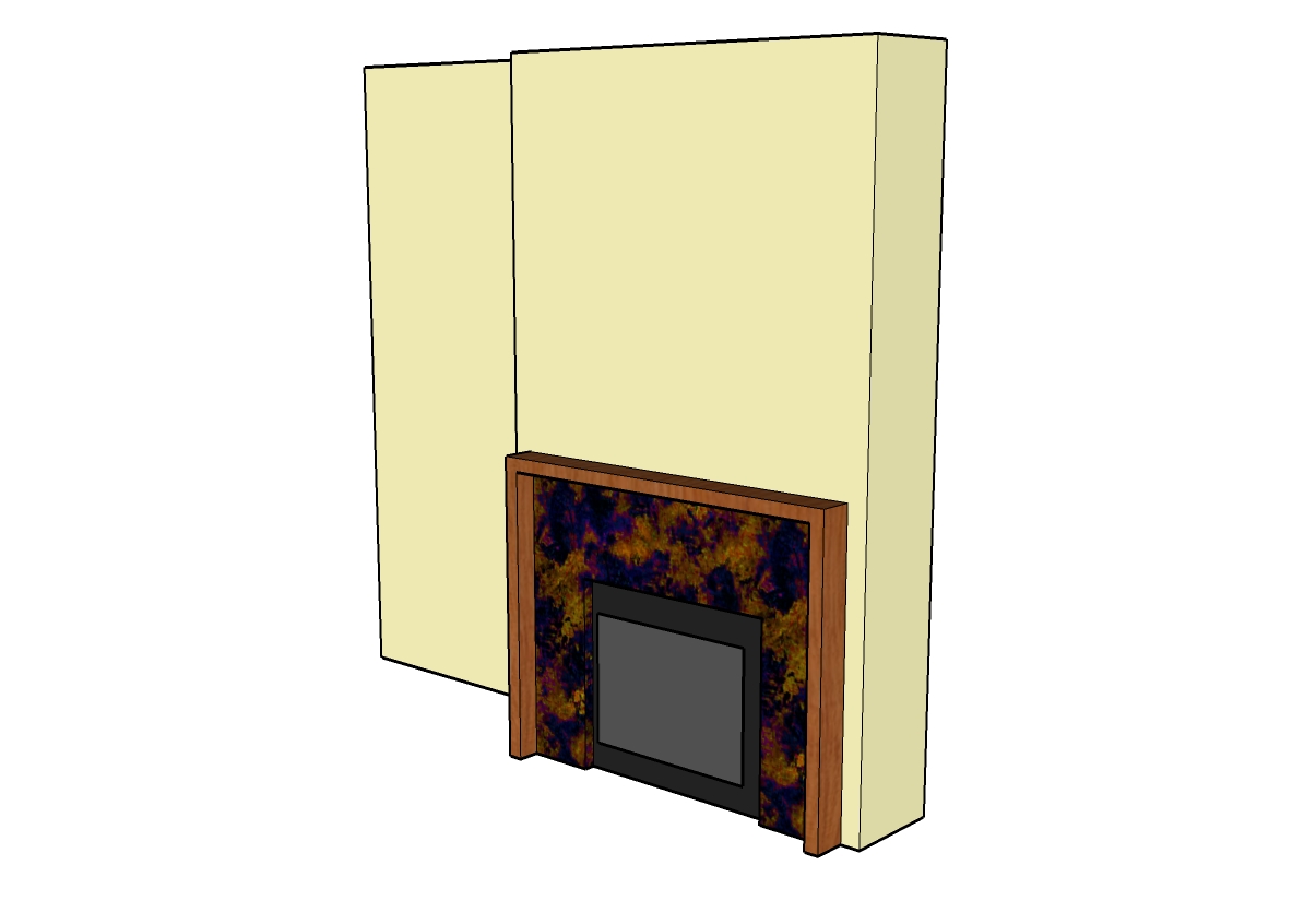
Excuse the ugly 3D image, (this is why I prefer hand renderrings) but I used this 3D sketch to illustrate how I wanted the copper surround and the wood mantle to be built.  A seperate sketch had all the dimensions on it.   I emailed this to the copper smith and my contractor who was making the mantle.  Unfortunately my contractor called me to say there wouldn't be enough of the antique wood left over from the door so what was plan 'b' ?  I asked him if he could find some rough hewn, gnarly wood that was about 2" x 6",,,,,, and that was the last I heard from him.


A few days later I showed up for my final site meeting and this was what they had built.  I LOVE it!!!
  

The homeowner is over the moon about it, and seriously I wish this fireplace was in my own home.  Its rustic and contemporary and I have to say I've never seen anything else like it, my contractor hit it outta the park with this one.  The wood he used was rough-hewn douglas fir, the knots are absolutely gorgeous and have the same character as the loft grade natural oak floor.  When I took this photo it wasn't quite 100% finished yet, the mantle was about to receive one more light sanding and a coat of oil.  Then the copper surround gets a once over with steel wool to remove some of the black coating and bring out the copper, the steel wool also gives it a low lustre sheen.

I hope you enjoyed this little glimpse of what the 'almost' finished space looks like, I have to say its a dramatic transformation from what was once there and I can't wait to post all the after photos. 


Note:  When building a surround and or mantle for any gas fireplace, its critical to refer to the mfg's installation specifications where you'll find all the minimum clearances that must be maintained.  There are strict clearances that must to be adhered to with regards to the use of combustible and non-combustible materials when cladding the surround and there are various clearance requirements with regards to mantle projections.  Always follow the mfg's specs for your exact model.


All Photos:  Carol Reed


Sunday, September 19, 2010

Guest Bedroom: 70's Sidesplit


Earlier this year I completed a project for a single mom and her young daughter which involved furnishing an entire house for them, from scratch, in only 3 months and on a tight budget.  This was a bit of a departure for me as far as projects go because there was actually no renovation work involved at all, not even a paint job.  To see some of the 'before', 'during' and 'preliminary after' photos of the project you can check out some earlier posts here and here.  You can also have a look at some after photos of the little girl's bedroom here.


My favorite room in this house was the guest bedroom,,,,,,which seems to always be the case with me! Since this particular clients has a love of all things french country, I had envisioned a simple, understated french inspired room.  The total spending budget for the room was $3,500 incl. taxes but not including the mattresses, design fees or mark-ups (note: reality of small budgets like this is that design fees can often be as much or more than what you spend in the room).  Because I didn't have much time for sourcing this also meant no time for refurbishing, refinishing, reupholstering or getting crafty with DIY projects either - I had to be fast and resourceful with ready to use finds.  I also had to work with the paint colour she had already chosen for the room, ICI's Bavarian Cream.  To be honest I wasn't a fan of this colour choice at all, in fact I really dislike any colour that resembles peach and these walls screamed peach.  Since repainting wasn't an option my approach was to play it down and ignore it.  I avoided putting anything in this room that had more of this colour,,,or enhanced this colour in any way - I find the best way to do that is with black and white.  This classic b&w scheme did such a fantastic job of neutralizing the peachiness of the wall colour that my client thought I had repainted the walls.    

I took these photos back in early June and the room is photographed exactly as it looked when I arrived, except for the fresh roses which I picked up at the grocery store on my way there!  I really make an effort not to prop-up rooms for a photo with things that don't belong in the room or aren't owned by the client - I prefer to keep it real.   In this case, I literally had a few dollars left over for a couple of accessories so I purchased a small bud vase at Pottery Barn and a bedside clock at Loblaws, the books are from the clearance table at Chapters.


I started my sourcing by searching for a pair of antique iron twin beds, not an easy task.  Its challenging to find a pair of anything and even harder to find a pair of antique anything.  A short road trip to one of the largest antique iron bed suppliers in Canada scored me this stunning pair of twins which I blogged about in an earlier post here.


At $600 a piece they were definitely the splurge for the room but worth every penny! They had been restored and modified to suit modern day mattress sizes so they were ready to use.  Seasonal hypo-allergenic duvets and egyptian cotton tone on tone striped duvet covers from Bed Bath & Beyond are folded back at the ends of the beds.  I tried to find duvet covers in a twin size that had a bit of black stitching or banding,,,but no luck.


A couple of days after buying the beds I experienced one of those rare ocassions of being in the right place at the right time when i came across a pair of twin matalisse bed sets at Elte for 60% off.  Two matalisse shams and two coverlets with beautiful scalloped edges for less than $130!  They were perfect for the antique beds.  Then on top of this I added a lace trimmed pillow case from Pottery Barn, and a lace-up accent pillow from HomeSense to each bed.


  I found a pair of ready-made gorgeous black and white toile style drapery panels from Invu and scored a black chest of drawers and milky glass gourd lamp from HomeSense. What doesn't show in the photos is the antique brass tear drop style pulls I installed on the chest - so pretty!!


A moravian star fixture (from Home Depot) was definitely the highlight of the room.  Wicker trunks from Ikea are placed at the foot of each bed.  The framed prints on the wall are in keeping with the french theme, they're copies of handwritten 'travel memoires' from Paris.


The only thing missing from the room on move-in day was a dresser.  I wanted an old painted dresser and though not expensive these things can take some luck to find so I held off until the spring antique season arrived.  A couple of months later and on my first trip of the season I found a vintage dresser at the Aberfoyle Antique Market. The size was perfect, it was only 17.5" deep and had 5 drawers so it worked perfectly with the room and the budget, it was a steal!


I added a vintage style oval mirror from Home Depot (handyman was there to hang it) and on the wall to the right of this photo is a series of decorative black iron hooks.  


Overall I loved the way the room came together - its luxuriously comfortable and beautiful.... and on full view everytime you walk up the stairs in this house, so inviting you actually want to just stop and stare at it!  My client and her daughter love the room so much they've had sleepovers in there themselves several times....


All Photos:  Carol Reed

Tuesday, September 7, 2010

Upload: September 6th


The new look of Restoration Hardware Toronto.


Its been a couple of months since I posted an Upload,,,,with things so hectic before going away on vacation at the end of July I didn't have an opportunity to do one of these before we hit the road and then since returning I've been swamped trying to get caught.  I've dumped hundreds of photos off my Iphone in the meantime, here's a random look at what I've been up to including; some job site photos,,some great finds, some new finds, some things that insprired and some things that just made me smile.


 I popped into RH last week with a client and we stopped immediately in our tracks right inside the door, took a look around and asked if they were open?  It was really dark inside even though it was the middle of the day, but yes of course they were open but with a entirely new look!  The Toronto showroom had just undergone a complete overhaul, every inch of the store had been painted a dark warm grey, Restoration Hardware's Slate.  You'll notice in the top photo they painted out all the mouldings and railings to create a monochromatic look - I love this treatment, it gives a contemporary feel to traditional mouldings and is particulary ideal for creating a gallery look.  In fact, its a gallery look they were going for.  Gone are the soap displays, paint displays and various nick-nacks and toys, even the hardware is contained and artfully displayed behind glass.  They were still busy setting up displays and awaiting delivery and installation of lighting so in the meantime the store is pretty dark.


From an idea in my head more than 6 months ago,,,,, to a sample I approved in July,,, 


To installation day a few weeks later.......


In addition to the custom copper hood, the counters and backsplash were installed in Gail's kitchen while I was away on holidays.  All the finishing touches are happening this week so Gail can finally, finally, move in. : )


Sourcing some lighting for Gail's mudroom.  I've never met a schoolhouse fixture I didn't love..


A puurrrrfectly styled bookcase ; )


Halfway thru setting the table on the back deck as his highness keeps an eye for squirrels.  My new 'Soho' outdoor pillows from Tonic Living seen on the bench.


New exterior lighting for the urban rooftop deck project. Clean and modern looking it reminds me of the lanterns we're accessorizing with.  Fixture from Sescolite.


In addition to white and dark grey sunbrella pillows, we're having a few non-outdoor fabric pillows made for the rooftop deck which will be brought out for entertaining.  I selected these fabrics from Thom Filicia's collection for Kravet - large scale, graphic, gorgeous!


Speaking of graphic pillows...I was crazy for these quilted pillows that I saw on the East Coast, although you can't get more traditional that quilting - these geometric patterns have a modern feel to me, I'd love to see them in a clean contemporary space.  They weren't made locally however, they were imported from Thailand which tells me this is a look we'll be seeing a lot of.    


And these,,,,,folksy looking pillows, I regret not picking up a few of each!


I looked at lots of quilts when I was away but still didn't find 'the one' that I had to have.  Unlike most of what you come across in many of the touristy stores in Nova Scotia, the quilts in this shop were all locally made by hand and cost thousands of dollars each.


On our trip we ate these almost every day - they were local Indian Point mussels from Mahone Bay and were the best mussels I've ever eaten.  I make them at home all the time but I'd never had them like this before.  Every where we ordered them they were served the same way, steamed (usually in garlic and wine) and served with a side of melted butter and lemon.  Sooo good, I'll be making them this way at home now!


I helped a family member select a new faucet for his kitchen reno.....


It works beautifully with the custom sink I had made for him earlier this summer and was just in time for the new counters to be installed.......almost done.  Sigh. : )


I headed north on a little road trip to survey this chink log home.  I'm re-designing its kitchen, 3 bathrooms, a lower level games room and,  cover your ears if you're a wood lover,,,we'll be painting out a LOT of knotty pine and giving this rustic home a modern edge.


The interior was a little slice of heaven for me, white, grey, and caramel wood tones, it just doesn't get any better than that for me.  A view into the master bedroom on the second floor, the chink logs are visible around the lower section of all the perimeter walls.  The plank floor boards are gorgeous and look stunning with the weathered grey logs.  To the immediate left is an ensuite which will get an overhaul.


A few irresistables at Angus & Company, (perhaps my favorite shop in TO) talk about wanting one of each...., yes please I'm so looking forward to fall!


Oversize bowls, fringe,,,,,seagrass.  sigh.


I'm wild for b&w accessories these, lacquered boxes look great in any room.


B&W pillow detail.


I've been craving hits of yellow since my trip out east,,,I found these silk pillows at a consignment shop the other day and I just might have to buy them for myself.  In fact they're much brighter than they appear in this photo, in person they're a vibrant canary yellow - I think they'd make any room sing.


All Photos:  Carol Reed


Saturday, September 4, 2010

Photographer: Mark Burstyn


The studio of photographer Mark Burstyn (Iphone photo by me).


I had the pleasure of meeting the very talented Toronto photographer Mark Burstyn this week while working together on a project (I'll tell you more about that in a future post).  With over 20 years of experience Mark has an impressive client list and a stunning portfolio of food, interiors, exteriors and product photography.   Although I'm completely captivated by his images, I was totally smitten with his bright loft studio and the way it was so stylishly outfitted.  It was flooded with natural daylight and had all the comforts of home, designed to accommodate every need of his varied clients.

Upon entering the loft I was crazy for this little vignette seen in the photo above.  I rarely meet a vintage chair I don't love, and this one was no exception, its simple retro lines upholstered in robins egg blue made quite a statement paired with the framed b&w photo. The powder room was located to the right of the chair and the inside of the bathroom was painted this same cheery shade of blue, it just made you smile when you walked in.  (Sorry I didn't take more pictures!)


The studio's kitchen area.

I couldn't resist sharing this photo with you of the studio's kitchen and dining area - its a complete working kitchen with full size appliances and outfitted with all the necessities, Mark keeps it fully stocked with lots of goodies, you can't help but feel a little spoiled when you're there. : )   The kitchen is by Ikea, including the furniture but I thought it was a really good example of a non-customized Ikea kitchen,,there are no extra bells and whistles like custom fabricated counters or custom paint finishes or gables or brackets.  The kitchen itself is spacious with a huge island, double height cabinets and loads of storage space.  The lower cabs are stainless, the uppers are glass with aluminum trim, the countertops solid oak, (steel + wood + glass +white). The lighting was well planned with nothing overlooked, I can imagine how beautifully lit this would be in the evening.  Its simple, utilitarian looking and super functional - it perfectly suits this raw loft space.   Of course my favorite part of the entire kitchen,,,,,,are Mark's framed photographs.

I'm always repeating that it doesn't matter how expensive or inexpensive the things in your space are, that's not what defines good design or good taste.  When you're in a well appointed space (every need has been though of) that's highly functional, pleasing to the eye and is filled with wonderful light, you feel a level of comfort and ease that's hard to depict in a photo.  In other words your experience in the space is enhanced - I believe that's ultimately what everyone wants to achieve in their own homes.

If you're craving a dose of stylish inspiration this long weekend, pour yourself a cup of hot tea, and have a browse thru Mark's gorgeous portfolio here - I'm sure you'll recognize some of his work.  Enjoy!


Chair Photo:  Carol Reed
Kitchen Photo:  Mark Burstyn
Related Posts Plugin for WordPress, Blogger...