Thursday, October 28, 2010

New Project: A 70's Bungalow Redesign


I received a call from a wonderful couple waaay back in the late spring, they were interested in hiring me to oversee a complete redesign of an old bungalow they had just purchased in the west end of Toronto.   They were downsizing from a large family home and envisioned this bungalow as being their new empty-nester modern 'condo' but without actually having to move into a condo building.  A bungalow would give them the benefit of some outdoor garden space but they wouldn't have to endure the inconvenience of elevators, underground parking and adjoining neighbours.....(I can totally relate!).

This new house would offer them 2400 s.f. of spacious living all on one level, including 3 bathrooms, a laundry room and 2 fireplaces.  The bungalow was built in the late 60's or early 70's and has those distinct low horizontal lines often symbolic of that era, and I loved that about it.  These lines would lend themselves beautifully to a modern redesign in a simple contemporary style.  It was evident immediately that we both shared a similar enthusiasm for the redesign of this house,,,and about a month later I was officially on board, about 2 months later and summer vacations out of the way,,, the 'marathon' design planning got underway - its been a whirlwind!

Here's a look at the floor plan when they purchased the house.


The kitchen had already been removed (by Habitat for Humanity) by the time I began preparing the drawings, hence this plan only shows the old sink location.


There was a large additon on the back of the house which was once an old porch but now enclosed, however, these are never insulated well (if at all) and often lack proper footings or foundation.  They had no idea what to do with this space so their initial plan was to just keep it as a 2 or 3 season room.  Considering its adjacency to the kitchen it didn't make sense to me to have this as a seasonal room, imagine closing off this room for 3 or 4 months a year, dedicating an entire wall of the kitchen to this closed off room.  I knew it either had to go completely or,,,they'd have to invest a lot of money to upgrade it.  Its usually faster and easier to tear down and rebuild these make-shift add-ons then fix them,,and for minimal difference in cost.

Now here's a look at a proposed plan they had come up with before they decided to purchase the house.   These are the plans they brought to me when we first met and explained that this is what they had in mind but they were still very open to new ideas, or 'tweeking'.  I was happy to hear that! : )


This plan was drawn up for the homeowners with the assistance of the real estate agent's office.  The thing that I didn't love about this proposed layout was the open concept at the front door with its half wall and column.  I'm not a fan of completely open concept, I like 'rooms' and I particularly like a bit of a separation at the front entry to provide a weather barrier and privacy.  Whether its your pizza delivery guy or dinner guests,,,its nice to have a zone where they can enter without being on full view, centre stage.   So my approach was to ignore this plan completely and begin my own space planning process.  Sometimes small changes to a layout can make a huge difference, other times its just not enough of an improvement to realize all of the homeowners requirements or the full potential of the space.

Here's a look at what I proposed,,although I explored dozens of options this is one of the final two layouts I presented to the homeowners which I thought offerred the best solutions.  There was  another version of this plan with a different Master Bedroom layout incorporating a walk-in closet dressing area connected to the ensuite.  I liked the idea of having separation for the closet and dressing area but the homeowners preferred this version below and were totally cool with having wardrobe closets open concept to the bedroom area.


I have to say my clients were a bit blown away when they saw the layouts (in a good way) - they hadn't envisioned relocating the laundry room but for me it was key to making this house work and I saw it immediately when I looked at the plans for the first time.  The no1 thing that bothered me about the original house layout was the laundry room location.  In the new proposed layout I created a laundry room with direct access into the garage, acting as a mudroom slash laundry room.  This puts the laundry room close to where all the laundry is generated and the new interior door to the garage gives them convenient access to recycle/waste bins without having to go outside.  On every project I work on, these bins have become such a major challenge do deal with, there's so many fo them, they're huge, they have to be wheeled to the curb every week and/or two weeks but you also need to access them on almost a daily basis.

In addition to a new laundry/mud room this proposed layout now offered an enclosed front entry vestibule where you could leave wet or mucky boots and umbrellas,,and then proceed into the long and spacious symmetrical hallway with a doulbe set of closets to hang your coat and drop your bag(s).  Opposite the closets would be a symmetrical, deep framed opening centered on the large living room fireplace, which I can tell you is going to be a spectacular, stunning modern fireplace,,,,,,,,of some sort,,,,,that's one of the final details I'm working on. ; )  The Den will be 'his' home office and has its own walk-in closet with file storage but will also house their server, wireless internet equipment,,,and home theatre/audio electronics.  Both homeowners required a home office so the Guest Bedroom will function primarily as a library/office for 'her' and accommodate ocassional overnight visitors (there also a full bedroom and 3 piece bathroom in the basement).  The kitchen is now open to what will be the new family room which will be bright and spacious and perfect for entertaining.  I'll post more about the kitchen design later!

The furniture configurations on the plans are completely preliminary at this stage and are meant only to give us direction in placement of lighting and electrical, but even this will be planned so there is flexibility in furniture placement.

The first and most important phase of the re-design was coming up with this new layout - from here I would develop the interior construction budget and then proceed to develop the design details for the kitchen, baths, fireplaces and all other other construction details and finishes.  But already, at this point just having achieved a floor plan that so drastically improves the function and flow of the space - the design process has already exceeded my clients expectations.  To me, I think the most critical and valuable part of the design process is creating a great floor plan.  If the overall plan isn't well thought out, if it functions poorly or lacks flow then it doesn't matter how 'pretty' you make it, the redesign won't be a successful one.

Construction is now well underway and I'm busy wrapping up the last final design details with the homeowners so stay tuned for periodic updates on the transformation of this 70's gem.

Saturday, October 23, 2010

One Fall Day


There's no other month that represents so many of my favorite things like the month of October, its even the month I was born so I've always felt that October and I were made for each other!  It's a month that truly stimulates all the senses and can make you feel so invigorated, it celebrates the best of mother nature and triggers our nesting instincts.  In my part of the world, October means warm sunny days, sweaters, boots, wood fires, harvest dinners, wine tastings, pumpkin pies, apple crisp, butternut squash soup, country drives,,,,, and all around you, being surrounded by the most spectacular explosion of colour you can imagine.  Once it arrives, I never want the month to end. : )

People travel from all parts of the world to experience the fall colours of North America but those of us who live here are priviledged to enjoy this natural phenomenom every year right outside our own windows. October wouldn't be complete without at least one drive into the countryside to soak in all the fall colours,,,and maybe come home with a pumkin or two.  On thanksgiving weekend we woke to the most perfect indian summer day you could ever wish for so I grabbed my camera and we took a short drive west of Toronto to the Niagra Escarpement area.  Because its been a warm fall season the holiday weekend this year wasn't quite the peak timing for colour but still, the 'leaf lookers' were out in droves and there was plenty of scenic beauty to take in even though we weren't seeing fall in all its glory just yet. 

Here's a glimpse at some of the images I captured that afternoon both on our drive in the country and from right outside our window at home.  Enjoy!


We drove and walked for hours thru picturesque roads like this one...


The yellows were luminous against the clear blue sky....


The leaves glowed in the sunlight, it was breathtaking....


A red Tree House in a forest of golden yellow...


There was bright orange.....


And spicy reds...


And still a lot of green....


The Niagara escarpment made a colourful backdrop to this farmers field.


I especially love the contrast of the colours against the weathered grey barns...


I was captivated by the rows in the corn fields along the side of the road, the texture and the colour especially,,,I caught a glimpse of this perspective for a split second when we drove by and had to turn back to get some photos (ok, i took about a 100) ; )


But you don't have to drive to the country to see all this beauty, back at home in the city up in my 2nd floor studio surround by windows, the view to the lake was framed with bright red maple leafs...


And in every other direction you looked the trees were literally glowing...


It was amazing to just sit on the sunny deck and stare at the colours...


And finally one last shot before the sun went down on this perfect October day.....


Monday, October 18, 2010

House & Home - November Issue


This past August I was THRILLED to have been selected by Mark Challen of Canadian House & Home to be the feature designer in a two page Sico Paint advertorial the magazine was producing, this would be the the sixth and final shoot of the series.   I was asked to design a dining room vignette featuring a few of "My Favorite Things" and showcasing a Sico colour palette, needless to say I was pretty hyped about the concept especially because dining and entertaining is already one of my favorite things! I feel so fortunate to have been given this opportunity, it was truly an amazing experience and such a pleasure to work with Mark Challen and Peter Paquette at H&H and the super talented photographer Mark Burstyn, who I mentioned not too long ago here.

The above pic is a snap I took on my Iphone the day of the shoot.   I'll do a behind the scenes post sometime in the near future describing how it all came together so quickly, including some speedy help from Elevator Digital in framing up my personal photography - thank you Kevin!  For now you can check out the entire spread in the current November issue of Canadian House & Home on stands, and on-line now!  Hope you enjoy, let me know what you think!


Canadian House & Home, November 2010


*EDIT*
Visit the House & Home website for your chance to win these stunning organic shaped bowls that we used in this shoot.  I absolutely adore these and think they're so versatile, used individually or grouped together.  If you check out Suzanne Dimma's home featured in the November issue you'll spot these in several different places around her house too...


Photo and room design by:  Carol Reed

Saturday, October 9, 2010

Modern Log Home - Guest Bath


Guest Bathroom design concept.


Last month I took a road trip to visit a clients weekend cabin located in a popular resort town a few hours north of the city (skiing, golfing, boating etc).  The homeowners are clients of mine who I've been working with for the past several years renovating their home in the city.  They purchased a weekend property earlier this year, its a chink log cabin that was built about 20 years ago.  A chink log cabin has squared logs instead of round and are stacked horizontally with a mortar bed (chink) in between the logs.  The logs used for this type of construction are weather equally on all sides so the exterior and interior look the same, in this case the builder used pine logs that had been weathered for 5 years and aged to a beautiful heather grey.  On the second floor where the guest bathroom is, the log walls are only about 3 feet high, as a result visually this creates a horizontal wainscotting effect.  In the guest bathroom, all the walls outside the room have this log feature but inside the bathroom there are only 2 of these log walls, you can see one of them in the photo below. 


Interior log wall of Guest Bathroom.


Now that my clients own the cabin they want to update the interior to reflect their personality and lifestyle, starting with the colonial 'knotty pine' kitchen and bathrooms.  They're a young family who are drawn to character homes but love simplistic modern style interiors and especially anything that's vintage 60's and 70's.  Knowing their style, I have to admit I was pretty EXCITED at the idea of mixing this modern aesthetic with the log cabin structure,,,,,,the interior would be a cool mix of rustic + vintage + modern + industrial - whatever you wanna call it (I hate trying to labell a style) it'll be a personalize mix that can only be called 'their' style.

For some bathrooms I design I'll spend a lot of time on the details, custom designing a vanity and mirror, I may spend hours searching for just the right marble or stone,,,searching thru batches of warehouse inventories to find just the right lot of tile or the perfect slab, and I'll order that 'perfect' light fixture, and faucets and statement tub,,,,,hoping they'll arrive within the next month or two.  But for some bathrooms I design, like this one,,,,,its all about simple design with ready-made and in stock.  These are the projects I really like to share on the blog because I think more readers can relate to these types of renovations.   My objective for this bathroom was to come up with a design plan using materials that were readily available thru local building stores up north and/or products that my clients could simply purchase off the shelf and bring them to the cabin on a weekend visit. The contractor was already standing-by, ready to go he was just waiting for the design plans.  So with no time to waste (literally!) here's what I came up with... 


Keeping in mind there are weathered grey logs on two walls and no windows, I wanted to use lots of white to keep it bright, modern and really showoff the wood.  To me, nothing beats the simplicity of white subway and hex tile, the grey grout will give it a vintage vibe and an entire tiled wall simplifies all the angles.  I proposed installing the subway tile vertically to enhance the vertical lines to offset the low ceilings.  A ready-made floating vanity in high gloss white is a modern contrast to the weathered grey logs, with 2 drawers its also super functional.  Because I wanted the vanity to go wall to wall, I've asked the contractor to make a cubby shelf at the one end.  A new glass enclosed shower with ready-made carrara marble jambs will replace the tiny old one piece insert.  I suggested an industrial style cage light painted in a fun bold colour like a tourquoise blue or bold yellow,,,with towels to match.  The large round steel rimmed mirror, numbered towel sets and chevron bathmat are fun graphic elements. 


A slightly different twist on the same concept, here I suggested an entire wall (the vanity/shower wall) be clad in the multi-toned glass mosaic with the rest of the shower wall tiled in the white subway and a light grey floor tile.  I've seen this glass mosaic at Lowes and HD so its readily available and not super expensive.  I like modern graphic of the small 3/4"x3/4" and all the various tones of grey and white which I thought added interest and compliments the wide stripe effect of the grey logs, both visible from outside the bathroom too.  Although this is probably my favorite of the two options,,,they opted to go for the white subway tile, installed in the typical horizontal fashion (I tried!).  I then sketched a quick 3D for them to illustrate the shower stall glass detail and how everything all worked with the slope ceiling.


A couple of days after the design plan was finished I did a quick scouting trip for some lighting and came across this awesome outdoor fixture that I thought would be perfect for the bathroom, especially with a silver base bulb.  I love the industrial style of this fixture and at only $45 I think they're a steal!  The homeowners loved it so much they've bought several of them to use in the other bathrooms too.  Now let's see if I can convince them to paint at least one of them yellow. : )


The old bathroom was torn out about 2 weeks ago and the contractor is already about halfway finished building this new one, he'll soon be ready for the glass and the countertop to be templated which are the only things not ready-made or off the shelf but will give the entire bathroom a custom look. Once this is done I'm not quite sure yet if he'll be moving on to the new design plans I've done for Master Bedroom Ensuite,,,,, or the kitchen, but I'll keep you posted!


HAPPY THANKSGIVING!


Sunday, October 3, 2010

Master Retreat: 70's Sidesplit


Since the end of August I've started on so many new projects, a few of which I'll be working on over the next 6 months to a year - and will tell you more about them in future posts.  Since before the end of August I've wrapped up a lot of projects so I'd like to get some of these after pics off my plate so to speak before I move on to posting about the more recent stuff I'm working on.   The 70's suburban sidesplit I furnished for a single mom and her daughter was completed earlier this year, for me it was the first time I took on a project that didn't involve any renovating whatsoever - that had all been done before I came on board.  You can read more about the background story of this project here, and see after photos of the Daughter's room here and the Guest Bedroom here.

Like the other bedrooms in the house the master bedroom was on the small side but typical for a sideplit, it had a small walk-in closet and a tiny 3 pc ensuite and no redeeming architectural features at all.  It had brand new hardwood floors and a fresh paint job when I first 'met' this room.  My task was the same for this space as it was for the entire house, furnish it from top to bottom from scratch and have it completed and move-in ready in less than 3 months.  Although she invested in a designer, her spending budget was modest so every splurge would need to be balanced with a few great finds. 


The Before: this is what the room looked like the first day I saw it, the painters were just finishing up (talk about bad timing!).  Once again I would have to work with ICI's Bavarian Cream. : /   My client has a love for all things feminine and glamourous and traditional and elegant and french inspired and she wanted her new room to be all those things, but she's also young, professional and stylish so it had to be done in a way that looked modern and fresh (and by modern I mean current).


The After:  I had a custom diamond tufted headboard and end of bed bench made, added an elegant crystal chandelier, a luxurious wool area carpet and glamorous mirrored chests on either side of the bed.  The ruffled bed skirt, damask duvet cover and shams are from Au Lit.


Ready-made lined cream linen drapes with inverted pleat top and full length sheers dress up the not so fabulous looking window.  I found an antique walnut dressing table with 4 big drawers and after contemplating several options for new chairs, my client found this antique chair stored in her mother's basement, it belonged to her much loved aunt.  I thought it worked perfectly with the vanity and loved the fact that it had sentimental value.  This chair and one pair of antique lamps were the only things that my client brought with her into this house.  She does plan on reupholstering the seat or adding a slipcovered seat with 3/4 skirt.  The etched mirror accessories are vintage from Chatelet Home.  The knobs on the vanity were replaced with crystal ones since this pic was taken.


I had originally purchased a potted orchid for the dressing table but by the time I had returned and taken most of these photos,,,,all the potted orchids in the house had died, she's now replaced them with artificial.  This is a bad Iphone pic, for some reason I have no decent after photos of this area of the room,,,I think its because from every angle I tried to shoot it I was getting a bad reflection in the mirror.. 


When it comes to designing spaces or furnishing a room, I'm most particular about lighting more than anything.  Sometimes its to my detrement because I can get really hung up on finding something that I feel works just right,,,,,,,style, size, function,,,if its not just right,,the entire room falls short.  These lamps are one of my favorites and are from Crate & Barrel.  I like the simple form of the base and the drum shade which adds a modern touch to the space, it has a subtle crackle glaze, the soft curves and silk shade are so elegant.  I think their simplicity pairs well with the traditional crystal chandelier. It was near impossible to find a pair of these in stock but after much begging, pleading and phoning I did manage to score a pair at the 11th hour.


The wool area carpet had a traditional feel to it, it had a taupey cream coloured border with a grey/blue main field.  The end of bed bench wasn't ready in time for move-in (the day this shot was taken) but was delivered only a couple of weeks later....


Diamond pique lace edged coverlet & euro shams, and lace edged pillow cases were great finds from HomeSense as was the sunburst mirror.


The bench was delivered a couple weeks after move-in...


When I delivered the bench I also brought along one more finishing touch (which is now my most favorite thing in the room), a cream coloured velvet pillow with feather trim.  My client was completely in love with her new room already and this little find sent her over the moon. : )
Feather pillow, HomeSense.


Even though everything in this room is new to my client except her aunts chair, I'm happy that all things in the room aren't brand new - it was important for me to mix in a few antique pieces so the end result is a mix of new and old, splurges and saves, ready-made and custom made, feminine and tailored,,,,, but best of all I think we achieved traditional without looking dated.


All Photos:  Carol Reed


Thursday, September 23, 2010

Almost Afters: Gail's New Fireplace


Last Friday I attended my last official site meeting for Gail's Kitchen and Family Room renovation.  I started working on this project on Dec.11th, 2009 so its been a looong process seeing this new space evolve from paper to reality week after week.  This last meeting represented what I call substantial completion, meaning the construction is considered complete, and the homeowner moves back into her new space!!!  The crew packs up all their things and they move-on to another job site, returning as needed to finish off any outstanding small items.

When I was at the house early that morning, the guys were doing some final paint touch-ups, I didn't have the opportunity to take any 'after' shots because they were just about to start the big clean-up but I'll be back for a follow-up visit very soon.   One of my FAVORITE things in the space was the new family room fireplace and last week was the very first time I had seen it.  The fireplace itself is a new clean face model gas unit by Napoleon.  Since my previous visit the new surround and mantle had been installed so it was a bit of a 'reveal' moment for me when I walked in, and when I saw it there, I just stopped in my tracks and gasped! : )  The design concept for the fireplace had changed several times over the past couple of months....


Here are a couple of initial concepts,,,in each I had envisioned antique or reclaimed wood being used for the mantle.  It was an awkward space, to the immediate right was a window to the immediate left is a half wall with stairs to the basement and the fireplace wall is also the only wall in the room for the tv.


A short time later we discovered a stash of antique wood boards in the homeowners garage (located in an income property they own across the street).  Of course I went crazy over them and asked the contractor to make us a rolling door from the boards and.......if there was enough material I also wanted to use it for the fireplace mantle.


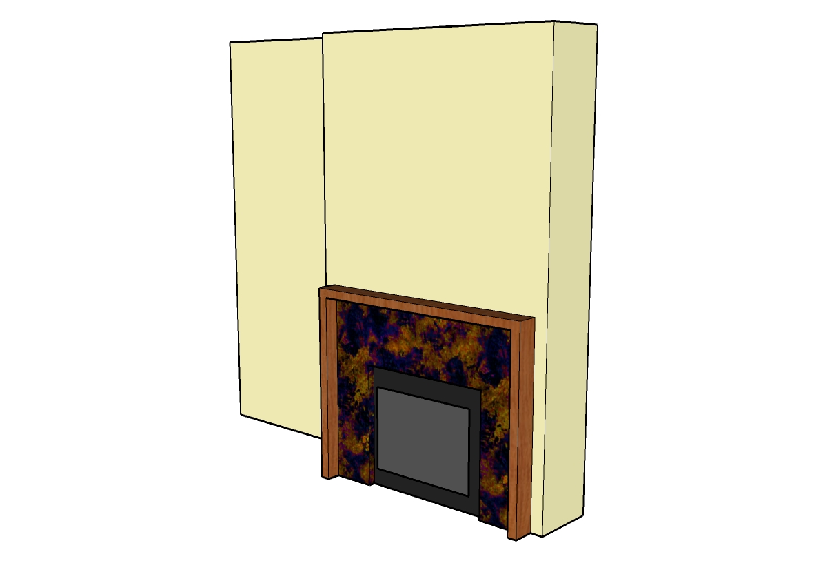
Then about a month later,,,,,the coppersmith visited the house to do a site measure for the new custom copper hood canopy I had designed.  He brought a few samples for me to review and as soon as I saw them I asked if he could also make the fireplace surround out of the same copper.  No problem he said (Oh I love to hear that!!!) so I sent him a sketch with dimensions....


Excuse the ugly 3D image, (this is why I prefer hand renderrings) but I used this 3D sketch to illustrate how I wanted the copper surround and the wood mantle to be built.  A seperate sketch had all the dimensions on it.   I emailed this to the copper smith and my contractor who was making the mantle.  Unfortunately my contractor called me to say there wouldn't be enough of the antique wood left over from the door so what was plan 'b' ?  I asked him if he could find some rough hewn, gnarly wood that was about 2" x 6",,,,,, and that was the last I heard from him.


A few days later I showed up for my final site meeting and this was what they had built.  I LOVE it!!!
  

The homeowner is over the moon about it, and seriously I wish this fireplace was in my own home.  Its rustic and contemporary and I have to say I've never seen anything else like it, my contractor hit it outta the park with this one.  The wood he used was rough-hewn douglas fir, the knots are absolutely gorgeous and have the same character as the loft grade natural oak floor.  When I took this photo it wasn't quite 100% finished yet, the mantle was about to receive one more light sanding and a coat of oil.  Then the copper surround gets a once over with steel wool to remove some of the black coating and bring out the copper, the steel wool also gives it a low lustre sheen.

I hope you enjoyed this little glimpse of what the 'almost' finished space looks like, I have to say its a dramatic transformation from what was once there and I can't wait to post all the after photos. 


Note:  When building a surround and or mantle for any gas fireplace, its critical to refer to the mfg's installation specifications where you'll find all the minimum clearances that must be maintained.  There are strict clearances that must to be adhered to with regards to the use of combustible and non-combustible materials when cladding the surround and there are various clearance requirements with regards to mantle projections.  Always follow the mfg's specs for your exact model.


All Photos:  Carol Reed


Sunday, September 19, 2010

Guest Bedroom: 70's Sidesplit


Earlier this year I completed a project for a single mom and her young daughter which involved furnishing an entire house for them, from scratch, in only 3 months and on a tight budget.  This was a bit of a departure for me as far as projects go because there was actually no renovation work involved at all, not even a paint job.  To see some of the 'before', 'during' and 'preliminary after' photos of the project you can check out some earlier posts here and here.  You can also have a look at some after photos of the little girl's bedroom here.


My favorite room in this house was the guest bedroom,,,,,,which seems to always be the case with me! Since this particular clients has a love of all things french country, I had envisioned a simple, understated french inspired room.  The total spending budget for the room was $3,500 incl. taxes but not including the mattresses, design fees or mark-ups (note: reality of small budgets like this is that design fees can often be as much or more than what you spend in the room).  Because I didn't have much time for sourcing this also meant no time for refurbishing, refinishing, reupholstering or getting crafty with DIY projects either - I had to be fast and resourceful with ready to use finds.  I also had to work with the paint colour she had already chosen for the room, ICI's Bavarian Cream.  To be honest I wasn't a fan of this colour choice at all, in fact I really dislike any colour that resembles peach and these walls screamed peach.  Since repainting wasn't an option my approach was to play it down and ignore it.  I avoided putting anything in this room that had more of this colour,,,or enhanced this colour in any way - I find the best way to do that is with black and white.  This classic b&w scheme did such a fantastic job of neutralizing the peachiness of the wall colour that my client thought I had repainted the walls.    

I took these photos back in early June and the room is photographed exactly as it looked when I arrived, except for the fresh roses which I picked up at the grocery store on my way there!  I really make an effort not to prop-up rooms for a photo with things that don't belong in the room or aren't owned by the client - I prefer to keep it real.   In this case, I literally had a few dollars left over for a couple of accessories so I purchased a small bud vase at Pottery Barn and a bedside clock at Loblaws, the books are from the clearance table at Chapters.


I started my sourcing by searching for a pair of antique iron twin beds, not an easy task.  Its challenging to find a pair of anything and even harder to find a pair of antique anything.  A short road trip to one of the largest antique iron bed suppliers in Canada scored me this stunning pair of twins which I blogged about in an earlier post here.


At $600 a piece they were definitely the splurge for the room but worth every penny! They had been restored and modified to suit modern day mattress sizes so they were ready to use.  Seasonal hypo-allergenic duvets and egyptian cotton tone on tone striped duvet covers from Bed Bath & Beyond are folded back at the ends of the beds.  I tried to find duvet covers in a twin size that had a bit of black stitching or banding,,,but no luck.


A couple of days after buying the beds I experienced one of those rare ocassions of being in the right place at the right time when i came across a pair of twin matalisse bed sets at Elte for 60% off.  Two matalisse shams and two coverlets with beautiful scalloped edges for less than $130!  They were perfect for the antique beds.  Then on top of this I added a lace trimmed pillow case from Pottery Barn, and a lace-up accent pillow from HomeSense to each bed.


  I found a pair of ready-made gorgeous black and white toile style drapery panels from Invu and scored a black chest of drawers and milky glass gourd lamp from HomeSense. What doesn't show in the photos is the antique brass tear drop style pulls I installed on the chest - so pretty!!


A moravian star fixture (from Home Depot) was definitely the highlight of the room.  Wicker trunks from Ikea are placed at the foot of each bed.  The framed prints on the wall are in keeping with the french theme, they're copies of handwritten 'travel memoires' from Paris.


The only thing missing from the room on move-in day was a dresser.  I wanted an old painted dresser and though not expensive these things can take some luck to find so I held off until the spring antique season arrived.  A couple of months later and on my first trip of the season I found a vintage dresser at the Aberfoyle Antique Market. The size was perfect, it was only 17.5" deep and had 5 drawers so it worked perfectly with the room and the budget, it was a steal!


I added a vintage style oval mirror from Home Depot (handyman was there to hang it) and on the wall to the right of this photo is a series of decorative black iron hooks.  


Overall I loved the way the room came together - its luxuriously comfortable and beautiful.... and on full view everytime you walk up the stairs in this house, so inviting you actually want to just stop and stare at it!  My client and her daughter love the room so much they've had sleepovers in there themselves several times....


All Photos:  Carol Reed

Related Posts Plugin for WordPress, Blogger...