Saturday, October 13, 2012

Cottage Bungalow - Update


Kitchen in progress.

On a personal note its been a crazy month and a half for me as my life has been split between two provinces -  me in Toronto, BF in Nova Scotia, packing up one house and office in Toronto and moving into (while renovating!) another in Nova Scotia.  Between travelling back and forth, sharing one computer and not having any service on my web phone for the past 6 weeks meant that my blogging and tweeting was seriously neglected.  So now that we're finally both in one place (Nova Scotia) and we have most of our technical challenges sorted out,,,I'm just gonna jump right back in where I left off!

My last visit to the cottage bungalow project was a chance to oversee some of the finishing details and address any last minute oversights or changes that needed to be done prior to move in.   It definitely doesn't look like it from the photos below but the homeowners were scheduled to move in just a couple of weeks after this visit.

Kitchen in progress.

I love how the kitchen is flooded with sunlight, the extra high ceilings and the sculptural effect of the articlating light over the sink.  The fridge is still covered in protective plastic, the floors are still covered up and the back wall of the kitchen is awaiting its custom stainless steel hood and stainless back splash.

Kitchen in progress.

The custom side panels for the island were being installed later this same day, so far I was extremely happy with the proportions of the island.  We're contemplating raising the pendants one rod length - with threaded rods we can't get them exactly the height we want so we work with the rod lengths provided, here they're shown installed at their longest.  After the range hood is installed we'll make the final call.  You can view some concept sketches and the finish boards and the rest of the kitchen design in this previous post.


Kitchen sink and faucet.

This time I lost the battle of the kitchen sink.  Despite my preference and recommendation for a large single bowl sink in this layout, the homeowner wanted a sink and a half and there was no changing her mind.  Plan B was a custom designed sink and a half with small radius corners and deep bottoms, but this eventually was vetoed for an in-stock, ready made version, shown above.  In this close-up photo its deceiving but there is a wide 5"+  trough behind the counter to accommodate the low window.  The counter continues wrapping down the back of the kitchen sink and across to the wall/window.  Despite the off centre sink divider, I opted to install the faucet on centre with the overall width of the sink which would keep it on centre with both the window and the sink cabinet.  
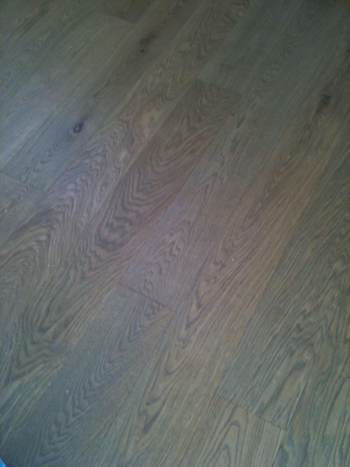

Flooring throughout.

The floors throughout the entire house except for the washrooms are a beautiful wide plank, european white oak in a subtle grey wash with an oiled finish.  This was the first time I had actually seen any part of the floor uncovered since their installation and the only room I was able to admire them in was the master bedroom.  I couldn't resist taking off my shoes to get the full experience, they feel like butter under your feet!


Dining Room fixture.

A black dome pendant makes a modern statement in the dining room.


Hallway to Bedrooms.

The main hall that links the front living spaces to the bedrooms and bathrooms.  The long series of glass doors lead out to a large patio and flood the hall with light.  The white on white scheme continues here with a series of white semi-flush barn lights along the ceiling.  I love the pattern the sunlight creates on the floor.


Guest Bathroom in progress.

One of two guest bathrooms.  On this day the vanity had just been installed so you can still see a temporary support on the underside of it.  The bathroom is a good example of the pure simplicity the homeowners desired, the room is completely tiled (but one wall) in matte white 12" square tiles.  The shower drain is a recessed trough so the floor is continuous. A piece of original artwork to the left of the mirror will be the showpiece of the room, and a selection of a few well chosen accessories will give it the finishing touch.  Well that, and a pair of wall lights!  Although the end result looks simple, I can tell you this was one of the most time consuming bathrooms I've ever detailed,,,,the alignment of everything was painstaking. 


Master Bedroom.

The master bedroom has beautiful views to what will be the back garden.  You get a glimpse of the gorgeous grey washed oak floors and the effect of the oiled finish, its beautiful here with pale silver walls and crisp white trim.  One of my all time favorites, the Ball fan, (its one of 3 in the house) will help balance the air flow of the vaulted ceiling. 


Master Ensuite in progress.

The master ensuite is a continuation of white on white simplicity.  A floating quartz stone vanity counter spans the room from one end to the other, the same matte white 12" tile is used on floors and shower walls as was used in the guest bath.   The wall space above the tub is reserved for a colourful, large scale canvas painting by the homeowner.


Master Ensuite Vanity in progress.

This is the top half of a white lacquered storage cabinet being installed over the countertop, it will have a divider down the centre and a pair of tall doors, each one opening to either sink for his and hers.  A lower section of cabinetry with 2 deep drawers will be installed directly below this.


The view of the master bedroom as you exit the ensuite.


As I mentioned in previous posts about this project, the homeowners have an extensive collection of antiques and artwork (she's an artist) so the intent of this white on white, clean lined interior was to provide a canvas for their pieces.   I am thrilled with the progress thus far and how all the design details and decisions have turned out.  I can't wait to see the fireplaces completed and their furnishings moved into this new space, we will be filling in with some new purchases too.   If I don't get a chance to visit again before Christmas, my next photo update will have to wait until spring as these homeowners will be heading to Florida for the winter.  


All Photos by:   Carol Reed


Saturday, August 25, 2012

A Day Trip in The Country


If I could bottle a day and savour it over and over again, last Thursday would have been one of those days.  It was an absolutely perfect summer day, clear blue sunny skies, warm breezes and my agenda........a long drive out of the city to check on a nearly complete client project.  I love a day trip more than anything, especially thru the rolling country roads north of Toronto.  The drive up north was a pure treat and I soaked in the early harvest scenery.  As I began my drive home, like a que from a movie script a vintage red top car pulled out in front of me at a stop sign and I drove behind it for over an hour.  It was like being transported to another time as we passed by old barns and old fashioned "General Store" signs along the road.  I could have hit the accelerator and sped past this car many times,,,but I didn't want to -  I was completely entranced by this nostalgic scene in front of me.  I felt like I'd been gifted my own vintage escort as I cruised the country roads.  There was a smile plastered on my face a mile wide, wishing the drive would never end.


It was truly a day full of vintage moments.  This old painted wood ladder was found in my clients garage, left behind from the previous owners.  I'm in love with this colour.  I think its the perfect shade of green for the front door of the house.  (And if they don't want the ladder, I've put dibs in on it.)


I rarely drive thru Primrose without stopping at Super Burger, its a destination on its own so I was looking forward to making a pit stop there on this trip.  Its a step back in time for some classic burger joint food....


During the summer months they open up their vintage TTC street car for extra seating.  Its 50's cool, complete with modern day air conditioning!


After cruising here behind my vintage escort I had a craving for an old fashioned vanilla milk shake and rings.  Oh how I enjoy great home made style onion rings,,,, I've even been known to plan road trips around them. ; )


There are some days you just wish would never end.


All Photos by:  Carol Reed


Monday, August 20, 2012

My New East Coast Home


Without a doubt, this is the most exciting and favorite project of my designer life to date.  I've been an interior designer for almost 20 years and nothing can match the passion I have for this project. This is my new old house on the beautiful South Shores of Nova Scotia.  The search for this, our 'next' home has been a looooooooong time coming, a search that's taken us to small towns all over the vast rural countryside of Ontario to the far shores of Nova Scotia.  We've travelled back and forth frequently this past year as our search narrowed on the East Coast.  This July 1st long weekend, we flew out east once again to proceed with an offer on this century old carpenter gothic.  On August 1st, we drove all the way out there non-stop to collect our keys.  


Here I am trying out the first set of keys!


She's a charming beauty, a Gothis fisherman's cottage sitting on 5 acres adjacent to a mile long white sandy beach.   The loud roar of the ocean rings in your ears, the smell of the sea air is dense, and the cool salty breezes flow thru the open windows.


Little did we know during our visit to the area this past March, that a morning stroll on this beach would become our new routine.  We didn't know it then, but we can walk our property to this very beach, this beach and nearby town that we were so taken with as we scouted out potential properties.


When visiting in March we took this boardwalk from the parking lot to the beach.....


Our path to the beach is just thru the trees to the left of this grand old chestnut tree on the front lawn of our house.  I fell in love with this giant chestnut tree and its rope tire swing the instant I saw it.  Its huge and majestic and there are beautiful views of it from inside the house.  I'd love to hang a fresh new swing on it.  

Besides the views of the beautiful chestnut tree, the inside of the house didn't have many memorable features. But that's not why we bought it.  I wanted this house because when you walk down that hidden path beyond the chestnut tree,,,,,,you arrive here....


The ocean.  Every moment of every day the scene changes as the tide comes in and out, and the mist rolls in and then suddenly out again,,,,and the wind changes from a breeze to gushing and then all still. Always a changing palette.


We have only one neighbour near our house, he's a fisherman.  He keeps his dory boat tied up here which is used on the weekends to row out to his fishing hut on a nearby island.  He's promised to make a bluenoser out of me yet and teach me how to cook lobster.  Already he's corrected me on the pronounciation of scallops - its pronounced "scaw-lups"!?  He's shown me where he keeps the oars and explained how to roll the boat out into the water (aka the open ocean), so I can take the boat out whenever I want.  LOL,,,,,,,um, I laughed and asked if he had flares on board.


I much prefer to gaze at the open ocean from the safety of the shore!  On Canada Day I enjoyed a long walk on the hot sandy beach, in awe of this beauty.  This was our third visit to the house and I had only gone inside once.  I wasn't so interested in the inside of the house, I love the houses charming exterior character, the chestnut tree and the adjacent beach but here's the real reason I wanted this house....  


...it comes with a barn.  A century old, sturdy, stunner of a barn complete with shake shingles. I think its only called a barn because that's the most common type of out building around here. This was actually a carpenters workshop and not a barn ever used for animals.  Our first visit to the house I went straight to the barn to see it first.  And I was ecstatic at the sight of the all original interior, both floors of it.  I love its geometry.  Its got beautiful bones and I hope to make good use of them. : )


There I am opening 'her up moments after getting the keys.  These side doors of the barn will be the main in/out doors to and from the house and will become future guest space and/or eventually be new office/sudio space.


Here's a peak at the back half of the second floor, this 2nd floor barn space will eventually could be converted into a guest room.  But for now,,,my priority is to renovate the interior of the house.  Sadly its lacking any trace of original character as a result of whats probably an 80's reno.  My work is cut out for me.

After getting the keys to the house, we spent a couple of days getting things organized before I flew back to Toronto where I'll be for the next several weeks.  I had to leave BF there with not much more than a cell phone and a list of local contractors.  Its been a bit of an adventure for him but he's doing better now that we FINALLY have internet service.  Whew.

The question everyone is asking me, "will I be moving there?".  Well of course we'll be moving to our new house but we'll always have a place in Toronto too (and I'll continue to work here too).  Not our current place which we'll be vacating in the coming months but after things have settled at the Nova Scotia house, a search might begin for a smaller secondary home here in Ontario.  In the meantime, I'll be commuting back and forth on a regular basis as I continue to work on existing projects and start on some exciting new ones.

As I said, I've got my work cut out for me with this renovation, demolition started inside the house this morning and I've barely started the design plans.......


All Photos:  Carol Reed


Saturday, August 11, 2012

Style at Home: Living Room Paint Palette


I was thrilled to be asked by Style at Home to share a favorite living room paint palette for their readers to be featured in a special Designer's Secret's issue, on stands now (and on-line at Zinio).  The requirements were to provide them with a four colour paint palette to include a ceiling colour, wall colour, trim colour and accent colour.   You can see the first page of the feature below were my palette is shown.


Style at Home - Designer Secrets 2012, Page 59


A favorite palette of mine instantly came to mind, its based on Benjamin Moore's, Horizon OC-53.  It's not a palette I've just pulled out the air, its a palette I've used time and time again over the past 7 years -  if I had to name a 'go to' colour that wasn't white, Horizon would be it for me.  Its the palest silvery blue that reads differently in every space, its as light as a white so it highlights architectural mouldings and showcases artwork like a white and it pairs beautifully with all wood tones.  I've sampled it with dozens of other greys and off-whites and its almost always the unanimous choice.  I've used it in client's living rooms, dining rooms, bedrooms, bathrooms, and ceilings, in both traditional and contemporary spaces, urban and country.  The feature on p.59 illustrates one of my favorite trim/ceiling/accent paint combos with Horizon OC-53.  (not to be mistaken with Horizon Gray, a different colour completely). 


Below is my own breakdown of the colours and why I chose them, along with a photo of a client's living room and dining room painted in these paint colours (minus the accent colour).  The house is a grand old Edwardian in mid-town Toronto, home to a young family of 4.  If I had to describe this palette, I would say it exudes SIMPLICITY & ELEGANCE.

WALLS:
Benjamin Moore
Horizon OC-53
This pale silver grey is my favorite alternative to white walls but with all the same attributes - its simplicity compliments wood tones, highlights furniture silhouettes and enhances other colours.  I first used it about 7 years ago and its been a go to paint colour for me ever since, it works in any room.  Its undertone has just a whisper of blue so this grey reads clean and sophisticated, never drab.

TRIM:
Benjamin Moore
Swiss Coffee OC-45
A warm off-white that has an aged looked to it and is perfect for architectural mouldings in a traditional space.  Paired with HOrizon this tinged white trim work gives a room timeless and elegant character.  (pair with a white trim for a contemporary space).


CEILING:
Benjamin Moore
Chantilly Lace OC-65
A very neutral clean white, a good balance with the mix of cool wall paint and warm trim paint.  It provides a nice crisp definition against the antique white mouldings.  In a contemporary space, use this for the trim too!

ACCENT:
Farrow & Ball
India Yellow #66
What I love about Horizon is you can go any direction for an accent colour.  My favorite with it is a deep ochre yellow, its inviting and chic paired with pale blue/grey, use it on the backs of a bookcase, upholstery on a statement chair, silk pillows, ceramic lamps or on the walls of an adjoining room.


Wall Colour:  Horizon OC-53, Trim Colour: Swiss Coffee OC-45
Room Design and Photo by:  Carol Reed (2007)


Upper Wall Colour:  Horizon OC-53, Wainscoting and Trim: Swiss Coffee OC-45
Room Design and Photo by:  Carol Reed  (2007)


Thursday, August 2, 2012

Cottage Bungalow: Kitchen


Kitchen concept board


I began designing a cottage bungalow project  back in January for some past clients. The house is located a couple hours north of Toronto in the 4 season resort town of Collingwood.  For them its a third home and will be used as a summer residence.  The house is a near century old cottage style bungalow that’s lost all of its historic charm over the years as you can see from some of the original photos below, and then how it looked when my clients purchased it.


The top photo shows the bungalow probably in the 50's (?) clad in the original wood siding which eventually was bricked over and had a cement porch added.  The second photo above is what the front of the house looked like when my clients purchased it last fall.


Front exterior mid-June.  The old brick has been removed and the entire house is newly cald in wood siding (white of course!).

The size of the house is deceiving from the photos, its quite deep and also has a separate detached large garage.  The scope of work involves a complete interior gut as well as a rear addition with a new master suite and a new side patio/covered porch area linking the house with the detached garage.  I inherited the project after the Architect had done the initial base plans including the new addition and the proposed new interior layout.  I started the interior design plans by doing some tweeking to the kitchen, below you can see the initial plan I started with and the final plan below.


This plan was prepared by the Architect's office and was used to get the permit process moving forward, and the new addtition started asap.  The kitchen used to be located in the rear of the house (you can see a bit of in the plan view above shown in dotted lines).  The new layout brings it to the front section of the original house, adjoining the other living areas.  The rear section of the house will house the bedrooms and the new kitchen location will overlook the new side patio outdoor living area.

The initial issues I addressed with the layout was the location of the cooktop, (in front of a window) and also the large amount of space between the front and back counters that this created.  It was a huge amount of workspace for a couple who don't cook a lot and also I wasn't fond of the upper cabinets over the pennisula.


Above is the final kitchen layout I prepared for them.  Its a straight line layout which I personally find to be the most efficient (range, sink, dw, fridge all in a line) with an island in front.  I eliminated the built-in wall ovens and gained back that counterspace for the main work wall, then was able to place a range to the left of the window.  The island will be great additional counter space, and will house pots, pans, recycling, dishware and a microwave.  It will be all one height with counter seating - great for casual daily meals and for entertaining. There will be no upper cabinets at all, the kitchen will be low and open, emphasizing the extra high ceilings,  with lots of wall space for the clients art collection.  I think we achieved better flow and a more efficient work zone.
  
The original part of the house where the new kitchen is located has wonderful high 11’ ceilings, the old windows were replaced with new to replicate the original 6 over 6 style.  We positioned a new window above the sink which overlooks the outdoor dining area but instead of having it installed above the counter height, it was installed at the same height as all the existing windows so its actually lower the kitchen counter.  This creates continuity with the window alignment (inside and out) and gives the sense the window has always been there.  To accommodate this, I made the counters extra deep at 30”, and created a trough space where the countertop drops down behind the sink, in front of the window.  This little trough can be a great spot for potted  herbs.   With an extra deep counter the double hung window over the sink won’t be easy to open but even knowing this, my clients opted to go this route anyway rather than switch this one window to a casement style. 

My client is an artist with a desire for all white interiors and clean lined architectural details.  She has amassed a large collection of oversize, very colourful paintings along with some interesting antiques and family heirlooms that will be beautifully shown off in the all white space, almost gallery style.  Although she loves clean modern lines, she also has an appreciation for heritage style details and it was important to them to see the character charm of the house be brought back to life and referenced in a fresh way.

Below are a couple of elevations showing the design concept for the kitchen.......


The kitchen cabinets themselves are non-custom, but the rest of the kitchen has lots of custom detail such as; a custom full height stainless steel backsplash, custom designed s.s. chimney hood, custom fabricated quartz countertops, customized panelled sides on the island, and custom made pantry doors made from antique wood.  With no upper cabinets at all, the kitchen will evoke a spare simplicity.

Selecting all the fixtures and finishes was all about balance and instinct - how to mix interior and architectural styles without it looking like a mish-mash?  For the best balance I'll always use an 80-20 rule.  Then give or take. Going with my own instincts for where to stray from this.   In this decidedly contemporary interior, deciding how or where to use rustic or country elements takes some thoughtful planning and a restrained approach.


Like the rest of the interior, I designed the white on white on white kitchen with a dose of modern lines and a pinch of vintage/industrial country.  The white cabinets and nickel hardware are clean and contemporary, as is the stainless steel hood and backsplash but the wide plank floor has a rustic patina with a weathered grey wash.  The white quartz counters are made from the newest technology but the large visible aggregate in this one reminds me of concrete which gives the kitchen a more relaxed vibe.  The faucet is a modern take on a bridge style faucet  (its a stunner!) and will sit in front of the classic 6 over 6 window.  Suspended from the extra high ceiling (unadorned, free from crown moulding) will be a pair of oversized white barn pendants highlighting the island.  An antique nickel swing arm lamp will be mounted over the sink window to provide some additional task lighting, (and another pair of these will be mounted on the Living Room side of the same wall to highlight a gallery wall of artwork above the stairs).  To contrast all the white and stainless steel, the pantry doors will be custom made from reclaimed wood, left in their natural colour.  
I’m looking foward to another visit to the house next week to see the countertops and most of the new lighting installed.  Not to mention, I’m anxious to see the nearly completed 3 bathrooms and 2 fireplace designs come to life!


All photos, illustrations and drawings by:  Carol Reed

Wednesday, July 25, 2012

The Art of Doing Stuff: Chicken Gate


Chances are if you follow my blog you also follow one of my favorite bloggers Karen at The Art of Doing Stuff.  I've been a regular reader of her blog since it's early days and its one of the few I enjoy on a daily basis.   When I first stumbled upon her site I instantly recognized her from her hosting jobs on various HGTV shows over the years so I was already a fan of her witty humour and sense of style.  Karen's a skilled home improvement DIY'er and home cook who is devoted to discovering how to do stuff, useful stuff that saves you money and enhances your life.  She's one of the most dedicated bloggers I know, posting daily blogs full of original and unique content that will make make you laugh out loud while you learn something new.

This week on The Art of Doing Stuff you can read about a little project of Karen's that I was thrilled to to help her with (believe me, its a rare occasion this lady needs help with anything).  It involved her chicken coop (which I have to say is one of the most stylish chicken coops I've ever seen) that she built entirely by herself, of course.   Above is a little sneak peek of a chicken coop gate concept I recently sketched for her, it was one of 4 concept sketches - you can see the rest of them read all about it over on Karen's blog here .  Check back there on Thursday of this week to see some of her after pics.


Photo Illustration:  Carol Reed

Saturday, June 2, 2012

Kips Bay Show House 2012


"Gentleman's Study" by David Scott Interiors.


This year marks the 40th anniversary of the Kips Bay Show House but I've only had the pleasure of touring the last 3 in person, its something that I make a point of visiting if I'm in NYC during the show house dates.  For the first time in its history the location of the show house was in a highrise and it was on the upper west side.  The tour includes two separate duplex penthouse units in the Aldyn building, a new development on Riverside Boulevard overlooking the Hudson River.  Since i've been designing a NYC family apartment for the past 10 months I was particularly excited about this years show house location.

I'm passionate about all genres of design, I'm always looking to experience and inform myself (and my eye) more about design whenever I can.........so the opportunity to tour a house full of designer rooms is irresistible to me.  And lets not forget its a charity fundraiser, for children.  I'm more than happy to support the cause and the design community while expanding my design data base. : )

There are many reasons why I enjoy touring the show house.  The rooms are designed by some of the most respected and highly published Designers in the US and some of the newest up and coming talent.  I love to see other Designer's work because its often in a style not like anything I've ever designed or had the opportunity to explore.  I particularly love the chance to see designer spaces IN PERSON which is a completely different experience than seeing them in print, its the full sensory experience including touch, sound and smell.  Many of the rooms have music playing and scented candles and flowers and textures that enhance the design concept in a way you could never achieve just through photos alone.

Below are a few glimpses of some of my favorite details.


"Gentleman's Study" by David Scott Interiors. 

This room was both Michelle and my favorite.  Its amazing how the smallest amount of colour can have so much impact, we both referred to this as the blue and orange room and you really remember the orange even though the orange was in very small doses.  I could have spent hours sitting in this room taking it all in, it was exquisite, the furnishings, the art, the objects - it was a master class in the art of display.


"Master Ensuite" by Charlotte Moss LLC

I assume the bathrooms were pre-existing as built by the developer and the designers decorated around what was already there.  What I thought was interesting in this bathroom was how a very contemporary bathroom was decorated with very (old world) traditional art and accessories, it worked beautifully and I loved this look.  For all those trad loving empty nesters looking to downsize, this is a good example of how you don't have to abandon your traditional style if you move into a modern condo.


"Master Bedroom" by Charlotte Moss LLC.


"Master Bedroom" by Charlotte Moss LLC.

Carpet runner with leather tie downs.  My absolute favorite detail in the entire house. Loved this.


"Bedroom":  by Mark Hampton

There was a lot of high gloss lacquered walls throughout the show house.  In this room I really liked the simple detail of how these prints were hung, each were hung by a decorative hook/ring fastened to the top of the frame.


"Le Bureau Prive": by RM & Associates

This is a terrible shot because of the direct sunlight streaming into the room,,but that in itself is the issue I was interested in as I deal with this all the time on projects.  Selecting window coverings for privacy, for sun control and/or as a decorative element is a huge challenge whether you have stellar views or not so stellar views, it can get complex.  You might have a million dollar view, but direct sunlight is a killer on fabric, wood and artwork.  So I always like to note how the designer treats the windows.  A sheer roman shade is one of my favorites and one that I've specified in my NCY reno project.


"The Conservatory":  by Neal Beckstedt Studio


"The Conservatory":  by Neal Beckstedt Studio

Another favorite room of mine, I was really drawn to this mix and all the various layers in the room and again how the designer dealt with 2 walls of windows in a very small space.  Where do you  hang art!?  In this space, they suspended it in front of the window, placed it on table top easles and leaned the art casually around the room.

The good and the bad thing about this type of show house is that every room or area is designed individually, done in the designers chosen style and concept for their given room.  There is no single design concept flowing thru the house, the rooms don't necessarily relate to each other so you have to keep in mind its more like viewing a series of 'show rooms' than a show house.   While most of the rooms weren't done in a style that I'm partial to, I do appreciate any style of interior when its well done.   With no client to deal with, these spaces are the perfect opportunity for designers to experiment, take risks, and have fun. And if you have an eye for detail, there were loads of great details.  Regardless of specific room styles, they are chock full of great design lessons by the pros such as; scale, proportion, furniture placement, colour, accessorizing, display, hanging artwork, dealing with windows, unsightly hvac units and integrating home technology.

Logistically there are a lot of challenges the designers have to work with - time, donations, and existing elements in the spaces that can't be changed.  When I look at any of these rooms, I always first try to understand what the designer's challenges were so then I can appreciate how they solved them.   I also appreciate the amount of personal time and funds each designer put into their rooms and the efforts they make to drum up and work with donated products, labour and services.  The best part is, in many of the rooms the designer will be there.  They truly love to talk about their room design and answer your questions - I guarantee your impression of the room will change after hearing about their process and vision.

A couple of other highlights that I don't have photos of was the room designed by Bunny Williams, Brian McCarthy and David Kleinberg which was a tribute to the late Albert Hadley, complete with some of his framed original sketches (Michelle spotted these instantly, his drawings inspired her career).  Another was the kitchen designed by Robert Schwartz and Karen Williams,,,,it was so interesting to see the kitchen counters built in front of a floor to ceiling window wall.  I currently have a kitchen being installed at a clients summer home north of Toronto, similarly, its designed with counters in front a low window, intentionally, the window is new but placed and sized to look as if it was part of the original house, maintaining the original character of the home but also creates more of a furniture look.

*EDIT*
For Virginia ; )

Kitchen Design by Robert Schwartz and Karen Williams.  Photo via www.plumsiena.com


If you are in NYC the show house tours continue through Thursday, June 14th.  For those of you who can't make it in person you can check out some beautiful photos of some of the show house rooms at this site.


All photos above:  Carol Reed
Related Posts Plugin for WordPress, Blogger...