Saturday, July 17, 2010

Gail's Kitchen Reno: Post #3- Progress


Its been 3 months of debris and dust.....finally its time for all the new finishes and fixtures!

After 3 months of demolition and new construction we're finally getting to all the exciting finishing details at Gails' Kitchen.  Just when it seems like things are moving along at a snail's pace, suddenly you hit a point when everything starts to come together quickly with visible progress every day.  Its like Christmas morning each time I visit the site now!!  While the contractor's been working on the new construction I've been finalizing a few design details like the fireplace surround, ordering light fixtures, sourcing some new stools and finalizing the hardware selections.


A couple of weeks ago we purchased the Ikea cabinets which were delivered next day - EDIT:  for immediate delivery you have to pick the entire order in the warehouse yourself.  Otherwise for large orders you should have them pick the order for you which means allow at least 2 weeks for delivery of the order which comes from their main distribution warehouse.


My absolute favorite part of any job is when the primer goes up.  I LOVE to see the new space painted entirely white, in many cases its the only time I get to enjoy the beauty of the whiteness of the space before the clients 'colour' goes up!  Personally I always think the spaces look better in white,,,, but hey,,, its not about what I want because its not my house.


When the hardwood flooring arrived on site I handpicked all the boards.  I specified a character grade wood that has lots of knots but which also means you can get lots of variance in the appearance with some really odd ball pieces thrown in there too.  With this much character in the wood its important that the boards are thoughtfully placed or it could look like a dogs breakfast, so I sort them into 3 piles of bad, good and best.  Instead of tossing out the 'bad' boards I have the installer use them in areas where they won't be visible like under all the kitchen cabinets, under the appliances and under the sofa.


I sampled 7 shades of yellow paint before we could find one that we were happy with.  Yellow has to be one of the trickiest colours of all to get right, it doesn't help that I'm not a yellow person but I appreciate my client's attraction to it.  We applied each of the samples on three different walls and not only did the yellows look drastically different on each wall, the same colour often looked totally different on the same wall.  Looking at all these samples above, except for the two whites the others looked nothing like the paint samples in hand, NOTHING.  From left to right, bottom row we have; BM Creme Brulee, BM Creme Fraiche, BM Affinity Soleil, F&B Cream, F&B House White, BM Cotton Balls, BM Spanish White (LOVE), BM Ivory White (LOVE).  Top row is a second sample of BM Creme Brulee which looks nothing like the sample on the far left.  The homeowner didn't pick either of the ones that would have been my first choice but she's madly crazy in love with the one she did pick!


I was so excited a couple of weeks ago to meet the Coppersmith at the house and review samples of antiqued, hammered copper. He'll make the copper patina to our exact liking and then he'll use it to build us a custom hood canopy exactly like my design sketch - I can't wait to see it!!!!


But before the Coppersmith left the building,,,,,I lured him into the family room and pulled out my design sketches for the fireplace and asked him if he could use that same copper to make a surround for the new fireplace.  No problem he said, piece of cake.  Now, that's the kinda response I like to hear!!  So he'll be back to measure for the surround as soon as the gas fireplace box is installed.


Nothing gets my heart beating faster than found treasure,,, and an enthusiastic contractor. : ))  My clients are currently living in one of their own rental properties during this renovation and in the garage of that house we found stacks of antique wood boards from the previous owner who was a woodworker.  I couldn't believe my eyes when I saw these beauties piled up in the junk pile.  With their live edge and the gorgeous wood grain my mind was realing thinking of all the different ways we could use these.  I sketched up a detail for a sliding barn style door and Tom's going to have these boards made into an oversize door panel, and then,,we'll use the rest to make the mantle for the fireplace.


They started installing the base cabinets on Wednesday....


By Monday we'll be ready for the counters to be templated.  


Meanwhile the cabinet doors and drawer fronts are off getting sprayed a perfect shade of white.  Check out this post for all the details we have planned, and check out this post for step by step process of how I have Ikea cabinets custom sprayed (note this is not a DIY project!).


Stay tuned for more updates over the next 4 weeks as this dramatic kitchen, family room transformation comes to completion. 


All Photos:  Carol Reed

Tuesday, July 13, 2010

On The Side


Things are pretty hectic right now with client work and vacation planning so I don't have too much time to spend blogging.....but I just had the urge to post a pretty picture!!  You can see in these photos one of my favorite side tables - I've used it on two different projects in the last year.  It has simple and elegant lines, has a warm patinaed metal finish and best of all its usually in stock..... and not crazy expensive! Its available in two different sizes which can be used singularly or nested.  I particularly love the antiqued mirror top.  Jules accent table by Crate & Barrel.

The photos above are from the living room of the 70's sidesplit I recently furnished for a single mom.  More photos of this room coming soon......


All Photos:  Carol Reed

Saturday, July 10, 2010

Art Gallery Inspiration


Last week on Canada Day I made an impromtu visit to the McMichael Gallery in Kleinburg, just north of Toronto.  You can read about the inspiration for this visit here.  I love to visit art galleries of any kind and I'm a particular fan of Canadian art so it was a wonderful way to spend Canada Day afternoon.  This past May marked the 90th anniversary of the Gallery's Group of Seven Collection and to celebrate this, they re-designed the exhibit and rehung pieces from their permanent collection and added some rare pieces from private collections.  The new exhibit is called The Group of Seven: Revelations and Changing Perspectives.  What impressed me most about the gallery on this visit (aside from the masterpieces!) was the wall colours - as you walked from gallery to gallery throughout the exhibit the wall colours changed with each series of collections.  The walls had all been freshly painted just prior to the opening of the exhibit this past May in a wide range of colours from deep rich jewel tones to light watery greens and blues, to neutral taupes.


Salon style exhibit of Canadian historical works.

Upon entering the exhibit galleries you're greeted by this powerful and dramatic long wall of 19th century Europoen inspired landscapes and portraits arranged salon style on a deep teal coloured wall.  I've always loved artwork hung in this manner there's something about it that just draws you in and captivates you and even though there's an abundance of art on the wall the individual pieces aren't lost - somehow the mass arrangement makes you want to stop and look at every single one like its part of a story.   In the same manner there might be some pieces that on their own aren't to your liking but when they're hung collectively like this you have an appreciation for all of them.

Here's a couple of similar paint colours from Benjamin Moore,,,I'm not crazy for teal because I have not so fond memories of it from the 80's (!!!), these are a slightly bluer version of teal than the wall colour the gallery used.  (I inquired about the paint colours but no one was able to provide them to me on that day and I havn't yet received any follow-up response yet so these are just my own interpretation.)


I often come across articles with tips on how to hang a gallery or salon style wall and I've read all kinds of different 'rules' many of them contradictory, regarding the spacing, the framing and the subject matter.  But the only consistent thing I've noticed about my favorite salon walls is that there really is no rhyme or reason to the hanging.  As I stood back and studied this wall, again I couldn't detect any overall consistent spacing but I did notice there was a definite 'invisible' horizontal border at the top and bottom of the wall which all the painting where hung within (looked to be about a foot below the crown moulding and about 2 feet above the floor).  Also all the pieces were all paintings from the same era and all were in gold toned antique style frames.  So I think these consistencies added to the powerful impact but I could easily envision varying works of art and frames incorporated in this hanging and I think the result would be just as effective.   My two favorite pieces on this wall are seen in the photo above, the beach scene in the top left and the smaller beach scene on the bottom right - romantic summertime images I can imagine in a room full of white linen, nautical stripes, sisal, wicker and painted furniture, they're simply gorgeous and not something most people would typically associate with Canadian art.

I will always be a fan of the traditional rugged landscapes that are symbolic of the Group of Seven's work, but what I really enjoyed about this exhibit were the paintings that are so different and in such contrast from those iconic images.  My favorites included many of the colourful still life flowers and portraits that I would love to design a room around!


Arthur Lismer, Summertime c.1918.  Oil on Canvas.
This painting reminded me of the two beach scenes on the salon wall.   Soft, pastel and beachy.


AY Jackson, Dahlias 1913.  Oil on board.
This painting just grabbed my eye, it literally popped off the wall.  The wall it was hanging on was painted in a browny/plum colour similar to below.  

There were a lot of purpley taupes and plum/browns used.  The paint colours don't translate accurately on the computer but looking at the fan deck  Benjamin Moore's Driftwood colour is similar to what the Gallery used based on my memory.   The other two colours are my own picks for a deeper taupe. 


F.H. Varley, Girl in Red c.1920-22.  Oil on Canvas.
Portraits have always been a favorite of mine, the colours of this one are stunning.  This was hung on a purpley/red painted wall similar to the paint colour below.  This would be a gorgeous colour to display artwork in a dining room or cozy den.
Going by memory this colour in person was a purply red but a bit on the brown side.  I managed to get a photo and its looks quite brown in the image below but I remember being more purple than brown.  I selected a few similar colours from Benjamin Moore above.  My least favorite colours are dark purples and burgundies so I don't tend to use a lot of these colours, I have used Amazon Soil and its a very livable earthy purple which was a beautiful backdrop for artwork.


wall colour was more purpley than brown as it appears in this photo.


Edwin Holgate, The Cellist c.1923.  Oil on Canvas.
This was so dramatic hung on the same dark red/purple wall as the portrait above.


J.E.H. MacDonald, Thomson's Rapids, Magnetawan River,  c.1910.  Oil on Paperboard.
There were a series of landscapes hung on a deep navy blue, one of my favorite wall colours in the gallery.  The look would be similar to these paint colours I've selected below....
Beautiful deep blues from Benjamin Moore any of these would provide a classic backdrop for artwork.


My favorite wall colours in the gallery for displaying the artwork were definitely the deeper richer tones. To my eye these colours made the paintings pop and truly highlighted them.   I'm not one for using these really deep colours throughout an entire house, they can be heavy and moody, but if you have a definitive accent wall or a seperate room they're beautifully suited to dining rooms, library/dens or powder rooms where they can be dramatic and cozy.  


Of course I love the look of classic gallery white walls, but my next personal favorite is a deep grey or black for displaying artwork.  On the second floor where the Inuit art exhibits were there was a beautiful black wall that looked stunning as a backdrop to glass display cases and there was a brighter less brown red.   Benjamin Moore's Black Beauty is a black I've used several times, Kendall Charcoal was my own bedroom colour for years and I loved it (Chelsea Grey is another fave),,,and Northern Fire is an orangey red that I find more cheery and fresh than darker browner reds.


My least favorite colours were the lighter wall colours they used in the gallery ranging from light sky blue, soft watery greens, taupe and mossy green.  I found that the paintings seemed dull and bland when displayed on these colours, maybe because so much of these tones were in the paintings themselves or maybe because the frames were painted in muted tones?  With light coloured and neutral walls I think artwork with lots of white, like black and white photographs with white mats, or white line drawings work really well because they look very crisp on these backgrounds, especially in metal or black frames.


If you haven't visited the gallery before its a great way to spend an afternoon, they have beautiful grounds with lots of picnic tables if you'd like to pack a lunch.  If you're looking for something to do with the kids this summer the gallery offers lots of children's day camp programs and art classes, (including spin art!) the kids can learn something new while having lots of fun and you can take home some masterpieces of your own to hang on the walls!  


Wednesday, July 7, 2010

Before & After: Little Girl's Room


You may remember a few of my earlier posts this year about the 70's sidesplit I furnished for a single mom and her young daughter.  I was tasked with furnishing this newly renovated (but not by me) home with 3 bedrooms, Living room, dining room, kitchen, family room, mud room and front entry, complete with accessories, window coverings and light fixtures - all to be completed within a 3 month time period and a very modest budget.  To say this was a challenge would be an understatement,,,,in fact I did all of this while simultaneously, also furnishing Brian's condo from top to bottom.  Yes I admit I went a little bit cuckoo there for a couple of  months while sourcing with a split personality,,,,,all girly and curvy and traditional and french for one place,,,,,,,,all masculine and modern and simple for the other.

So today I thought I'd share some of the after photos of the 70's sidesplit by starting with the little girl's room.  The little girls room and the guest bedroom were the smallest rooms in the house and also had the smallest amount of the budget allocated to them.  The little girl's requirements were pretty simple,,,she wanted pink, ruffles, and sparkle.  Her mother insisted nothing trendy and nothing too modern, it had to be classic and preferably with some french style.   Aside from the budget challenges the timeline meant that there was little if any time to order custom pieces or special order items, and forget about time consuming treasure hunts for antiques or vintage pieces, we needed things instock or quick ship! 

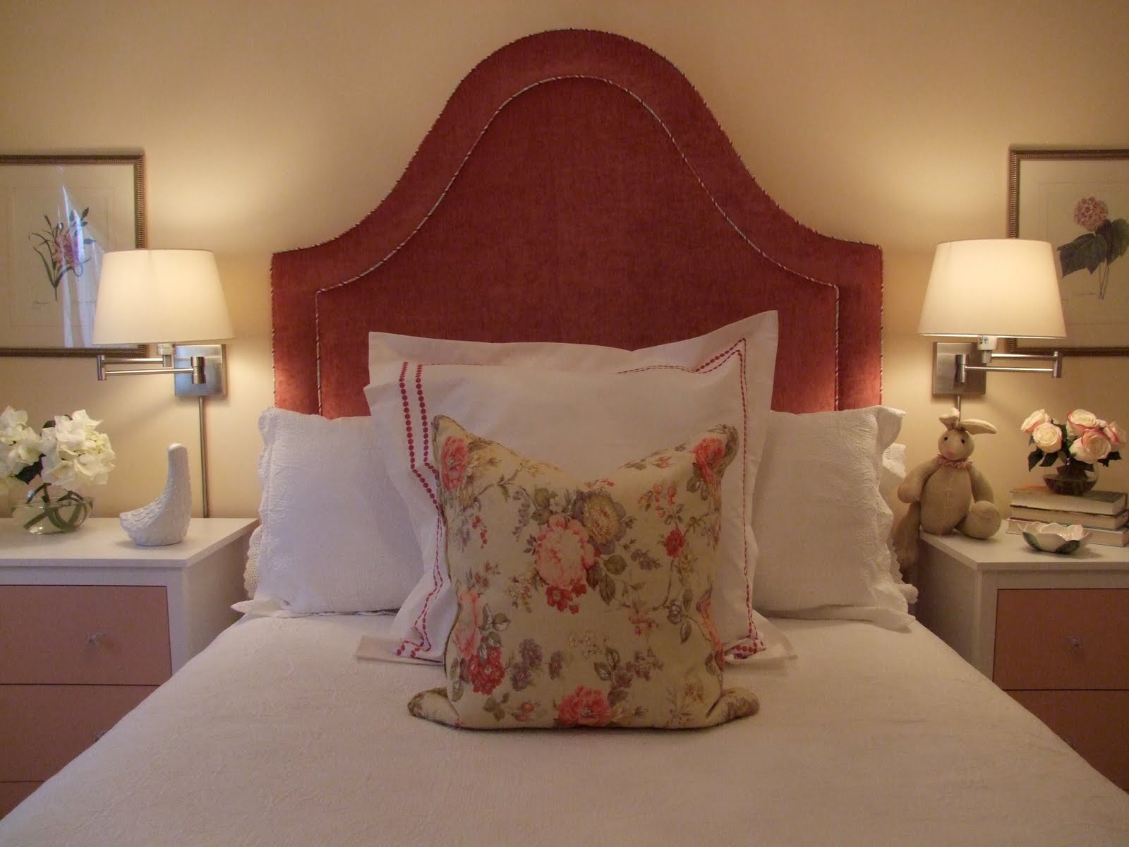
Here's an After photo of the girl's bedroom.......


Here's what it looked like Before

The room had new floors and newly painted walls when I came on board, neither of which were to be changed, so new paint or wallpaper wasn't an option.  I had to learn to love ICI's 'Bavarian Cream'.


This was the second edition of the concept plan, and a loose one at that,,,,,originally I had planned a series of low dressers with knee space for a desk to go along the window wall but that plan changed early in the buying stage and they're no longer shown here.  Instead you see an antique vanity : ).


One of the first decision made in the planning stage was to splurge on a custom upholstered headboard, ruffle bedskirt and roman shade.  So the first thing I did was select some fabric and then sketch up a design for a headboard so I could get the order in production asap.  I designed the headboard to have an exagerrated height and a contrast biased cut piping detail. I chose a solid colour fabric that would give her more flexibility in pairing patterns with it in the future.


While I was in a consignment shop looking for other things for the house, I spotted this vintage vanity table.  It has french style legs and the paint finish on it looked as if it was custom made for the girls' room, it was in great condition and a great price. It was perfect and I bought it on the spot. Except this meant I had to change the plan, we'd no longer have room for the combined low long desk/dresser combo under the window wall and this.......


Unfortunately the vanity table didn't come with a chair and I was having a really hard time finding something that would work with it and that was a affordable.  Just when I was losing hope, I walked into HomeSense one day and bam, there was this perfect painted Louis style chair with cane back, and it was only $150.  Wow, twice lucky with this one room!  I took some of the wall paint from the room and drybrushed the chair frame with it so it would blend in more with the vanity.  Then I took a minwax stain marker and applied it to the carved details to give it more of an aged look.  


Because of the change in plan due to the vanity purchase, I decided to purchase 3 drawer dressers to be placed on either side of the bed that would also be night tables.  In total, this gave her 6 drawers which is what I had originally planned for along the window wall.  I chose the Koppang dresser from Ikea because it had simple lines that wouldn't clash with the vanity and because they were an incredible price.  I replaced the knobs with crystal ones and had the drawer fronts painted a shade of pink found in the striped fabric.


Here's a glimpse of the dresser with the new paint colour and knobs.  This was taken on move-in day, we still had some art prints to hang and accent pillows to buy for the bed. 


I purchased a series of six botanical prints at the Sherway antique show in January then took them to my framers where I selected matts and a simple antique looking frame.  I had the Bavarian Cream paint sample on hand for reference.


We added a simple french line around the matts,,,, in pink of course!


The prints were ready to hang and here you can see the deep pile shag area carpet I placed under her bed, its one of the softest plushest shag carpets I've ever felt, velvety soft.


The homeowner's mother had these antique lamps in her basement storage room and I was crazy for them when she asked me if I thought they could work on the vanity.  They were purchased in Paris in the 1940's or 50's by her aunt.  The shades are hand painted silk and the bases are solid brass.  Gorgeous!  Still to come for this corner is a fabric and ribbon memo board.


Beautiful detail......


I opted for a bookcase on the wall at the foot of the bed, its another Ikea unit called the Liatorp chosen for its traditional styling.  I had the beadboard backpanel painted the same pink as the dresser drawer fronts.  There are only 3 Ikea items in the entire house,,,,,2 of them happen to be in this room!  This was taken just a few weeks after they had moved in and they hadn't yet filled up the shelves. 


The botanicals finally got hung.....


I contemplated whether to hang two bontanicals on either side of the bed or just one,,,,I decided just one at the time but I think I'll add 2 more in the coming months.  You can see a bit of the painted chandelier in this photo,,it has clear beads with pink drops.


I love swing arm lamps beside a bed, in this room I thought that these ones added a bit of contemporary freshness to the vintage vanity lamps and traditional chandelier.  For the summer the duvet cover was removed, normally its folded at the foot of the bed but I took this photo about 2 weeks ago and I like the lighter look of just the matalese coverlet at this time of year.


Since move-in date at the end of February, we've added the botanical prints, a new euro sham and a vintage look floral accent pillow.


The eyelit lace trim pillows were from Pottery Barn.  You can see the biased cut contrast piping detail of the headboard,,,like a candy stripe.


The pink bordered eurosham is from Pottery Barn and the feather filled floral pillow is from HomeSense.


It really is such a small room I wasn't able to capture the entire room or overall view in one image.  The other side of the room has the bookcase unit which still needs some filling up,, so next time I visit I'll get some more shots of that side.


I think the key to this room is that we avoided themey type bedding or accessories, the pieces we chose are all classic and can grow with her into her teen years and beyond.  The solid fabric headboard and multi toned striped skirt can be mixed with other solids and textures as well as florals, geometrics or checks so there's lots of potential to easily layer and change things up.  There's lots of room for her to display her personal things on the bookcase and on her vanity top and room on the bed and her dressers for more stuffed toys or dolls.  I was able to give her pink and flowers and sparkles and even some ruffles without it looking too granny or too babyish .........I have to say I don't even mind the Bavarian Cream so much anymore.   

All Photos:   Carol Reed


Thursday, July 1, 2010

Canada Day: McMichael Gallery


Bay of Islands, By Frank Carmichael (1931)

I had nothing planned for this Canada Day blog post but as I sat on my deck early this morning enjoying a coffee I couldn't help but think of where I wish I could be at that moment.  If I could chose anywhere in the entire world to be on any day in July, without a doubt, that place would be on a waterside dock at a cottage in Muskoka, Ontario, just a couple hours north of Toronto.  While I was sipping my coffee, I was browsing thru a book from my coffee table - the cover of which happens to be a landscape painting of that same region in Ontario, the granite rocky shoreline of georgian bay with tall pine outcroppings.  This painting has become one of those iconic images of Canada that I certainly can relate to.


The Jack Pine, By Tom Thomson (1916-1917)

"We define ourselves as citizens and as a country by the images we think of when we describe our place in the world - what we call 'here'.  Although there are no towering firs on the prairies, no majestic mountains in Nova Scotia, nor borbidding icebergs in Vancouver, and no tidal flats in Ontario, we relate to the iconic paintings of these natural aspect of our country as being part of who we are as Canadians.  We are mostly an urban people now, yet we continue to think of ourselves in terms of geography.

The images created by the Group of Seven represent a Canadian sensibility, which means that they contain in the choice of their subject, and in the means of expressing it, an essential reflection of who we are as individuals brought up in this particular part of the world.  These images, which were created by Tom Thomson and the members of the Group of Seven in the early twentieth century, have been adopted by us as signifying the country when we imagine it.

At a certain point, if images are strong enough and profound enough, and if they are sufficiently broad in their appeal, they achieve the status of a symbol.  That is, they come to stand for something more complex and comprehensive than what they simply describe or depict, and they evoke emotions and responses that are powerful.  National anthems are musical examples.  Thomson's great paintings The Jack Pine (above) and The West Wind (below) are the visual equivalent of a national anthem."


The West Wind, By Tom Thomson, (1916-1917)


Just like these images alone don't reflect the varied landscape of Canada, these particular Group of Seven paintings don't depict the varied subject matter and locations that make up the collection of their work.  Its safe to say I'll never be fortunate enough to own any one of these pieces but we do own a nice collection of Canadian art books and many of them are on the Group of Seven.    


  The text above is the forward from a book called 'The Group of Seven and Tom Thomson' by David P. Silcox, published by Firefly.  It has a beautiful cover and is always prominently displayed in either my floor to ceiling wall of shelving or on my coffee table, I move by books around a lot!


One of my other favorite art books that I always have on display is simply called 'Thomson' by Dennis Reid and Charles C. Hill.

Although I've provided the Amazon links to the books above, I'll also add them to my sidebar (eventually),,,,,,my favorite Toronto source for art books is D & E Lake Ltd.  This little shop on King Street East in Torontno is like stepping into the past, its filled to rafters with with over stuffed bookshelves with towering piles of inventory stacked on the floor.  If your lucky enough to walk in on a day when Donald is there, you're in for a treat!  He's the proprietort and he's an authority on Canadian Art and art books, he owns an impressive art collection himself and I imagine he must own the largest and most valuable rare book collection in the country (?).  He carries unique and sometimes contraversial books you won't find at the big chain retailers, in addition to art books, he has a vast selection of design, architecture, food and wine books.  Just tell him what you're interested in and he'll happily make recommendations for you...... but you'll have to stop him at some point because he could go for hours pulling one book after another, he's a walking encyclopedia who not only knows the content of each book but he'll also tell you about the author and the publisher.  Its an experience you'll enjoy as much as the books you'll come home with, you'll even get an old fashioned hand-written receipt.


So just like that, a beautiful sunny Canada Day morning brought images of Muskoka to my head, in my heart that's where I wish I was at this very moment but sadly, I'm not.  I had intended on spending this day working but on whim, after browsing thru the art books, we've decided just moments ago to head up to Kleinburg for the day to visit the McMichael gallery and enjoy the Group of Seven collection in person.  If I can't be lounging on a dock today, then I can't think of a better way to spend this day than enjoying these iconic Canadian images in person.


Click here for info on The McMichael Gallery and its collection.


Happy Canada Day!!


Related Posts Plugin for WordPress, Blogger...