Showing posts with label Renovation. Show all posts

Saturday, February 16, 2013

Style at Home: Luxe Retreat


What a surprise to flip thru the current issue of Style at Home and see a bathroom from one of my projects featured!  This is a bathroom I designed some time ago as part of an extensive reno of a 3 level condo owned by my then sister-in-law Kara.  I had such fun with the details in this guest bathroom, generally I'm not one for doing lots of various tiles in one room but in this case Kara fell in love with a collection of marble tile samples I had gathered up on a table and had to have them.  Her only request was that I use them all, but aside from that I had free reign to do whatever I wanted with the design.  I used a 3 x 6 honed calacatta marble as the starting point which was installed in a brick pattern in the shower and in a herringbone pattern on the floor.  Around the calacatta I created some classic hotel style border lines using marble mosaics on the floor and glass listellos in the shower.  The end result is a truly luxe looking space that I hope makes her guests feel extra special. 

I'm thrilled to see this little gem of a space on the pages of the March issue.  For the full bathroom story you can check out the March issue on Zinio.com or in print on newstands now. You can view more photos of Kara's condo previously published in Style at Home on their website here.


Style at Home


Saturday, October 13, 2012

Cottage Bungalow - Update


Kitchen in progress.

On a personal note its been a crazy month and a half for me as my life has been split between two provinces -  me in Toronto, BF in Nova Scotia, packing up one house and office in Toronto and moving into (while renovating!) another in Nova Scotia.  Between travelling back and forth, sharing one computer and not having any service on my web phone for the past 6 weeks meant that my blogging and tweeting was seriously neglected.  So now that we're finally both in one place (Nova Scotia) and we have most of our technical challenges sorted out,,,I'm just gonna jump right back in where I left off!

My last visit to the cottage bungalow project was a chance to oversee some of the finishing details and address any last minute oversights or changes that needed to be done prior to move in.   It definitely doesn't look like it from the photos below but the homeowners were scheduled to move in just a couple of weeks after this visit.

Kitchen in progress.

I love how the kitchen is flooded with sunlight, the extra high ceilings and the sculptural effect of the articlating light over the sink.  The fridge is still covered in protective plastic, the floors are still covered up and the back wall of the kitchen is awaiting its custom stainless steel hood and stainless back splash.

Kitchen in progress.

The custom side panels for the island were being installed later this same day, so far I was extremely happy with the proportions of the island.  We're contemplating raising the pendants one rod length - with threaded rods we can't get them exactly the height we want so we work with the rod lengths provided, here they're shown installed at their longest.  After the range hood is installed we'll make the final call.  You can view some concept sketches and the finish boards and the rest of the kitchen design in this previous post.


Kitchen sink and faucet.

This time I lost the battle of the kitchen sink.  Despite my preference and recommendation for a large single bowl sink in this layout, the homeowner wanted a sink and a half and there was no changing her mind.  Plan B was a custom designed sink and a half with small radius corners and deep bottoms, but this eventually was vetoed for an in-stock, ready made version, shown above.  In this close-up photo its deceiving but there is a wide 5"+  trough behind the counter to accommodate the low window.  The counter continues wrapping down the back of the kitchen sink and across to the wall/window.  Despite the off centre sink divider, I opted to install the faucet on centre with the overall width of the sink which would keep it on centre with both the window and the sink cabinet.  


Flooring throughout.

The floors throughout the entire house except for the washrooms are a beautiful wide plank, european white oak in a subtle grey wash with an oiled finish.  This was the first time I had actually seen any part of the floor uncovered since their installation and the only room I was able to admire them in was the master bedroom.  I couldn't resist taking off my shoes to get the full experience, they feel like butter under your feet!


Dining Room fixture.

A black dome pendant makes a modern statement in the dining room.


Hallway to Bedrooms.

The main hall that links the front living spaces to the bedrooms and bathrooms.  The long series of glass doors lead out to a large patio and flood the hall with light.  The white on white scheme continues here with a series of white semi-flush barn lights along the ceiling.  I love the pattern the sunlight creates on the floor.


Guest Bathroom in progress.

One of two guest bathrooms.  On this day the vanity had just been installed so you can still see a temporary support on the underside of it.  The bathroom is a good example of the pure simplicity the homeowners desired, the room is completely tiled (but one wall) in matte white 12" square tiles.  The shower drain is a recessed trough so the floor is continuous. A piece of original artwork to the left of the mirror will be the showpiece of the room, and a selection of a few well chosen accessories will give it the finishing touch.  Well that, and a pair of wall lights!  Although the end result looks simple, I can tell you this was one of the most time consuming bathrooms I've ever detailed,,,,the alignment of everything was painstaking. 


Master Bedroom.

The master bedroom has beautiful views to what will be the back garden.  You get a glimpse of the gorgeous grey washed oak floors and the effect of the oiled finish, its beautiful here with pale silver walls and crisp white trim.  One of my all time favorites, the Ball fan, (its one of 3 in the house) will help balance the air flow of the vaulted ceiling. 


Master Ensuite in progress.

The master ensuite is a continuation of white on white simplicity.  A floating quartz stone vanity counter spans the room from one end to the other, the same matte white 12" tile is used on floors and shower walls as was used in the guest bath.   The wall space above the tub is reserved for a colourful, large scale canvas painting by the homeowner.


Master Ensuite Vanity in progress.

This is the top half of a white lacquered storage cabinet being installed over the countertop, it will have a divider down the centre and a pair of tall doors, each one opening to either sink for his and hers.  A lower section of cabinetry with 2 deep drawers will be installed directly below this.


The view of the master bedroom as you exit the ensuite.


As I mentioned in previous posts about this project, the homeowners have an extensive collection of antiques and artwork (she's an artist) so the intent of this white on white, clean lined interior was to provide a canvas for their pieces.   I am thrilled with the progress thus far and how all the design details and decisions have turned out.  I can't wait to see the fireplaces completed and their furnishings moved into this new space, we will be filling in with some new purchases too.   If I don't get a chance to visit again before Christmas, my next photo update will have to wait until spring as these homeowners will be heading to Florida for the winter.  


All Photos by:   Carol Reed


Wednesday, May 26, 2010

Gail's Kitchen Reno: Post #2 - Customizing Ikea


Gails' kitchen and family room renovation is a project of mine that's currently in the early stages of construction. I first posted about this kitchen and family room renovation a couple of weeks ago and if you missed it, you can go here to see all the before pictures and read all about the objectives for the redesign and the process behind developing the final proposed layout.  Here's another look at the new floor plan....


Its quite an extensive renovation with lots of new construction and reworking of plumbing and electrical so one of the ways to achieve everything on the wish list (quartz counters, high end appliances, all new floors, additional sinks, new fireplace etc. etc.) and stay within the clients conservative budget range is to use Ikea cabinets as the basis for the kitchen design.  In this post I won't bother going into all the reasons why this makes so much sense as I've written about all the reasons Why I love Ikea Kitchens here, and its for all those reasons why my client and I came to the decision to take this route for her new kitchen.   Also in that post you can find a list of my favorite ways to customize Ikea cabinets and give it a bespoke look - I'll be implementing all of those tricks in this installation too.   

When planning a kitchen based on Ikea cabinets I treat the base cabinetry like building blocks,,,or legos and configure them in any which way I need them.  There's really not too many limitations as they offer such a wide range of cabinet sizes and styles.  Since this kitchen will be more on the relaxed trad side than the modern side,,,,,I recommended the Tidaholm door style which is a simple shaker style door in natural oak.  As I've mentioned previously I prefer this door style over their other shaker door style the Adel, because the Tidaholm has a cleaner squared edge shaker profile and joinery corners.  Also its key, if you plan on painting the doors the oak doors take a new paint finish better than the Adel door style which is a synthetic polyester finish.  And for this project, we definitely intend on painting them!


The Cooktop Wall:  Essentially this is the main wall in the kitchen which houses the rangetop, exhaust hood and wall ovens.  This was a major change from the old kitchen layout which had a cooktop poorly (and dangerously) located on a narrow island.  I always place ranges or cooktops against walls where ever possible and try to allow counter space on either side.  In this configuration we have lots of extra deep drawers which will accommodate pots, pans, small appliances, mixing bowls, cookware, as well as spices, seasonings and utensils and knives.  The open shelves will house most of the dishware with additional pieces in the glass fronted hutch.  The shelves will provides easy access for Gail (who is a chef) who's always cooking for a crowd.  I've incorporated a desk space for her laptop, cookbooks, messages, and household bills.  I'm on the lookout for an old antique wall hutch that we could use above her desk surface but its not something you can easily find on a deadline, so in this elevation I've illustrated the backup plan which will be new glass fronted wall cabinets with a blue accent colour painted on the inside.  The range hood canopy will be custom built and we're planning on cladding it in an antiqued distressed copper,,much more blackened in appearance than shiny new copper.  (sorry but the colours depicted in this renderring are not quite accurate, the walls will be a very soft fresh pale yellow, all the cabinetry a warm ivory white).


The Island:  The sink side of the island is of course directly opposite the cook wall and despite how large the island is, I still couldn't fit everything in that Gail ideally wanted, but we're as close as we could get.  They'll be a Shaw farmsink, a second prep sink (that was a must!) and a set of refridgerator drawers.  Its these fridge drawers that really make her prep zone and cooking zone work efficiently, she can keep all her dairy and veg here, where they'll be right at hand instead of in the large main fridge.  The biggest challenge about this island has been trying to light it, you can't help but notice it only has a ceiling over half of it! The ceiling goes from 8' in the kitchen area opening up to 20' in the breakfast nook area so its a bit a challenge.  The situation just became more challenging when last week we discovered a new beam would need to be dropped exactly where I've got the light fixture hanging........


The Island:  On one end of the island they'll be another set of wide deep drawers and the other three sides of the island will be clad in a combination of operable doors and fixed door panels all finished off with a baseboard treatment around the bottom instead of a toe kick.  On the seating side of the island I'll be supporting the overhang with some simple corbel style brackets and also adding a small bookshelf unit with beadboard backing.


The Pantry & Bar:  Like the island, this section of cabinetry will be tricked out with additional trimwork to give it more of a furniture look, so in addition to the Ikea base cabinets the contractor will be installing beadboard back panel,,,corbel brackets and corner block details to the base, and built in recessed puck lighting.  I have to admit this elevation is a moving target right now,,,,its actually been changed several dozen times, probably 2 or 3 since this version was drawn.  The size of the wine fridge was the subject of many debates between my clients and my recommendation for a tall but narrow unit ultimately was vetoed for this double door style.  As for the cabinetry, Gail's been quite conflicted as to how much open vs. closed storage she can live with and I predict we'll be going back to one of the original pantry configurations I proposed which had more upper cabinets, less open shelving which will be more practical.   Right after this is posted I'll be working on one more variation of this wall.


Coming up next I'll share some images of the concept board for the space illustrating all the finishes and fixtures I've specified for the space along with some updated site photos.  

Next week I'll be writing a separate post outlining my tips and advice for painting your newly ordered Ikea cabinets based on the process I've used successfully.  I've had several people inquire about this so please know I havn't forgotten and I promise you'll see it next week.


All Images:  Carol Reed


Saturday, May 8, 2010

New Project: Gail's Kitchen Reno


It all started back in December of ’09 when I had my initial meeting with a new client to discuss their kitchen/family room/mud room renovation, a back to the bricks complete overhaul.  They’d been dreaming of this kitchen overhaul for close to 15 years and suddenly it was now or never,,,,,,it was time to either redo these spaces or go in search of a new house that had a kitchen and family room that better suited their needs.
The house is located in the picturesque town of Oakville (west of Toronto) and is an old stone tudor style house situated on a huge treed lot.  The three areas that I was going to be redesigning -  the mudroom, the kitchen and family room made up the back of the house which was a rear, 2 storey addition built in the ‘80‘s and done by the previous owners.  
Before: Here’s a plan view of the kitchen and family room as it existed when I first met the homeowners.


Part of the kitchen opened up to a tall vaulted cathedral ceiling, but spanning straight across this tall ceiling space was a catwalk.  Immediately upon seeing the kitchen the first thing I thought was - that catwalk has got to go!   Its never used, it leads to an unusable rooftop deck, it detracts from the 20’ high ceiling and is just collecting dust.  From a design perspective it had no redeeming qualities or purpose.
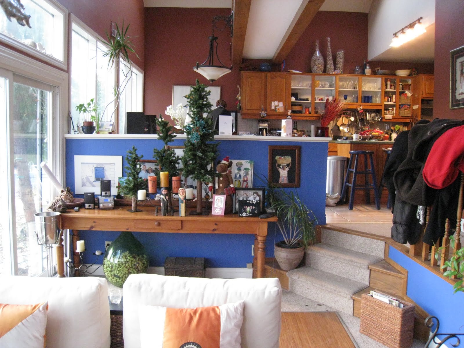
The Design Brief:  Gail is a home chef who used to cater private functions but now cooks only for her own family and friends,,,,,,,,,with 3 young adult daughters, a dog and an open door policy to neighbours and friends - its a crazy busy house and the party is always in the kitchen.  Pop in on any given Friday, Saturday or Sunday night and you’ll find her cooking up a feast for 12 or 20 people, usually all spur of the moment and impromptu!  You've seen the existing floor plan shown above, now here’s a glimpse of what their old kitchen looked like for the past 15 years.


Yes, that's a catwalk on the upper left!


View from the family room to the kitchen.


View from the kitchen to the family room.

You’ll understand from seeing some of the photos why this combined kitchen family room space just wasn’t working for them - improvements were needed all around, new flooring, better layout, more counter space, more seating space, larger capacity appliances, a second sink, better lighting,,and in general a kitchen that was current and fresh looking and that was more in keeping with the character of the century old house.

The deep saturated multi-coloured walls, seashore collectables  and open cabinets made for lots of visual clutter.  

My vision:  A lighter fresher colour palette with relaxed coastal charm, lots of white cabinetry, painted beadboard, distressed wood floors, classic fixtures and pro style appliances.  In otherwords, good-by generic dated, golden oak builders kitchen with its santa fe colour scheme....hello Something’s Gotta Give,,,,,,,,,,,or,,, something along those lines.  The set design of the Hamptons beach house for the 2007 movie Something's Gotta Give was by far the biggest star of that production - it was even featured in  Architectural Digest, taking on an iconic status.  That house spawned a renewed appreciation for relaxed traditional interiors, particularly the classic white kitchen - and that's exactly what Gail's house needed.  


SGG Living Room as seen in Architectural Digest


Diane Keaton on the set..


Diane Keaton and Jack Nicolson on the set.....

If you're a decorating or design junkie and you havn't seen this movie, its worth buying, not renting, buying. I have the dvd (given to me by a client who was building her own SGG inspired weekend house on Lake Simcoe) and I've watched the move dozens of times, just to admire the interiors.

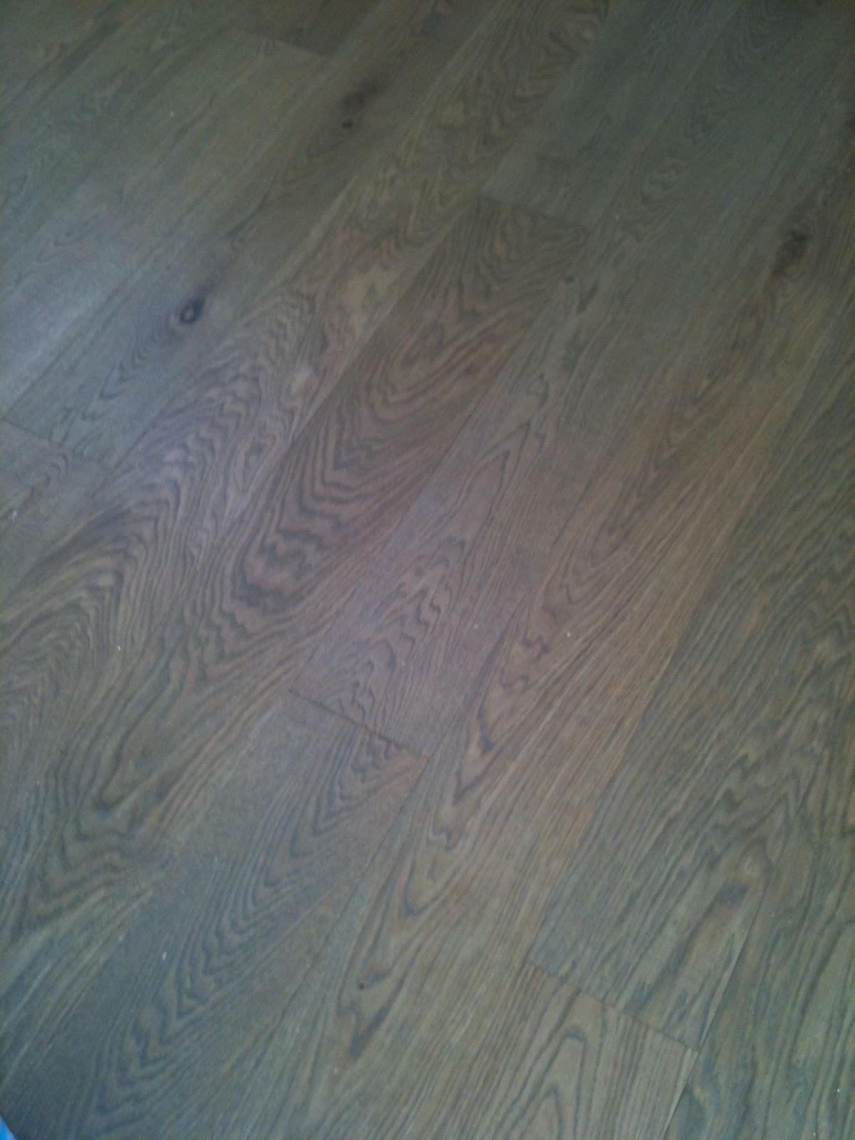
The Design Concept:  Gail's house is not a formal style house, it probably was a cottage originally so it has more informal, pared down architectural detailing.  Because she loves to cook and cooks a LOT, this kitchen needs to be highly practical and functional with pro style appliances and must have seating for lots of guests.  The homeowners vision was not immediately as clear as mine however, but only because she hadn’t seen the movie, seriously, - SHE HADN’t SEEN THE MOVIE “Somethings Gotta Give”!  Regardless, I knew from discussions with her and her love of all things traditional and her ADDICTION to all things beachy that she and I were on the same page.  She rented the movie the following week and like millions of others, fell completely in love with not only the kitchen, the entire house.  Now you might think,,,yawn, boring,,nothing new or cutting edge here, a classic white kitchen - but really, for someone who’s only ever had one kitchen that looks like above,,,,this IS all new and would be beyond her dreams.  Just because its a style that’s timeless it doesn’t mean it has to be boring, when traditional is done right it should be new and current looking - it should be magical.  Besides, its really only the overall character of the SGG kitchen we’ll use as inspiration by maintaining several of its main elements;  traditional white cabinets, dark counters, stainless steel appliances, white subway tile backsplash, vintage inspired fixtures.  The rest of the details will be unique to Gails style and her space.  We’ll be incorporating a light coloured wood floor, soft buttery yellow walls, a dramatic range hood canopy and wall shelves instead of glass fronted cabinets.   This is going to be one dramatic transformation!


The Final Plan: After exploring more than a dozen layout options, this was the winning plan.   Along with the catwalk, the walls around the pantry area will be removed, making room for a large convergent style island and a long pantry/bar wall.  The existing kitchen table will be reused and ideally butted up to the new island to form one big continuous seating arrangement for chef’s table style dining or for spreading out buffets.   The addition of a second prep sink to the island was a difficult one to accommodate but one that Gail concluded was a must have.  The existing fridge is being reused, despite the door swing which has always swung the wrong way, this is something she's learned to live with, a full height freezer tower will be added next to it.  One of the keys to this layout working efficiently is the addition of refrigerator drawers in the island directly beside the prep sink.  These drawers will be used for veg and dairy so they're right at hand in the prep zone which reduces the frequency of going to the main fridge.  

It was a challenging kitchen to design because of the traffic flow, with multiple doorways and staircases leading off the kitchen and a change in floor level, there were definitely a lot of obstacles to work around and loads of requirements to meet.  But I think with this plan, we managed to tick all the boxes and meet the budget!

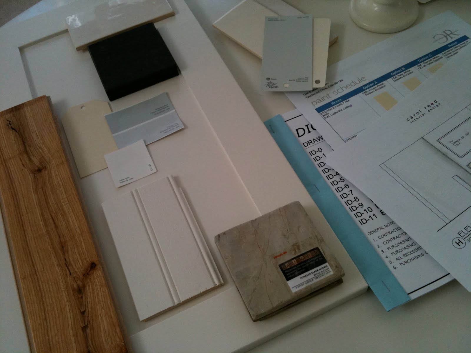
The final design plans and material selections were completed in early March and the search for a contractor began...


Set of working drawings and material sample board for the site.

After going thru a lengthy bidding process we were fortunate to get an amazing contractor on board (one I've worked with before). He's as enthusiastic about the new design plan as Gail and I are, he brings a positive energy to the project and so far has been a pleasure to work with.  Demolition took place a few weeks ago and the new construction is well underway.  We had our first regular site meeting yesterday and as you can see from the photos below, the space is looking better already!


The catwalk has been removed.


Stay tuned, next week I'll be posting more design drawings of the kitchen illustrating all of the design details we're incorporating and the new cabinetry configuration.  Following that I'll be posting about all the new lighting and plumbing fixtures and photographing the progress on site.

Oh and by the way,,,,did I mention this was going to be (yet another) Ikea kitchen!  Or 'Bespoke Ikea' as I like to call it.


Saturday, October 10, 2009

Rosedale Reno - Dining Room Sneak Peek


Dining Room by Carol Reed Interior Design

I had the opportunity to work on a full scale gut and reno of a Rosedale home for a young family back in 2007/08.  When I became involved in the project the century old house had already been stripped back to the brick and when you stood in the living room on the ground floor you could look up through three stories and see the sky above.   My scope of work involved planning all the interior detailing (mouldings, staircases, doorways etc.), lighting layout, designing the fireplaces and builtins, selecting all the interior finishes, specifying all the lighting, hardware, window coverings, and finally, sourcing a few key furniture pieces.   

Although its been more than a year and half since they've moved in and the interior construction was completed, there's still a lot of finishing touches to be added but these things will evolve over time as the family grows.  Frankly, after the lengthy and all consuming process of planning, building, and moving into the house, my clients have  simply been enjoying living in it and focusing on their busy day to day lives raising their two young daughters.  Slowly the rooms are coming to completion with the addition of artwork and accessories that the homeowners have been accumulating since they moved in but with so many rooms, it continues to be a work in progress.

I'll post more detail about this renovation project along with more after photos in the near future.  I visited their home this week and had the opportunity to take some up-dated photos, the small glimpse of the dining room above is one of my favorites.   This room will be getting a lot of use in the upcoming months and in just a couple of weeks I know it will be decked out for the holidays in silver, blue and green........but in the meantime,,,

Happy Thanksgiving!


Photo:   Carol Reed


Thursday, June 18, 2009

My Condo Renovation

Master Bedroom
The first time I had an opportunity to design a home for myself was about 6 years ago. My boyfriend and I were buying our first place together and we decided to look for something we could renovate and redesign to our own specs. We found a 1980's condo on the waterfront with panoramic lake views and just 10 minutes to downtown, in original condition and ready for a complete gut. It wasn't my dream home, nor did I even design it in a style that reflects what I would want in my dream home, but it was somewhere we only intended on living for 2 or 3 years (which turned into 4). I designed it in a style that I felt suited the condo and would be appealing to buyers when it came time to sell. Although these photos are a good example of my work, they don't necessarily reflect my true personal style. Condo living doesn't appeal to me (i need outdoor space), have a passion for simple country antiques, vintage finds and traditional architectural detailing. So buying this condo also meant we had to rent a storage unit across the street to store our oversized rustic pieces and my ever growing collection of 'great finds'.
New Open Concept Kitchen
The existing kitchen was a completely enclosed tiny U shape room, we knocked down all the walls opening it up to the lake views. The new 9 foot long island had a poured on-site concrete counter top and the back counter was stainless steel with an integrated oversize single sink. The backsplash was back painted glass that just glowed a watery blue/green colour.

Living Area

The open concept living and dining area had floor to ceiling windows and almost no wall space. The furniture was kept low to not obstruct the view. The draperies added vertical dimension and texture to the space and helped warm up the expanse of bare windows at night.

Dining Area

During the day the condo was flooded with direct sunlight so in additon to lined drapery panels, I had Hunter Douglas solar shades installed on all the windows. This helped control the temperature and protect fabrics and wood from fading. (The photo above was taken at about 10 in the morning.) It wasn't possible to install a junction box in the concrete ceiling to hang a light fixture over the dining table so i opted for a high arched floor lamp. It also swiveled so it offerred us the added bonus of being able to swing it over the coffee table in the living room if we wanted. I custom designed the dining chairs and the dining table was a freebie, a cast-off '80's meeting table from my old office, headed for the dumpster but i thought it had great lines and I loved the walnut veneer. I hauled it home just in time for our first Christmas dinner in our newly reno'd condo. I added a larger glass top to it and it comfortably seats 6, we've squeezed 8. I can't tell you how many inquiries I've had about this table and offers to purchase it. In fact its the most standard plain office meeting table there is, the style is commonly referred to as a drum table but i've always admired it for its simple lines. It pairs well with all chair styles, i often use the modern Bruno chairs or Eames side chairs with this style table.

Living/Dining Room Evening Shot
A view of the living and dining area at night, my favorite time. Large expanses of window with water views become large black walls at night, without the drapery panels the windows would look very cold and bare especially in winter.
The Views.....
The condo had floor to ceiling windows that wrapped around the perimeter of the unit, and faced south overlooking the lake and marina below. To the far right we could see the corner of one other building, which happens to be what I think is one of the most beautiful condo buildings in the city and provided a stunning architectural view.
The purchase and closing was quick, giving me only about 3 weeks to complete the design drawings and co-ordinate the start of constuction. Demolition was extensive, we removed absolutely everything, including the stippled ceilings, taking the entire unit back to the bare concrete. In a matter of a few weeks I had designed everything including 2 washrooms with custom vanities, the new open concept kitchen with custom shelving, counters and backsplash and even custom doors, casings and baseboards throughout. The entire renovation took 4 months to complete....... but the furnishing of the unit took another 2 years!
In upcoming posts I'll show more before and afters photos along with some of my design sketches and also write about what it was like having the condo featured in Canadian House & Home!
All photos above by Carol Reed
Related Posts Plugin for WordPress, Blogger...