Showing posts with label Kitchen Design. Show all posts

Saturday, June 27, 2015

My Kitchen Reno Progress: The Antique Wood Floor


In the early stages of my kitchen reno we discovered the original wood floor boards (the same as we uncovered and refinished throughout the front part and 2nd floor of the house) were not going to  be salvageable.  Sadly, after scraping off the current top layer of vinyl we discovered the plywood sheeting that was installed over the original floor boards was screwed down with a million screws all spaced randomly closely together. Each attempt to remove a screw resulted in the heads being stripped or breaking off.  There’s only one way to remove a subfloor like this and its not easy - its backbreaking tedious work requiring a skill saw to partially cut thru the boards and then pry up the wood in bits and pieces while also cutting the screws off. Its a slow process and after all that prying and removing of screws the floor boards underneath would suffer a lot of damage. It would result in a lot more time, a lot more work, a lot more money to end up with not so great boards.   My heart and mind were set on having the same antique wood boards continuous throughout the house but the time and effort needed to uncover and then restore the kitchen boards wasn’t practical and didn’t make sense to pursue. I needed to come up with another solution, and fast, since we had just demolished the old kitchen.

The original floors in the rest of the house after being stripped of paint, ready for finishing.

I knew without a doubt I wanted wood floors in the kitchen as the house did originally. Trying to find new wood to install right next to the antique floors in the rest of the house wasn’t appealing to me, at all. Distressing new wood to make it look like old, also wasn’t appealing to me (besides the last thing I needed is another project). The entire point of the kitchen floor is I had never given it a second thought, there was no over thinking or contemplating choices,,,they would just be wood as you would expect them to be in a house of this age.  Nothing imported, nothing decorative, in other words not over designed,  I would just be peeling back the layers to restore some original character - or so I thought.  Turns out I needed to another layer not peel away.  : /  Fortunately in Nova Scotia there are a lot of re-sellers of antique wood flooring as well as suppliers for salvaged architectural wood products.  One of my concerns was that we didn’t know what species our original floors are and it’s important to me they be the same.   Up until this point no one had been able to identify the species, hemlock?, pine?, ash? all we knew is it was local.

After a bit of research I found a supplier who demolishes dilapitated historical houses, piece by piece, salvaging and re-selling the components. A few of the houses recently dismantled looked to be of the same age, size and character of our house. I sent off some pictures of our floor boards and they easily identified them for me as red spruce from approx 1875.  Lucky for me they had several batches of salvaged boards that matched, this would be my perfect solution.  Unfortunately for me it was early February and we would need to wait a month or two before we could search thru their inventory which wasn't accessible until the snow melted.

The antique boards I selected.

On Easter weekend we finally made the trip to pick up the wood.  I was thrilled to find a batch of smooth, previously walked-on, unpainted flooring boards, which meant they would be fairly easy to refinish as they wouldn't need to be planed or grinded down.  And, the fact the boards came out of a house on the South Shore was also perfectly fitting.   What wasn't perfectly fitting was that the boards were so long (some were over 16' long) we had to cut them down to less than 11' in order to fit in the trailer, this meant we wouldn't be able to do single continuous boards across the width of the kitchen, like the rest of the house, but it was a small compromise I was happy to work with.  On the spot I calculated the best lengths to cut so the seams would be under the cabinets or in inconspicuous places, and counted off the quantity of boards we needed as they were loaded up - using a piece of bark for a make-shift note pad.


Since the boards are all planks and not tongue and groove, they were face nailed in place, they're also random width, rarely two boards the same size.  I did a dry layout in key areas to make sure the best boards were used in the most visible open areas and placed the cut boards so the joints were staggered and as discreet as possible.  The task of trying to align two cut pieces so the widths and colouration matched was a challenge, in hindsight we should have marked each piece of a cut board at the time it was cut so we could pair them up easily.  Once the 'art directing' of the layout was done,,,I took a jet plane out of there while all the dusty and noisy work happened, first sanding and then nailing - 6" nails, each one pounded in by hand.  It was a long and noisy installation.

Newly laid old boards, sanded and ready for finish coat.

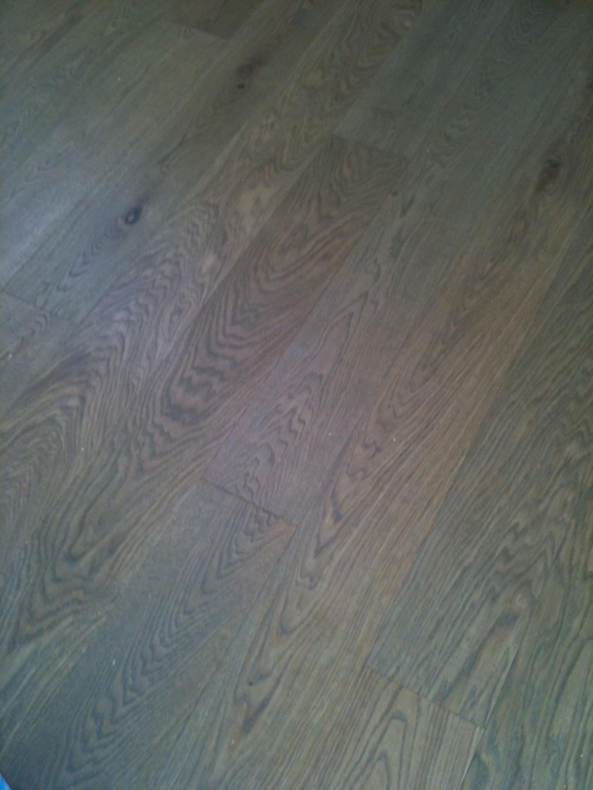
I returned a week or so later to find the floor completely laid and ready for its finish coat, it was wonderfully smooth and felt amazing underfoot.  I was happy to see that so much of the patina remained after the sanding, they had a subtle greyness to them and beautiful blackened crevices.

The newly laid antique kitchen flooring viewed from the back sun room (family room).

Where the kitchen and the addition on the back of the house meet there was already a 3/4" transition in flooring height and now with the new installation of the kitchen floor that transition got even larger but we made the best of it by sloping a threshold between the two rooms.  


The newly top coated floor and a peek of the other finishes going in the room. 

Next up I'll post about the cabinets and the other details in the room.  Here's a little sneak peek of some of the finishes with the floor.  The cabinets are painted in a colour  inspired by vintage crockery….

Check out the previous post for the first look at the kitchen reno, the before and after floor plans.

 
All photos:   Carol Reed


Wednesday, June 17, 2015

My East Coast House: Kitchen Before & After Plans


Before - the dining area of the old kitchen

The Kitchen in my new old house on the East Coast is the second last room in the house to be renovated, today its near completion except for a ceiling light fixture and some furniture for the eating area. Renovating this kitchen was a long and painful process that has taken more than a year to complete thus far. This is what the kitchen looked like when we bought the house and how it remained until the ktichen reno started last year. (Dining area seen above, kitchen area below)


The kitchen was ugly to say the least. It came with no appliances other than an old electric stove. The exhaust hood was not vented nor recirculating (thus useless), the dishwasher didn’t work, the water was not drinkable and the sink leaked out the bottom of the cabinet when the faucet was turned on. The plastic coating on the cabinets was peeling off in large sections held in place in some spots with shipping tape. The floor was covered in peel and stick vinyl tiles which were broken in places and mis-matched patched in others. The ceiling like the rest of the main floor was acoustical tile, complete with stains. 


Before & After Floor Plans

When we purchased the house I had re-designed the kitchen as part of an overall master plan that we would implement in 2 phases. The kitchen would be in the second phase about a year after phase 1. Over the course of that year while the second floor and front part of the house were being renovated I continued to re-think the new kitchen. The biggest challenge is the space itself, I really hated the old placement of it in the centre of the house.  Like most old houses the kitchen had so many doorways it was like being in a hallway.  One thing I knew for certain is I wanted to flip the kitchen to the other side of the room so it would be on an exterior wall with windows.  

My first kitchen design plan involved moving windows and adding double french doors to the deck and incorporating a wood stove. More than a year later, far behind schedule and already over budget before phase 2 started,,,,,the priority became to re-work the kitchen without changing any of the window locations or putting in new patio doors. There were a lot of unexpected but necessary ‘blow-outs” in phase one so minimizing the work and costs for phase two was critical but I was ok with that because i felt ‘the simpler the better’ approach suited my vision for the kitchen anyway.   A week before the new wood stove was to be delivered I decided to have it installed in the back sun room (family room) which would make that room useable all year and still provide heat for the kitchen.  Without the wood stove in the kitchen I was left with ample room for a seating area which currently is planned as a built-in banquette. 

Looking at the rest of the ground floor, the other change I made was creating separate dining and living rooms.  I intentionally wanted to keep individual rooms, having lived in an open concept space once before I definitely prefer not having my living or dining room open to the kitchen, however, I do love an eat-in kitchen and open concept family rooms.  I intentionally didn't build any cabinetry on the wall between the kitchen and dining room so that it could easily be opened up should any future owner want an open concept.  As it is the separate dining room maintains the flexibility of becoming an office, or a bedroom if not used for dining.  Figuring out what to do with the existing laundry and bathroom was key in determining my new kitchen layout.  In the end moving the laundry or bathroom was not an option for many reasons besides budget, so those rooms will stay where they are and will be the next room(s) to be renovated after the kitchen.

The old combined laundry and bathroom will be divided into separate rooms, the laundry room will get a new exterior glass door to what will be a patio on the sunny west lawn of the house with views over a meadow to the beach beyond.  The washer and dryer will be under counter and behind a fabric skirt, with a sink and wall cabinets this area will also function as a servery/pantry which will be convenient between the kitchen and patio area (future screened in porch).  Being able to come directly into the laundry and bathroom from the yard is also a great bonus feature when you have more than an acre of lawn to mow each week - tick control means stripping down and showering after yard work.  : /

The family room at the back is a single story addition to the original house, its concrete foundation has no insulation and even with ducted heating in the space it was an extremely cold room, unbearable in winter.  The new wood stove keeps it toasty warm and was the best addition ever because this is not only the biggest room in the house but it also has the best views and the most sunlight - now its useable all year long.  

Despite the numerous kitchen layouts I came up with none of them were ideally what I wanted and it became a very frustrating cycle of trying to decide which layout I hated the least rather than loved the most. Very. frustrating.  I have piles of scrapped plans like this one.


I'm happy with the plan I decided on and know that a new layout wasn't worth making drastic or extensive changes for.  I struggled with the fridge placement the most, debating over putting it to the right of the dishwasher but I just didn't want the large bulkiness of a fridge blocking the openness of the kitchen directly as you entered it.  The back door is the main in/out entrance where everyone enters the house (no one uses the front door here).  The compromise was to put the fridge away from the cooking/prep area but add under counter fridge drawers to the island.  

With those agonizing decisions over with we moved forward in clearing out the old kitchen and putting in all new finishes.  The ceiling, like the dining and living room had the original wood beams which we  uncovered from under layers of tile and plaster.  The floor is another story which I'll post about next…...


Kitchen reno progress.
The kitchen really is the heart of the home,  I have to say that renovating this one has given me a new perspective on renovating and the reality of what is truly necessary, what matters and what doesn't matter, what brings you joy in its day to day use.  A make-shift kitchen with no running water and no large appliances for months on end while endlessly waiting for trades to show up (like waiting 3 months for the electrician and 6 weeks for a plumber) was enough to make me never want to renovate again, ever. At least this house. ; ) But it also was truly revealing in many ways.  For the most part, when we were here we ate as well as we did with a full functioning kitchen, and even had lots of house guests and visitors - I just had to shop very selectively and plan meals more creatively.  Having survived all of that, I'll confess I'm finding the new kitchen to have an excessive amount of space compared to what I'd become use to, but for now that's one problem I'll happily enjoy living with.


For more post on my East Coast house Reno progress:


All Photos & Drawings by:   Carol Reed


Monday, January 12, 2015

The Australia Project - The Evolution of a Space Plan


Design Plans and Kitchen Concept for the Australia Project, by Carol Reed Interior Design


While its not out of the ordinary for me to travel a few hours drive to a clients weekend retreat or summer cottage, or even have the opportunity to fly back and forth to work on a project in Manhattan… being asked to design a whole home renovation on the other side of the world is not a request I get every day.  In addition to my full-service projects I've always oferred a selection of limited e-design services for homeowners across North America but I limit this type of consulting to single rooms only.  Last year I made an exception when I took on the whole home re-design of a residence in Australia, as a hybrid full-scope/e-design.
One of the homeowners whom I knew from Toronto is an expat now living in North South Wales, Australia.  She’s a newlywed (married an Aussie!) they're first time homeowners of an older style bungalow in need of a modern overhaul. They both travel a great deal for work so embarking on a home renovation would require the ability to do much of the consulting virtually - and this is where I came.  We knew each other when she lived in Toronto and she has been in some homes that I had designed, there was the comfort level of working with someone from home, and knowing I had experience in long distance projects.  They reached out and a couple of skype meetings later we began the process of re-designing their forever home.

Kitchen and Dining Before.

Before we could delve into new finish materials, design details or furniture, we had to start with reworking the floor plan.  Here’s a look at the floor plan I started with. Its single storey, with no basement, and an attached garage (to the left side of the house), the back of the house and balcony overlook a beautiful green conservation area.  The windows across the front and sides of the house are partial height, the windows across the back extend to the floor.  Lengthways from one end of the house to the other, the ceiling slopes up to a centre peak.
The house was very divided with lots of interior doors and there is no basement or attic space.  The main objective was to update all the fixtures and finishes as well as create a more open concept  living, dining, cooking space. A dedicated storage room had to remain as well as a home office large enough to accommodate two workspaces.  Lastly a new master suite was on the must have list.  As for finishes, they wanted sleek, modern, all white, and natural wood floors with the addition of colourful artwork and accessories.  

When I first reviewed the plan and the exterior photos, my instinct was to move the kitchen and dining areas to the back part of the house so they could enjoy the view and direct indoor/outdoor access.  Below is a look at the final layout we arrived at….

The new plan provides them with a long open concept great room, with slope cathedral ceiling and views overlooking the conservation area.  New retractable doors will allow them to have an expansive opening to the exterior and new sliding doors directly off the kitchen so they can access the bar-b.   The den has ample room for both of them, an oversize sliding glass pocket door allows them to close it off when they have company.   The laundry is combined with the storage room and will have a futon for overflow guests who need a place to crash (beyond the two spare bedrooms).   The main hall bath gains a vanity with storage and a tub shower combo, the master ensuite gets a sleek walkin shower with trough drain and floating vanity and the 4th bedroom was converted into a maser walk-in closet.

I know from experience often the first reaction people have when they see floor plan is to critique it, and often wonder "why is that so big, or why is that so small" or think "what if we move this here and that there?".  I think that's natural and expected, especially if you weren't part of the planning process in getting from a to b.  Its the reason I don't ever present a client with just one layout - because even if they love it, they'll wonder if they are overlooking any other possibilities. There are some Designers who believe its best to present one solution only, but this method never served well for me despite how confident I might be with any given plan, I believe clients have expectations of being offered choices.  I like to present only the best options and let them be involved in making choices from there.  There is never just one way to slice up a space and the possibilities can vary greatly in budget and personal preference.  Below is a glimpse of where I started reviewing layouts with them and where we ended up at the final new layout. 

_ _ _


The first concepts were based on their idea of moving the laundry out of the kitchen and into the main hall bathroom (stacked units) in lieu of the existing shower stall.  Besides the obvious disadvantages to this placement, it had some benefits worth considering.  (At this point we weren't exploring the master bedroom changes until the living areas were determined.)


This concept was the least amount of change, but still offered lots of improvement with a new centre island kitchen opened up to the living room.  Initially this was the extent of the renovation they had envisioned before contacting me - a new kitchen with a bigger opening to the living room.

Some more walls came down in this layout to further open up the kitchen, dining and living rooms and get more exposure to exterior views and light.

Next even more walls came down.  Sections of the centre wall needed to remain as its the main supporting wall.  Although not noted in this sketch the laundry would again be in the bathroom. What was lacking at this point was a larger home office (Study) and the laundry situation was still being debated.


The next three concepts explored the idea of placing a stacked washer dryer to replace the hallway linen closet, allowing us to add a larger vanity with storage into the main hall bathroom with the tub/shower combo. 

This one was getting there but the main concern was still the Study was too small, and ideally I wanted to explore the idea of putting the kitchen along the back of the house instead of the storage room….


This was getting really close to where we finally ended up but the need for a larger laundry area was being realized. 


And this was the almost final layout.  The laundry was combined with the storage room, and also a futon for the occasional overflow of guests. When we began the space planning the intent was that all the windows and exterior doors in the house were being replaced and the exterior re-clad in a new finish.  We intended to work with all the existing window locations as is but the homeowners were also investigating if they could increase the amount of windows across the back living room wall.  But because of the bush fire hazards in their area, their local by-laws (and property insurance) restricted them from changing their window configurations/sizes at all.  Which meant this kitchen plan, requiring modifying a window to work with the fridge,,,was out.    

So one more round of tweaks led to this final layout below (also shown earlier in the post)…...  
 The final kitchen layout ended up being a U shape with centre island.  After the engineer's review, we had to also incorporate a supporting stud wall immediately to the left of the sliding doors beside the fridge so this area got squeezed a bit smaller.  This new plan gives them one large living and entertaining space with cathedral ceiling, direct access to the balcony and wonderful views.  The double office has lots of natural light, and its wide entrance flows off the main room, and their bathrooms and closet space were upsized and enhanced. 

So I hope you enjoyed this peek into the space planning process and how we arrive at any particular final floor plan with a client.  Taking the client thru this process assures them they have made the best possible decisions and they move forward with confidence, even if the scope of the renovation doubled (!).   Following this space planning we developed the details for the kitchen and baths and selected all the new interior finish materials and fixtures compiled into a set of working drawings (which involved working in metric and learning some new jargon!).  I''ll share more of the design concepts in another post.


 G'day ; )


All drawings and images by:  Carol Reed Interior Design Inc.


Monday, September 15, 2014

Karen's Kitchen: Canadian Living


Karen in her new kitchen with her chicken Cuddles.  Photo by, Donna Grffith
At long last, welcome to Karen's kitchen!  Words cannot describe how excited and proud I am to see Karen's kitchen renovation featured in the currrent issue of Canadian Living!  If you follow Karen's wildly popular blog, The Art of Doing Stuff, you've no doubt read her updates about the more than year long renovation and seen some sneak peeks along the way.   Not only have Karen and I been twitter and blogging friends for several years, I'm honoured to say she's also an E-Design client of mine.  I was fortunate to work with Karen on her kitchen design from the initial planning stages of the project and helped guide her through the inevitable and various design dilemmas along the way.  Karen had a great vision right from the very start along with some very challenging space issues - with her great sense of style, her resourcefulness, her diy skills,,,,and a little help from me ; ), I think the the transformation is nothing short of spectacular.  Its truly satisfying to see a plan and a vision come to life but to hear how much she loves, loves, loves, her new kitchen is the most rewarding part of all. 


Canadian Living, October 2014


Not only does Karen look stunning posing with Cuddles in her new kitchen (that dress!), but she wrote the feature too.  I hope you'll enjoy reading the full story and all the before and afters along with sources in the current issue of Canadian Living, on stands now or you can purchase the digital version thru Zinio.  You won't be disappointed.

You can read more about the planning phase of the kitchen, including the before and after floor plan, optional layout plans and the design requirements,,,in an earlier post I wrote last year, here.   


For more info on my E-Design services for kitchens or bathrooms 
please check out my e-design website


Saturday, June 21, 2014

Springing Into Summer


Spring has come and gone and I didn't manage to get a single update on the blog.  Maybe because I was so pre-occupied waiting for Spring like weather to arrive I didn't realize it had come and gone, already?  So instead of jumping back in with new regular posts (I've already prepared a couple) I thought I'd do a quick recap of what I've been pre-occupied with during the past few months, wow the time has flown by - in 4 different time zones no less.  I love that with the advancement of technology and travel I can work on projects in various cities, provinces or countries.  Principles of design are universal but I really enjoy being exposed to different regional traditions and lifestyles as well as exploring the local materials that influence the design of a home. 


Upper East Side reno project, Living Room progress.

NYC - Construction on the UES reno project was completed some time ago and after taking a much needed break from more than a year and a half of reno madness, the homeowners were ready to focus on furnishings and decor.  So with the hard work done and a great canvas in place we've been working together on the furniture room by room.  The very first pieces to arrive this spring for the living room where the sofas and the area carpet.  So much more to come, tables, lamps, pillows, mirrors,,,its very exciting to see it coming together.  (no the table in the corner is not part of the new furniture plan ; )).


A whole home renovation near Sydney, Australia

AUS - Over the winter (their summer) construction started on a whole home renovation I designed for clients in Australia not far from Sydney, she's an expat from Toronto and he's a native Australian. Aside from having to learn some new jargon and conversing in metric, the process was no different than renovating in North America.  The entire renovation was completed in slightly more than 3 months and the homeowners moved back into the home in early May.  I'm looking forward to sharing more about this project on the blog and its entirely new floor plan.  The project began with a very modern vision of a white on white interior and for the most part stayed true to that initial concept.


Stony Lake Cottage main entrance sneak peek.

ONTARIO - In May I was in Toronto getting started on a couple of new renovation projects one is in Oakville and is a family home for a young couple and I'm so excited to get started on the design planning and the other is a master suite renovation for long time clients in Port Credit.   I also headed up to cottage country to get some progress photos of the Stony Lake project which wrapped up last summer.  It was finished and furnished enough for use last season, some more furniture and small accessories are still needed to fill in some gaps but its been a huge transformation so far.  Lots more before and after posts to come.  


Sneak peek of Karen's new kitchen.
Image from: The Art of Doing Stuff.
Over the spring I enjoyed keeping in touch with Karen and helping her work thru some final details on her long anticipated kitchen installation.  Its finally finished and ready for its close up, in fact its being shot for Canadian Living magazine this coming week.  If you haven't seen the sneak peeks on Karen's blog yet, click on over and have a look, as I try and contain myself from showing you the rest of it - which I've already seen, and its fantastic!! 


Field of beams.  Reclaimed antique wood, in Canning, Nova Scotia.

NOVA SCOTIA - Home of the world's slowest renovation, my own house project came to a halt in the winter when early into the kitchen phase of the reno we discovered we just couldn't salvage the existing wood floor boards.  Sheets of plywood screwed down with a million screws would make it almost impossible to remove without doing a lot of damage to the wood floor beneath.  The good news is I was able to track down some antique wood flooring of the same age and species.  The bad news is we had to wait for the snow to disappear before we could get access to where the wood was stored.  It was a looooong snowy winter......so things were at a standstill for a while but an update on my kitchen reno is coming soon, soon as I have some progress photos.  Any day now.  : / 


That's a really brief update on some of the things that have been keeping me busy without even mentioning the garden work I'm trying to do or the many E-design orders I've had the pleasure of working on.  I couldn't be more excited that Summer's here and especially to be able to enjoy most of it on the East Coast!


All Photos and drawings:  Carol Reed, except where photo is credited otherwise.


Thursday, November 14, 2013

The Art of Planning: Karen's Kitchen


Photo by Donna Griffith, for Style at Home


You may remember last  year I prepared some design sketches for my cyber friend Karen’s chicken coop gates.   If you’re a fan of the Art of Doing Stuff blog, like I am,,,you know Karen doesn’t often need help with anything because she’s a master at figuring how to do stuff herself.  She has a wonderful character style house and over the years she’s done many home improvements and decor projects inside and out.  Not your average homeowner diy's,,,,Karen has an impressive archive of magazine quality 'afters', in fact the inside of her house and her backyard have both been featured in Style at Home magazine which you can admire here and here.

Clearly Karen doesn't need any help in the decor or handyman departments but one of the few things she hasn’t tackled is the house's original 1940‘s kitchen.  She's pretty attached to the old kitchen and its easy to understand why - it oozes an authentic nostalgic charm that’s hard to replace (top photo).  Even the editors at Style at Home couldn't resist photographing and featuring it just the way it is.  Yah, even the "before" picture of Karen's kitchen is magazine worthy. ; )  Inevitably the time has come to replace it and Karen knows enough to know this in’t something she wanted to tackle on her own because the consequences of making mistakes or oversights are daunting, and expensive.  So this is where I came in.  Karen hired me thru my  e-design services to work on the new kitchen plans.  As far as finishes and appliances went she knew what she wanted but what she was struggling with was how to fit all of the new elements together.  She needed a plan.  


ASSESSING...
The first step I take is to review the existing space to assess what's working and what isn't.  The whats not working about her current kitchen might be obvious, but its not all bad.  There are aspects of this kitchen layout that Karen enjoys, particularly the huge expanse of uninterrupted counter space between the sink and range....and having a kitchen table and chairs. To be frank the shortcomings of the kitchen were easy to find solutions for but doing so and maintaining those elements that she loved was truly the challenge.  That and accommodating all of the other things on her wish list.


THE DESIGN BRIEF...
- 'not cookie cutter'
- no new construction
- non-custom cabinets
- more storage
- a range hood
- a glass door fridge
- a furniture style pantry
- a stand alone butcher block table
- a place to sit
- a fixed budget
- did I say 'not cookie cutter'..

Knowing that we couldn’t alter the bathroom, laundry room, mudroom or doorways,,,,,I recognized the biggest obstacle in Karen’s kitchen was the counter height window on the end wall.  It’s location was a prime spot for a range and hood, or a fridge,,,or wall cabinets.  Ideally it needed to be moved to best utilize the space. Unfortunately the window was fairly new and had involved re-stucco’ing the exterior of the house.  The option of moving it or changing it now was not in the budget so it was staying.  Had we not been able to find a workable layout that Karen loved, I would have suggested she hold off until her budget allowed to move the window because it would open up so much more layout potential. 


This is an example of how we could have utilized the wall had we moved the window. We quickly eliminated this option (and variations of it) for budget reasons and moved on.


Even though this layout doesn't appear to be drastically different than the existing, the changes are significant enough that with new, more efficient cabinetry and appliances it would be a big improvement.  This option ticked all the boxes including a 36" range.  It was the front runner,,,,,until,,,, Karen came home with an antique butcher block island that she couldn't resist and that meant a change in plans.  But I've seen and completely approved,,,it's a beauty worth changing things up for.


THE AFTER PLAN....
After exploring more than a dozen layout options we arrived at a final plan that Karen loves (shown above).   You can read Karen's first post about her kitchen reno plans here .......and you'll notice she received no shortage of opinions and suggestions from readers too. ; )   I'm confident in saying they can rest assured that the planning process was extremely thorough and not a single possible option was overlooked.  : )  (We are aware the fridge overlaps the window a tad in this layout but this is the worst case scenario and we're prepared for how to deal with it.  The fridge she's hoping to get is narrower than this but we're planning for the larger option just in case).

True to her vision “not cookie cutter” would be the design mandate and concept for Karen’s new kitchen.  This applies to the layout too. There are a LOT of kitchen design standards, rules of thumb and conventional layouts with their regulated work triangles - well this plan doesn’t necessarily follow all those rules.  And that's perfectly ok.  I can say from experience that the clients who do a lot of serious cooking are the ones who's kitchens stray from generic design standards the most because they have much more specific needs, usually simpler.

When I approach a kitchen plan from scratch I use spacing standards only as a starting point (which also is an instant way to gauge if your footprint is considered tight or generous).  From there I determine how and where adjustments can be made to suit the space and the users specific needs.  There's nothing wrong with conventional layout standards but they simply don’t always fit or work for every situation, that doesn't mean you can't still have a kitchen that's functional - it just means you need more adaptable solutions (while maintaining safety and functionality of course).


In addition to the floor plan I also worked out all of the wall elevations which detail Karen's new cabinetry and will facilitate getting it ordered.  The task of pulling this entire plan together is now in her very capable hands and I can't wait to see it all come together.   Karen has done some savvy networking to co-ordinate a few great collaborations and sponsors for this project.  The design layout reflects the products and publication opportunities that are anticipated thru the collaborations as well as some of Karen’s unique finds so it promises to be an interesting and beautiful transformation story for all parties involved.

You can follow the kitchen reno progress over at The Art of Doing Stuff and I'll post updates here as it starts coming together!


Tuesday, January 8, 2013

Style at Home: Gather Around


Style at Home Magazine February 2013.  Photography by Donna Griffith.


The publication of Gail's kitchen in the February issue of Style at Home is an exciting full-circle moment of sorts. Its the first project since having this blog that I've documented the process from initial meeting to magazine right here on the blog and on twitter. 

Its been a long process to complete this circle including a year since the time of the shoot to publication.  Gail and her family have been enjoying this new kitchen (and also the renovated family room and adjoining mudroom) for two years now and she loves it as much, if not more today then when she moved into it in the late fall of 2010.   I've enjoyed a glass of wine and delicious food at this island several times over the past two years and to see the joy in Gails eye's as she thrives in this new space is truly gratifying for me.   The absolute best part of any job for me is when I actually see the completed space being used just as I had envisioned in even my earliest sketches.  Its rare to actually see her kitchen empty like this, as its the hub of this home and always, always buzzing.

Without a doubt the most satisfying compliment for me is when visitor's tell Gail, even though its all new and is in a addition to the house, that they feel like this kitchen has always been there, that it feels like it originally belongs to their century old house.  And that, for me, is exactly what I was hoping to achieve.

You can check out the full feature in the current issue on-line to digital subscribers at zinio.com and on news stands this week across Canada.  I absolutely love how photographer Donna Griffith so beautifully captured the space and how Ann Marie Favot's simple styling had the perfect touch.  I'll be posting some more photos from my own portfolio shoot (also shot by Donna) at Gail's in the weeks ahead. 

Thank you Donna, Ann Marie, Bethany and the entire team at Style at Home!

You can check out older posts on Gail's kitchen thru the links below:


Saturday, October 13, 2012

Cottage Bungalow - Update


Kitchen in progress.

On a personal note its been a crazy month and a half for me as my life has been split between two provinces -  me in Toronto, BF in Nova Scotia, packing up one house and office in Toronto and moving into (while renovating!) another in Nova Scotia.  Between travelling back and forth, sharing one computer and not having any service on my web phone for the past 6 weeks meant that my blogging and tweeting was seriously neglected.  So now that we're finally both in one place (Nova Scotia) and we have most of our technical challenges sorted out,,,I'm just gonna jump right back in where I left off!

My last visit to the cottage bungalow project was a chance to oversee some of the finishing details and address any last minute oversights or changes that needed to be done prior to move in.   It definitely doesn't look like it from the photos below but the homeowners were scheduled to move in just a couple of weeks after this visit.

Kitchen in progress.

I love how the kitchen is flooded with sunlight, the extra high ceilings and the sculptural effect of the articlating light over the sink.  The fridge is still covered in protective plastic, the floors are still covered up and the back wall of the kitchen is awaiting its custom stainless steel hood and stainless back splash.

Kitchen in progress.

The custom side panels for the island were being installed later this same day, so far I was extremely happy with the proportions of the island.  We're contemplating raising the pendants one rod length - with threaded rods we can't get them exactly the height we want so we work with the rod lengths provided, here they're shown installed at their longest.  After the range hood is installed we'll make the final call.  You can view some concept sketches and the finish boards and the rest of the kitchen design in this previous post.


Kitchen sink and faucet.

This time I lost the battle of the kitchen sink.  Despite my preference and recommendation for a large single bowl sink in this layout, the homeowner wanted a sink and a half and there was no changing her mind.  Plan B was a custom designed sink and a half with small radius corners and deep bottoms, but this eventually was vetoed for an in-stock, ready made version, shown above.  In this close-up photo its deceiving but there is a wide 5"+  trough behind the counter to accommodate the low window.  The counter continues wrapping down the back of the kitchen sink and across to the wall/window.  Despite the off centre sink divider, I opted to install the faucet on centre with the overall width of the sink which would keep it on centre with both the window and the sink cabinet.  


Flooring throughout.

The floors throughout the entire house except for the washrooms are a beautiful wide plank, european white oak in a subtle grey wash with an oiled finish.  This was the first time I had actually seen any part of the floor uncovered since their installation and the only room I was able to admire them in was the master bedroom.  I couldn't resist taking off my shoes to get the full experience, they feel like butter under your feet!


Dining Room fixture.

A black dome pendant makes a modern statement in the dining room.


Hallway to Bedrooms.

The main hall that links the front living spaces to the bedrooms and bathrooms.  The long series of glass doors lead out to a large patio and flood the hall with light.  The white on white scheme continues here with a series of white semi-flush barn lights along the ceiling.  I love the pattern the sunlight creates on the floor.


Guest Bathroom in progress.

One of two guest bathrooms.  On this day the vanity had just been installed so you can still see a temporary support on the underside of it.  The bathroom is a good example of the pure simplicity the homeowners desired, the room is completely tiled (but one wall) in matte white 12" square tiles.  The shower drain is a recessed trough so the floor is continuous. A piece of original artwork to the left of the mirror will be the showpiece of the room, and a selection of a few well chosen accessories will give it the finishing touch.  Well that, and a pair of wall lights!  Although the end result looks simple, I can tell you this was one of the most time consuming bathrooms I've ever detailed,,,,the alignment of everything was painstaking. 


Master Bedroom.

The master bedroom has beautiful views to what will be the back garden.  You get a glimpse of the gorgeous grey washed oak floors and the effect of the oiled finish, its beautiful here with pale silver walls and crisp white trim.  One of my all time favorites, the Ball fan, (its one of 3 in the house) will help balance the air flow of the vaulted ceiling. 


Master Ensuite in progress.

The master ensuite is a continuation of white on white simplicity.  A floating quartz stone vanity counter spans the room from one end to the other, the same matte white 12" tile is used on floors and shower walls as was used in the guest bath.   The wall space above the tub is reserved for a colourful, large scale canvas painting by the homeowner.


Master Ensuite Vanity in progress.

This is the top half of a white lacquered storage cabinet being installed over the countertop, it will have a divider down the centre and a pair of tall doors, each one opening to either sink for his and hers.  A lower section of cabinetry with 2 deep drawers will be installed directly below this.


The view of the master bedroom as you exit the ensuite.


As I mentioned in previous posts about this project, the homeowners have an extensive collection of antiques and artwork (she's an artist) so the intent of this white on white, clean lined interior was to provide a canvas for their pieces.   I am thrilled with the progress thus far and how all the design details and decisions have turned out.  I can't wait to see the fireplaces completed and their furnishings moved into this new space, we will be filling in with some new purchases too.   If I don't get a chance to visit again before Christmas, my next photo update will have to wait until spring as these homeowners will be heading to Florida for the winter.  


All Photos by:   Carol Reed


Related Posts Plugin for WordPress, Blogger...