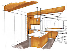
The past couple of months construction on the NYC family reno project has been moving along at a rapid pace. I've painstakingly overseen the precise placement of plumbing and electrical rough-ins, in some cases we were scrutinizing 1/4 inches. More recently, over the past two weeks I've overseen the stone tiles being sorted thru, picked-out and installed. The paint samples are about to go up,,,,kitchen cabinetry is being installed and very quickly, very suddenly it all seems like the entire home is coming together all at once. Its visible, tangible progress for the clients when all the 'beauty' starts appearing, a major turning point in this long process.
There are 3 bathrooms in this "3 apartments into 1" conversion, however, the tiny footprint of each of the original bathrooms had to remain as is. These compact size bathrooms consumed an unimaginable amount of time in planning out the details to the precise inch. On top of that, sourcing vanity/console options that are no larger than 18" and trying to maximize storage when recessing niches or cabinets into the wall space was limited - it was a challenge!
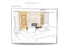
The most challenging of them all for me was the Boy's bathroom. It's original layout had a tub/shower unit which we would replace with a walkin shower. What you can't really see clearly in these concept sketches is that the room has quite a few jogs, including a dropped bulkhead in the shower not depicted in here at all. The clients desire was to do this bathroom in all ceramics or porcelain tile. Not usually my preference especially when the cost of the ceramics or porcelains can be equal to the cost of a marble. I recommended we do a marble mosaic floor tile paired with a simple ceramic on the walls. Just that bit of marble would add a luxe edge along with texture and pattern. I'm not a fan of decorative tile borders and inlays or using a multitude of various tiles in a bathroom for the sake of adding some 'wow'.....an approach I find just too decorative and trendy. I think the tile should provide the basic bones to the space, evoke the vibe you are going for and add a sense of long lasting quality. If using a ceramic, I go for timeless white or colour block an entire wall in an accent colour. If you use a natural stone, the statement is simply in the stone itself, no enhancing needed, leave the decorating to the towels, accessories and artwork. A common exception I make is the use of a contrasting band or pencil liner.

The sketches shown in this post were really really preliminary and done at the concept stage waaay back in August of 2011. (For this post I've stripped them of dimensions and notes.) The intent of these was to illustrate to the client how we could use a basic and classic ceramic tile shape but still add some detail. We considered doing a combination of a dark blue vintage style (handformed, crackle finish) 2" x 8" floor to ceiling wall tile behind the sink and toilet, then tiling the shower walls in white field tile with frame borders in the same blue tile. Even though they had told me they didn't want 'subway' tiles, they really loved this. (variation of this above and below)

There is a jog in the wall where the shower glass screen is so this provides a natural transition spot to change to a different wall tile inside the shower. A small carrara marble mosaic floor tile is continued thru to the shower floor, the shower sill would be carrara slab, on the wall not visible is a recessed soap niche also made of carrara slab and outside the shower is a full height small storage closet. Completing the space is contemporary plumbing fixtures and vintage style lighting.
One of the most common apprehensions clients have is floor to ceiling wall tile. I personally don't understand the resistance, especially in a bathroom - and true to that these homeowners were uncertain about taking the tile all the way to ceiling behind the sink so the final decision was half height.
Months later when all the final specs and detailed design drawing were completed I can tell you the final design is not like ANY of these concepts!!! ; ) You'll have to visit again to see sneak peaks of the installation. You'll see we ended up with a modified version of this last sketch above, except we're going with a different type of sink all together and we're using Select White Thassos marble on the walls. ( The sink and toilet will also be in the reverse location.)
This young boy's bathroom will exude the fresh classic crispness of navy and white. Whatever walls are not clad in white tile, will be coated in a deep navy paint. All the polished chrome will sparkle against it and the white will look extra fresh. What I love most about this foundation is that navy is such a 'neutral' you can chose from a myriad of accent colours for your accessories be it yellow, purple, green or red.
Check out the full back story and before photo
here.
See the before and after floor plans
and my concept for the architectural details
here.
All Drawings by: Carol Reed Design