With only a week or so left til 'Move-in Day' at the bachelor pad,,,things have been progressing quickly and I've been sourcing and purchasing furnishings, bedding and lighting non-stop from morning til night (not to mention I'm simultaneously furnishing another entire house from top to bottom with a move-in date just a week after Brian!!). All of the major pieces have been delivered to the condo and this coming week and thru next weekend we'll be installing new light fixtures, faucets, hanging artwork, shelves, hooks and getting the small accessories in place.
One of the most awkward spaces in the condo is an area just inside the entry, its a wide alcove area that I think was most likely intended for a home office nook. Its right inside the entry area, past a set of mirror sliding closet doors, leading into the main living space. Since Brian didn't want his home office located here (his desk will be in the 2nd bedroom) we had this extra space to deal with and a small furniture budget to boot. Its a great amount of space for extra storage but that wasn't a priority in this situation as there's a spare bedroom and really Brian hasn't accumulated a bunch of stuff, he's starting from scratch. It certainly would be a great spot for a library but Brian doesn't have much to fill the shelves at this point so we were planning a small library of shelving in the second bedroom where his desk would be. So what to do with this area that you see immediately upon entering???
Inside the entry he needs a drop zone, a place to drop his keys, his briefcase, a shopping bag etc. I'm not a fan of console tables as I think they take up space but don't give you any storage, you can't sit on them and they're not too handy for dropping all your bags on - I prefer a bench for this, which does double duty for you or your guests putting their shoes on. Above the bench I thought we could add a 'console' shelf or two and start a small gallery of artwork and photos that Brian can build on over the years. I was thinking of not just a picture ledge but a 'console' shelf wide enough to hold a tray or bowl for keys and mail,,,a vase,,,and other decorative objects. This would provide a nice visual display upon entering the condo and is also the direct sightline Brian will have directly opposite his bedroom door - the first thing he'll see every morning, so it has to make him smile!
I sketched up two variations of this concept, one with asymmetrical shelves and one with 2 different size shelves justified to the right. I hoped to find a vintage mid-century modern style bench in teak or walnut that would sit against this long wall, below the shelves and art display. We would start with ready-made frames and add some personal photos of Brians then some small accessories and objects. After looking at the two sketches, Brian liked the first option with the asymmetrical layout so this is the direction we'll take this weekend when the shelves are installed.
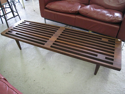
During one of my visits to Queen West Antiques right before the holidays, I walked in and immediately saw this incredible walnut slat bench - I gasped,,,,,yes, out loud (!) - as I knew this would be such a great piece for Brian. I could hardly contain my excitement, this was going to be the very first purchase for the condo - It was in great condition and the price was right in our ballpark. I love pieces like this, I go crazy for benches because they're so versatile. This could be a coffee table, an end of bed bench,,,,a front entry bench,,,or just up against a wall or behind a sofa stacked with books, its the type of piece that can move with you from place to place and you can always find a spot for it. It didn't take me long to seal the deal with Kate and voila, this was the very first item purchased for the condo! It was the perfect starting point because it really represented what my approach would be for the rest of the furnishings,,,it was affordable, great quality, beautifully designed, clean lined, and versatile.
The only downside to the bench was that it was slightly lower than I would have preferred, so I'm having a nice thick cushion seat made for one side of it out of a tweedy grey woven fabric,,in a box style with button tufting. This will make one side of it the perfect seating height and the other side great for dropping bags or purses. I had the pleasure of storing this beauty in my front hall for a few weeks and I got quite attached to it - I'm missing it now so much that I really wish I could have kept it.

For previous posts about this condo project, including floor plan click below:
A New Project - Brian's Condo
Brian's Condo - Dining Rm Update
Sketches and Photos: Carol Reed

.jpg)


No comments:
Post a Comment