Saturday, April 30, 2011

Weeping Willows


I love the colours of early spring,,,,when the fresh green leaves are so bright they practically look neon.  It can be especially surreal looking at dusk as the sun is low and the fresh leaves are illuminated in the sunlight.  Its still too cold here for the cherry blossoms to make an appearance or the magnolia buds to bloom (I'm anxiously waiting and watching, camera in hand) but today I came across the most beautiful setting of weeping willows that were a sure sign that spring has finally sprung.   The willow buds were a bright fresh chartreuse green they were almost glowing, the sight of them against the calm blue water and the bright green grass was spectacular.  Although I could have sat there for hours and just stared, I only spent about 20 minutes taking this series of photos today.  Some of them I'll have printed and framed up in contemporary frames for client spaces (or my own) one day, I just love the modern element photography adds to a room and that the subject matter and colour palette is limitless.  

I'll keep my eye on these weeping willows in the coming weeks,  maybe if I'm lucky I'll catch them on a misty morning or basking against a colourful evening sky.......


All photos:  Carol Reed


Thursday, April 21, 2011

NYC: Inspired Impressions


While touring thru the Kips Bay Showhouse in NYC last November, Michelle and I got to chatting with a student volunteer who was monitoring one of the rooms (she was sweet enough not to bust us for taking photos!).  We exchanged cards with her and when she saw that Michelle was not only an Interior Designer but also illustrated interior renderrings, she excitedly told us abut the Jeremiah Goodman exhibit over at the New York School of Interior Design and insisting we MUST go see it while we were in town.  We of course, standing there dumb struck with awe that we hadn't heard about this exhibit until now,,,, only needed to be pointed in the right direction.  Its one of those things that you couldn't have planned, but which you felt was so meant to be - the timing was perfect, here I was in NYC with who I consider to be one of the best interior renderrers in the industry today,,,,,with the opportunity to view the works of the legendary interior illustrator, Jeremiah Goodman.  Its true, the best things in life are never planned!  Since it was too late that day for us to make it to the exhibit  we planned our visit for the very next day, allowing us lots of time to soak it all in.
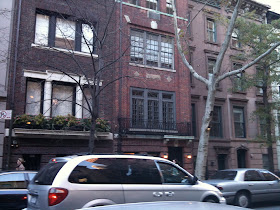


The school itself is located on a beautiful leafy sidestreet, on the upper east side.  The steet is lined with beautiful old brownstones.


I fell in love with the neighbourhood with its sidewalk cafes and flowers shops - despite how expensive everything is in NY,,I had never seen roses this cheap in my life.  And the colours!!!  I practically cried at the mere thought of walking away empty handed...to this day I'm still not over it.  I stare at this picture a LOT and dream of the fresh bunch of colourful roses I could have on my desk every week,,for ONLY $10.00!!!!!!  Oh,,,kay,,, so back to the exhibit...


That's Michelle, patiently waiting for me while I admire and snap photos of the streetscape.....and fantasize about how awesome it would have been to go this design school!


Inside the school student sketches lined the corridor wall outside the gallery space.


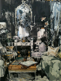
I'm sure I could hear Michelle's heart racing as we entered the exhibit space.  We were familiar with Jeremiah Goodman's work before we arrived at the school, but for those of you who aren't, I'm sure you'll recognize many of the designer spaces he's painted.  He's renderred some of the most beautiful and famous interiors of our time.


Jeremiah Goodman in his Upper East Side apartment, image via Interior Design.


For seven decades Jeremiah Goodman, now 88,  has produced his artistic interpretations illustrating the glamorous interiors of high profile decorators and their famous clients such as; Bill Blass, Diana Vreeland, Greta Garbo, David Hicks, Billy Baldwin and Tony Duquette.  Between the years of 1952 to 1967 he was commissioned to illustrate every cover of Interior Design Magazine, depicting photographs of rooms featured in the magazine.  The exhibit at the NYSID, Inspired Impressions was a retrospective showcasing 38 of his favorite interior paintings, works dating from 1947 to 2009.


His painting were considered interpretations rather than exact reproductions, he was known for improving on the original interiors, often making them more glamorous than they were in life and injecting them with personality.


The entire experience was so surreal to me,,,it was amazing to view these paintings with Michelle and hear her describing and admiring Jeremiah's technique for capturing light and shadow and how you could see his rough draft pencil lines.  From his older works to present day you could see how his technique evolved over the years, from literal to more impressionistic.


His used gouache and mixed media on illustration board for most all of his work, some are painted from life and some from photographs done while standing and working over a table, not an easel with some completed in no more than 2 hours.  Living Room, Bel Air, California 2006.


David Hicks London drawing room, 1985.


This was Carolina Herrera's NYC Living room, 2009.  She attended the opening Party of the exhibit.


One of my favorites was this more recent paintings, the New York City townhouse of Reed Krakoff, CEO of Coach, painted in 2009.
What I was impressed with more than anything when I looked at the rooms was not only how much personality each room had but how utterly timeless they were.  Without looking at the dates on the paintings we simply couldn't guess how old they were, a great reminder that that's the trademark of great design.


Only one day after returning to Toronto, I was out sourcing and stopped in my tracks when I spotted this Monograph of......Jeremiah Goodman.  And then I looked up and saw his framed renderrings hung on the walls throughout the showroom.  How strange was it that I had crossed paths with this artists work twice in one week, in two different cities?  When I told the showroom assistant that I had just seen an exhibit of his work only a couple of days ago she was shocked,,,and wanted to know all the details.  She hadn't heard about the show, even the book and the prints they had were pretty rare.  For the first time ever, Goodman's exclusive dealer, Dean Rhys Mogan, had just recently made available these signed limited edition giclee prints.  His work has never before been available in preproduction form, the book on display in the store wasn't even for sale.


The sales associate gave me a tour around the shop, telling me about each of the renderings.  It was a great to hear more about the spaces he painted becasue when Michelle and I saw the exhibit the pieces were simply labelled with date, location and homeowner, there was no one in the gallery to tell us the story about the rooms.


Framed L.E. signed giclees for sale at 12|12.


Jeremiah only painted rooms that he admired and of people that interested him, his interpretations expressed his emotional response to the room injecting mood and personality into the renderings that a computer aided drawing alone just can't capture.  Its a rare art form that I truly hope is not a dying breed (as he's described it himself), in fact I believe if anything that automation has brought about a resurgence and renewed appreciation for the quality of hand renderrings.  With talented designers like Michelle so graciously willing to share and teach others her techniques I hope this art form can live on in tandem with technology.   Thanks to all her inspiration, I'm picking up my pens and markers more than ever before and realizing how powerful this age old technique can be.


Top Photo:  Jeremiah Goodman's home studio via Interior Design

Saturday, April 9, 2011

70's Bungalow: Progress 2


The tile work is almost finished and the hardwood has just started to be installed.  The finish carpenter is on site prepping doors and getting ready to install the base mouldings and door casings.  And the custom kitchen cabinetry arrives this week for installation,,,,,,I'm sooooo excited to see it!!!   I stopped by the job site earlier today to drop some more paint samples off for the Master Bedroom and was thrilled with the progress since I was there earlier in the week and since my last progress post.   The travertine tile has gone up on the Living Room fireplace wall and I LOOOOOVE it (above photo).


The guest bathroom tile is just about ready to be grouted, they have to just finish off adding a Caesarstone jamb around the inside of the window, you can see a small piece of it on the window sill now that the tiler was using as a spacer.  The grid line effect will disappear once the grout is applied.


You can just see a glimpse of the honed travertine floor tile.


Honed calacatta floor tiles in the master ensuite and paint draw downs on the wall.  Wall tile goes up on Monday (where you see the black backer board).  You can check out the design sketches and finish boards for the bathrooms here.


The powder room has polished calacatta floor tiles and I can tell you the wall paint, is NOT going to be the bottom sample : ).


The natural walnut floors were installed in the kitchen and family room yesterday, here's a look at the range wall which is ready for the cabinets and appliances.  I love how the space is flooded with daylight.  For over six months now I've had a clear vision of what this kitchen will look like when its complete but if you want a 'sneak peek' you can check out the kitchen design plans here.


A view into the kitchen from the family room.  If you look close you can see a couple of paint draw downs on the left wall inside the kitchen,,,and I'm happy to say the perfect shade of white has been selected (we'll be painting all the main living areas and hallways white).  Although I have to say, the primer the painter used on this job is the nicest colour of white primer I've ever seen, I would be perfectly happy with that as the wall colour it was really that good - I'll definitely be getting the name of it.


Another view into the kitchen from the family room at the back of the house, I love how you can see the Living room's travertine fireplace in background.


Details make the difference.


My favorite thing on the entire project,,,,are these walnut veneer doors.  They arrived earlier this week and the wood veneer is simply stunning!!!!  Even now in their unfinished state you can see the sheer beauty of the walnut grain, its like a work of art.   This character and depth of colour will be accentuated even more when the clear top coats are applied.  What you're seeing here is only the top half of the door, there's four doors altogether, bookmatched, and they'll be hung in pairs on the two closets in the front hall.


Stay tuned for lots more progress updates in the days and weeks ahead.


All Photos:   Carol Reed


Thursday, April 7, 2011

Paper Wait


I was captivated by these glass paperweights I came across yesterday at Teatro Verde.  I've been so busy lately, my desk is currently buried under a mountain of paperwork so I thought one of these would be a stylish way to get it under control, or stop it from toppling over! (?).

For the past couple of months I've been spending most days in my car driving all over the city and beyond buying furniture, lamps and artwork in an effort to furnish a house for one client while picking up fixtures and tile samples for another.  I'll be honest, its not my favorite thing.  Spending my days endlessly driving from showroom to showroom searching for and buying furniture or lighting is not about designing for me,,,,,its shopping.  For the most part, it's really like being a personal shopper and it seems like I've been doing soo much of it lately - I miss designing, drawing, I miss my rag paper and pencils.........

Yes, I really miss my desk so I couldn't resist buying it this little gift to make it feel extra special when I return,  right now a fresh bunch of tulips would go perfectly with it too!!  Hopefully I'll be able to spend some time enjoying it soon, but tomorrow,,, is another  installation day at the Modern Love house, so the pile of paperwork and my desk will have to wait a little longer.


All Photos:   Carol Reed

Friday, April 1, 2011

70's Bungalow: Progress


The most exciting phase of the 70's Bungalow redesign has FINALLY arrived!  Last week the newly drywalled interior received two fresh coats of primer and this week, the tiler's are onsite installing the tile floors and walls in the bathrooms, laundry room and entryway.  For the next 4 to 6 weeks it will be like Christmas day every day at the house with new finishes, fixtures and cabinetry arriving one after the other.....all of the things I've been planning and detailing for the past 8 months!!  


A recap of what the house looked like before demolition started.  Check out this post for an overview of the before floor plan and the new proposed floor plan. 


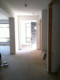
The above photo was taken from inside the front hallway facing the entry.  A new front door will be one of the last things installed.  You can see a glimpse of the new windows that were installed last month.  The living room is to the left of this view, this opening into the LR was altered to make it symmetrical, taller and I had the wall beefed up to make the opening more substantial.  On the right you can see a pair of double closets.


The pair of closets were designed to be symmetrical and centred on the hallway and the opening to the large living room area.  In between the two closets is an alcove that will have a bench or, a console and a bench with a large mirror.  On the ceiling centred in front of this area will be a modern semi-flush chandelier.  These closet doors will have the only custom doors in the house, a pair of natural walnut veneer flush panel doors.


Opposite the entry into the living room is the partially re-modeled fireplace.  I'll post more on the firepalce redesign in an upcoming post.


New aluminum windows were installed throughout the house, and finished in a custom black colour.  They have clean drywall returns, no casings.  This view is the end wall of the long dining room.


Perhaps the biggest transfomation is this once knotty pine sunroom.  It was an addition to the house sometime in the 80's.  We eliminated all the wood panelling  and a row of skylites on the angled ceiling and replaced all the windows added heating/cooling ducts.  One wall of windows (on the immediate right of this view) was closed up to provide wall space for a large screen TV and the exterior brick wall separating this room from the kitchen was opened up.  This will be now be used as a family room and is open to the kitchen.


After entering from the front hall of the house, you turn left to go down the secondary hallway leading to the bedrooms.   The large opening on the left will be a home office/library (for her) and occassional guest bedroom, at the end on the left is the laundry/mud room and access to the garage).  The first door on the right is the powder room, further down on the right is the den (his office) at the end is the principal bedroom.  All the doors except the laundry room will be single panel framed sandblasted glass doors.


The Mr of the house will use the den as his office, the room's existing brick wood burning fireplace is undergoing a complete overhaul, the stepped back mantel was removed and all the odd angles were cleaned up by cladding the upper mantel and sides in flush drwyall from floor to ceiling.  I had them frame in a recessed niche made for a flat panel TV.  I'll post more on this fireplace redesign later...


This is called the "Library" and will be 'Her' home office.  Custom built-ins are being made for the wall on the left and also the recessed area just out of view on the right. To the right is an ensuite washroom...


A small ensuite guest bathroom has a low soaker tub/shower combo and will get a custom vanity.


The dressing area in the Principal Bedroom, there will be wall to wall wardrobes on the left, a custom walnut tallboy under the window,,the ensuite bathroom is thru the door on the right.


The master ensuite has been completely relocated, it will have a large walkin shower with a frameless glass screen and a custom double sink floating vanity.  Its well on its way to becoming a vision of modern simplicity dressed in calacatta marble, zebrano wood and glossy white.  Here's a previous post on the bathroom design plans and finishes.


Doesn't look like much now, but this will soon be a slick laundry room with high gloss cabinets and stainless steel mosaic backsplash.  This laundry room was relocated from the back of the house, originally adjacent to the kitchen, its now located with direct access to the garage (w/recycling centre) and serves as a mudroom/laundry room.


I'm looking forward to seeing the completed tile work next week, I'll be onsite overseeing the paint drawdowns and making the final colour selections with the homeowner, by 'colour' I mean white and tinted greys. : )


All Photos:  Carol Reed