Sunday, June 27, 2010

Student Work: Lisiane D'Amico


Renderring by student Lisiane D'Amico

I often receive resumes and portfolio's from design student's looking for internship placement or employment opportunities.  Even though I can't hire them all, I'm always impressed at the quality of work being done at the student level - it seems to just get better and better.  A result of new technologies and all the wonderful illustration capabilities of programs like Photoshop, AutoCad and Sketchup which make their projects's look so professional.  Also I think the ability to source product, material and research on the internet has provided them with a wealth of resources at their fingertips.  Not to mention, having access to online trade magazines and website portfolios and blogs of the world's best designers - none of this existed when I was a design student.

In Ontario recent changes to regulations in the Interior Design industry associations has resulted in all accredited school programs becoming 4 year degree programs instead of 3 year diploma programs or 4 year degree programs.   Following the 4 year degree, an additional 3 year internship is required prior to being able to write the NCIDQ exams, and allowing registered status at the provincial association level.    Knowing first hand the skills and knowledge that's acquired thru all these years of school and hands-on work experience, it truly amazes me when I regularly hear of people who decided to become an 'interior designer', just like that, with no formal training or related work experience.  But the problem is the profession of Interior Design is often misrepresented and confused with the practice of Interior Decorating particularly as it relates to the field of residential design.  But that's a whole 'nother topic of heated discussion that I'm not going to get into here!  

Unfortunately even many students who decide to enroll in post secondary interior design programs are not quite prepared for what a career in this field involves,,,,,and there's a high ratio of drop-outs after the first year.  In my own class, we went from 30+ to less than 12 at graduation.

Most graduates of Interior Design programs go on to work in fields not related to residential, the majority of graduates go on to specialize in Healthcare, Hospitality, Corporate or Retail environments which is where most of the jobs are whether its with small local firms or large international companies like HOK.  Its rare actually that design students focus on residential design during their 3 or 4 year program and in fact the instructors discourage students from this so they can create a diverse portfolio to take with them into the workforce.

So instead of archiving all these wonderful student portfolio's that I receive, I thought I'd share some of my favorite student projects here.  The first student is Lisiane D'Amico, she's a graduate of Ryerson's Architectural Sciences program and has gone on to pursue her passsion for interior design where she feels she could explore the more creative side of architecture.  She's currently a 2nd year student at Sheridan College's Interior Design program, I first met her thru this blog and invited her to send me samples of some of her work.  I've chosen what was her first residential project at Sheridan, the Campbell-Harding Residence which she describes as "Modern-Mission".


Ground Floor Plan
For the assingment, Lisiane was provided a complete client profile (bio) including all their design requirements along with a base plan of a house.  She was required to design all the interior partitions, select all the material finishes, design the lighting and electrical layouts and select all the furnishings and fixtures.  The project was to be designed in a style that blended both owners love for modern and mission design styles.
For Lisiane's first ever attempt at a residential plan, I think the layout works well and she's paid great attention to sight lines and maximized window locations.  If she were working on this project in my office I'd suggest exploring a U-shaped kitchen layout as an option to the small island and I'd like to alleviate some of the door traffic at the bottom of the stairs.


Second Floor Plan
The most challenging aspect of any project is the partition layout,, particularly figuring out where to put the stairs because they dictate how both floors will flow.  It can take years of experience and even personal experience to understand how the location of walls and doors will effect the flow and efficiency of a house.  On the second floor here my only observation again is the congestion of doors at the top of the stairs, and if she were working on this in my office, I might suggest simply reversing the stair direction, up is down, down is up and see how that develops.
When working with residential clients we design things very specific or particular to that client's wants, even if we don't think its the best solution,,,with commercial design its more about designing for the masses, its all about universal design, averages, typicals, and social behaviours.  In the master bedroom, this is an area that could be designed dozens of different ways and work equally well depending on that particular homeowners lifestyle.  In my experience, I find that putting the closet and the dressing area next to each other works best for most clients, so in this case I would also present an option to the client that places both the walkin closet and ensuite on the right side keeping the bedroom area on the left.  This keeps your dressing and grooming areas side by side without having to walk from one side of the bedroom to another.


Elevations
I think her furniture selections, millwork and cabinetry detailing is fantastic!


I love the photogallery on the tall staircase wall!  This was one of Lisiane favorite elements too.


The Kitchen
I think her kitchen detailing and material selections are excellent too, I love a sink under a window!

Sample Board
Sample boards for concept presentation purposes are tricky.  They can be totally misleading if the materials aren't visually represented in correct proportion to how they'll be used in the space and its difficult for most people to visualize how colour or fabrics will actually really read in application.  In this case, I think Lisiane's done a wonderful job in not only selecting the materials and furnishings but in presenting them on a board.  I can see with the mix of dark woods and contrasting light materials this is a modern interpretation.


Boards like this take an enormous amount of time to prepare, in real life I used to do hundreds of these when I worked with commercial clients but for residential,,,,,,not so much.  Truthfully if your presenting concepts or options to clients there's no point in gluing this stuff down because it'll be deleted or changed before the glue has time to dry, and once things have been approved and agreed upon, then there's not much point in pasting it all on a board, it simply not a good use of time.  I make a simple site board with materials on it and file the rest away in the project binder.  But students are required to do these so they can present their project to the class - just like in commercial projects designers have to present to a committe or board.

The most interesting part of this project requirement for me was that the students weren't given a budget to work with.  I think that's so unfortunate because that really is the key variable that drives the decision making process and what drives innovation throughout a project.  A huge part of defining whether a design solution is successful or not is how the designer utilized the budget. 


I had the opportunity to discuss with Lisiane what she was looking forward to focusing on in the upcoming school year  and I think she nailed two of the biggest issues I've always felt have been ignored at the classroom level - budgets and business.  Its critical that students learn how to work with a budget and learn the business side of the profession as these are pivitol aspects to success.   Next year she's required to do a two week student placement so if any designers out there are interesting in having Lisiane work with you for a couple of weeks you can email her at lisiane.damico@me.com.

Thanks so much Lisiane for sharing your project with me - your presentation and renderring skills are outstanding and I look forward to posting another one of your projects soon.

If you're a student and have a project you think I'd like  -  email it to me and I might feature it here!


Tuesday, June 22, 2010

Upload: June 22, 2010


Fresh white peonies and some fireplace renderrings in my studio


Well its been 3 weeks since my last Upload here.....which coincided with the peak of peony season around my house,,,,,and that lasted all of about 1 week this year.   They bloomed faster than I could cut them and then a few days of hard rain destroyed anything that was left on the bushes.  Such a shame I just wanted to cry,,,,,,um, actually I think I did.  So then, picking up here where I left off you'll see the last of my peony photos for this year! : (  


I was stacking the peonies wherever I could find a spot.  


I was like the Peony Express,,,I was taking them to friends and clients!


If you remember my last upload post you'll remember a vintage dresser I found at the Aberfoyle antique market, I delivered it to my clients and had her handyman hang the mirror above.


The mirror was purchased a couple of months ago and was waiting for the dresser, it was nice to finally get these pieces in place.  The dresser was perfect for this spot,,it was only 18" deep and had 5 drawers.
Mirror is from HomeDepot, flowers are from Chapters. All it needs is a couple more accessories  (Doors, floor and wall colour were all pre-existing when I came on board, and all had to stay as is).


It is possible to find some really cool fixtures for not a lot of money.


I can't help it, there are usually about 2 or 3 shots like this a day - Iphone is so touchy!
Now off to source some items for a rooftop deck...


Making fabric selections for new outdoor furniture


We're thinking about these for the rooftop deck too,,,,the large size


A lighting option for end tables..


A modern outdoor light fixture option....


This one isn't the one for this project but I love the pattern this fixture throws off, dramatic!


I sat down last week for a long chat with one of the owners of a new furniture store coming to the Caledonia & Castlefield design district.  He sketched out the floor plan floor for the new showroom and has shown me tons of photos of the product they'll be selling.  I've been hearing all about the progress of this new store for months now so it'll be intersting to see it evolve.  It's called Shelter Furniture, you can check out their facebook page here for a sneak peek of what's to come.
One of my favorite pieces soon to be available at Shelter Furniture


Before photo: I'm currently designing a new island for this client's kitchen, but were not stopping there, the entire kitchen is going to get a complete modern facelift.  Oh and the floor,,,that's going too!


And in my spare time (!?),,,,,I'm helping a family member finish his kitchen reno.  He needs cabinets stat, so I helped him get that all sorted out.  See drawings taped to hood!


I've been searching for a certain pair of night tables for about 5 months now,,,the search continues.


At first i like these lamps (almost love them) but I hesitate, I know if I start to see them en masse, I'll hate them.  But oh how I love a black shade!


Entrance to Gail's Kitchen, in the midst of construction as I arrived for a site meeting last week.


Things are moving along, framing, electrical and plumbing inspections have been passed and the drywall went up last week.  This is the view from the family room up into the kitchen.


I tweeted last week that if no one bought this chair, I would.  But it wouldn't fit in my car and I don't currently have my own mod patio for it, or a client for it.  My basement is already full of chairs.  I envision it spray painted with a new fabulous cushion and a funky side table.  C'mon,,,its only $95, I can't believe no one's bought it yet!!!


I may need to rent a storage locker soon.  I spotted this set of nesting tables outside an antique store in Oakville and I can't stop thinking about them.  I wish I had a client for these, I'm crazy for them.  This is the type of thing that takes a room to the next level.  When you have a room full of new furniture, you need to add something like this.  Its the unexpected thing you can't ever plan on finding or imagine you'd ever buy but once you see it in place it makes the room.  I can envision this even though its on the sidewalk and believe me, it would be stunning!  Look at the tourquoise detail......


And this chair,,,,,yes it needs some new fabric but this,,is the quintessential accent chair and it would make quite a statement in any space.  Love it.


I'm so influenced by the weather, my moods and my appetite.  I love the rain, I always have.  We've had a lot of it lately and the other day it was the strangest of days, it was a mix of both brilliant sunshine and torrential downpours.  Rubber boots and Ray-bans, I think those are the best kind of rainy days....


All Photos:  Carol's Iphone


Sunday, June 20, 2010

My Father's Daughter


Snow globe of me and my dad

On father’s day I always think about how I was never considered myself a Daddy’s girl.  I was the 5th born of 6 kids and the first and only girl, the only girl of 6 kids.   Obviously everyone thinks my parents were trying for a girl and the 6th child must have been an accident.  But I don’t think my father was trying for a girl at all I think he was trying for the ultimate hockey line.  Its true, we believed the 6th child really was an accident ; ) but conveniently he made an excellent goalie!.  Until he came along I was the ‘stand in’ goalie,,,from the moment I could stand my brothers strapped boys skates on my feet and planted me in front of the net while they took shots at me (on our ice rink in the backyard).  That’s kinda like what the rest of my childhood was like..  

Everyone assumes I must have been spoiled being the only girl, in fact I was anything but spoiled,I would say it was more like I was spared.  The boys would torment me to the edge then stop short of getting caught by mom or dad.  Maybe they resented me because I had my own room, I’m sure that was it.  Believe me, having a room of your own was a priviledge in a 1200sf 3 bedroom house.  Being the only girl made me an easy target for my brothers, they have no mercy when it comes to sisters.  It was entertaining for them to see how quickly they could make me cry or how easily they could scare me or out run me or out jump me or outshoot me or throw farther than me. So it became my goal to not let them see me cry and to try and keep up with them, not only did I want to do everything the boys did, I wanted to do it better.  Sure I could ice skate, slolem ski, drive a speed boat, dive off the big rock, swim across the bay, catch a line drive, and a 16 lb pike, drive a golf ball 300 yards, but that was before I discovered power tools. : )

My dad never hired a repair man or a tradesman in his life.  If it was broken he fixed it, if it was beyond repair he made a new one,,,as a rule he wouldn’t buy anything he could make himself.  And he would never ever, ever throw anything out, especially a piece of wood - a child born of the depression era.  Old hockey sticks were prime lumber. I’m sure he could have written a book on the things you could make with old hockey sticks.  Til this day my parents first colour tv cabinet still sits in my moms living room - the tv was encased in a wood cabinet so even when the tv tube was shot my dad continued to use the cabinet to house all his future tv’s - it was perfectly good wood afterall.  I even remember him re-painting his own car,,,,,,,with a brush!  I remember the endless home repair projects because I was often my dad’s helper, I would stand by watching him work on various projects and hand him the tools or hold things that needed holding. He owned every tool and gadget you can imagine, our garage was like a rent-all store, if you needed a tool, Howard had it.  There was always a stream of neighbours and relatives showing up to borrow tools (he kept a log) and the phone was constantly ringing with requests for a helping hand for a repair project.  My dad was the go to guy if you needed help with fixing something.

My father was a master Mr. fixit, a genious DIY’er and a pioneer of reuse and recycle, he repurposed everything and not because it was the 'green' thing to do.  He was innovative.  Before there was picture in picture tv, he stacked multiple tv’s side by side and watched them at the same time.  He put wheels on furniture long before mobile furniture was trendy, he was as savvy with a sewing machine as he was with power tools. He sewed his own slipcovers not because he was trying to be shabby chic.  He used the sewing machine to repair holes in our camping tents and to make new covers for cots and mattresses, and new seat cushions for chairs, he even sewed our own life jackets (?), kinda scary.  To everyone who knew him he was the one who could figure out how to fix anything and everything - and he always did.....except for his cancer.  That was the one thing he couldn’t fix, and no one else could either.  Sadly he lost that brief horrific battle 3 years ago and we all miss him terribly.


Never throw out a piece of wood, it might come in handy (example above)
Why buy a birdhouse when you can make one (example above)
Birdhouse made by Dad from salvaged scrap wood on display in my moms garden.

Thanks to my dad, I have a pretty good collection of power tools and I’ve used all of them personally for many home improvements over the years, when I moved into my first home, my dad would give me a new power tool for every birthday and christmas.  I think it was his way of saying 'your going to need these a lot so you should learn to use them yourself'.  And I’m so grateful I did.  Nowadays, I dont’ have much time to do projects around my home myself but its a good feeling to know that when I ask my ‘handyman’ to do these things for me or if I hire someone to do it, I know its not because I can’t do it myself.

I inherited a lot of my dad's traits and its served me well in this profession - I’m inherently resourceful, technically intrigued, and I have this unending desire to ‘fix things’ to solve problems, to reuse or repurpose things, to figure out to how make something work better, or create something for less than what it would cost to buy it.  I know I definitely inherited the ‘why buy it when I can make it’ gene from him but sometimes it works to my detriment.  A civil engineer by profession, my dad was a superb draftsman, his hand printed schematic drawings were like works of art, beyond that he didn't exude much artistic flair - I was fortunate enough to inherit that gift from my grandmother (his mother) who was a stained glass artist.

I’m also thankful to Microsoft.  Really.  Because up until a couple of years before my dad died, I never imagined anything I did could really impress or wow my dad much,,,,,until he decided to take some computer course to learn how to use a computer and the internet.   That’s when the proverbial tables changed and my 20+ years of using a computer finally payed off.  The fact that I could easily navigate my way around an MS operating system with my eyes closed made me look like some kind of genius, I might as well of been Bill Gates in my father’s eyes.  He looked at me with utter awe and amazement as my fingers flew across the keyboard,,,with multiple windows open at a time, ‘fixing’ all of his problems, finding all his 'lost' files and folders, using shortcuts and showing him around the 'big wide web'.  He’d often call me with a computer question or problem, I was his hotline for computer help, talk about role reversal.  Something that was so easy to me, so effortless and second nature was a total mystery to him. Something my father (and brothers!) didn’t know how to do that I did!  So if for nothing else but for my ability to use a PC and the internet he thought I was utterly brilliant. : )

I started this blog on the first anniversary of my dad’s passing partly because I was always thinking about him and missed how he was always asking about what I was working on.  If my dad was still alive today I know without a doubt he would be the biggest fan of this blog,,,,,I guarantee he would faithfully log in every day to see if there was a new posting, and if there was, I know he’d read it out loud to my mom,,,,,then he would email his siblings and tell them there was a new post,,, then he would call me and rehash all the details in amazement at the extravagant efforts I put in to sourcing this or this or that,,and then tell me what was on sale at Canadian Tire this week.  Of course first I’d have to walk him thru how to become a ‘follower’ and  how to leave comments, because he would want to do that....   

Happy Father’s Day Dad,,,,I know you're following.

No.5

Saturday, June 5, 2010

CREED: One Year Anniversary!


CREED: [ noun. = A summary of principles, beliefs or opinions]
BEAU-TY: [noun. = The quality that gives pleasure to the mind or senses and is associated with such properties as harmony of form or color, excellence of artistry, truthfulness, and originality.]


A year of blogging.  Last week marked the one year anniversary of this blog and I have to say, I can’t believe its been a year already??  You can click here to read my very first post and introduction to blog land just 12 months ago.


Keep’n it Real.....
I will admit I’m not one who follows any of the ‘rules of blogging’,,,,,,I’m sure there are rules but I’ve never read them, I just dove right in and started blogging.  I’m just doing my own thing here and if others want to read, or share my posts or even leave a comment - I’m thrilled, I love receiving comments from readers and look forward to the feedback. My goal on this design blog has simply been to post original content and to be authentic, a blog about interior design written by an interior designer.  For me the best way to achieve that is to simply express my point of view by writing about and photographing my own projects and my own experiences, as honestly as I can. Afterall,,no one else can do this, except me!


My living room.


Thanks....
Clearly, my goal was never to set out to achieve as many followers as I could, cause that would require a strategy of sorts requiring much more participation in blogland than I can possibly manage right now.   I’m so appreciative of the 24 readers who have been followers on this blog and I’ve enjoyed reading all your comments here and I’ve enjoyed visiting your blogs too!   I’m still amazed I have any followers at all, but as my stats counter tells me there are actually several hundred visitors a day to this site which kinda freaks me out, honestly!  I’d like to share a special thanks to my very first two followers,,,who signed up within hours of this blogs launch, they are my most faithful and loyal readers and the only 2 followers I actually know.  Its no coincidence they also happen to be two of the most important people in my life - Anita being not only my mentor for many years but also one of my closest and dearest friends,,,and my younger brother Tom who was my very first best friend and will continue to be my bff,,,he’s also the only family member who is computer savvy enough to figure out how to become a follower on a blog (I’m not kidding!). I come from a pretty large family and honestly, my family readers alone would total 40+,,,,if only they knew how. 


This is Anita...isn’t she beautiful!  This photo was taken about 2 weeks ago while having lunch together.  She’s also a designer and runs her own design firm, I learned everything about the design industry (and business, and relationships, and cooking, and life in general) from her.  We worked together for 10 years, but it never seemed like work.  I miss seeing her everyday.....   


This is Tom aka 'Six' .......aka the rock star!  He’s an avid curler and last year he made it to the provincial’s (a once in a lifetime opportunity for a rare few), it was a 7 day televised tournament and I couldn’t have been more proud and excited for him.  I quickly elected myself president of his fan club and created a blog that chronicled his trip to the provincials, it was called ‘Six Rocks’,,,it was only online for 2 months and accessible only to our family and friends but it was hugely popular.  It was 2 months after that little experiment with blogging that I launched this design blog.  


Most popular Post....
Why I love Ikea kitchens.  This post definitely generated the most comments and emails of any other post.....over the years I’ve designed a LOT of ikea kitchens and what makes them successful in my eyes is when nobody can believe they’re ikea kitchens!  Proving that Its not about how much something cost or where you buy it - its about how you use it!  For me designing with Ikea products is like playing with lego blocks,,,the possibilities are limitless.  I look forward to posting Part II of Why I Love Ikea Kitchens in the upcoming year featuring new bespoke Ikea kitchens and more tips and tricks.


Yes - this is an Ikea kitchen.  More after photos of this project will be shared in the year ahead.


My Favorite Posts....
I have a couple of personal favorites from this past year. One was The Before & After of an E-Design project. Simply stunning! For anybody who hasn't considered the benefits of using e-design services, this is bound to impress you. My client's after photos prove that a small investment in a good design plan will net you maximum value from your reno dollars. You can also check out my e-design website thedesignshop for more images of this project in the sample gallery.


This is an after photo the client sent to me, I'm planning on visiting the house in person in the upcoming weeks to take my own photos which I'll share with you here.


Another personal favorite post was the Victorian House Tour. Having the opportunity to tour this house was a thrill for me and such an unexpected surprise. My sister-in-law was the listing agent for this house and as she was preparing for the public open house she invited me to come by for a tour. I have a thing for victorian houses and this one, happened to have been designed by the well know Toronto firm of Powell & Bonnell some 10 years ago, and probably one of the few (if not only) traditional home they've designed. Of course, I fell in love the second I walked thru the door. I had come armed with my camera and I excitedly went from room to room just shooting away candidly. I must have taken hundreds of photos in about 20 minutes. I composed a blog post from some of the photos and the homeowners were so thrilled with the post they printed it out and left if with all the real estate agent’s literature for the public open house. Of course it didn’t take long for the house to sell and I’ve been invited to visit the homeowners new home one day once they’ve settled in, and I can’t wait to see what they’ve done with it.


Living Room vignette from the Victorian House tour.


The Year Ahead......

{Before & Afters} I’ll finally be getting around to posting final after photos of Brian’s Condo, along with More after photos of the 70’s Sidesplit, more photos of a mid-town condo reno, and after photos of the stunning e-design bathrooom reno...


Sneak Peek of the 70's Sidesplit master bedroom.


{Client Projects}:  In the coming year there’ll certainly be no shortage of subject matter for me to blog about, my biggest challenge will be finding the time!  New projects include the dramatic transformation of Gail’s Kitchen and Family Room currently under construction,,,,,,I’ll be  collaborating with one of the city’s hottest landscape designers on the redesign of a rooftop deck of a mid-town condo, I’ll be furnishing a modern suburban family home for a yonge couple including a hip nursery and very chic his/her dresssing room,,,I’ll be tackling a new kitchen design for a idyllic log cabin retreat in north ontario that is nothing short of this designer’s dream setting.  And all this, will be happening over the next few months......


The plan for Gail's Kitchen & Family Room reno.


Modern love - furnishing a home for a young couple.  I've got the main pieces in place for this Living Room, wait and see how the rest of it comes together.


{Student Work}:  Each month I receive dozens of portfolio’s and resumes from students seeking employment or internship opportunities.  Unfortunately I can’t hire them all but I’m blown away by the level of talent and skills these students have developed, i wish ci could. , One thing I’ve been wanting to do for some time now is to start posting some of these amazig projects that the students have created.  I hope to illustrate the level of talent and skills design students possess and provide a platform that will give them some well deserved exposure.  I’m thrilled to tell you my first post featuring student work will be this month and i’ll be intrudocing you to the the work of of 2nd year student Lisiane D'Amico .... of Sheridan college.  She’s also a graduate of Ryerson’s architectural science program and you’ll be blown away by her talent..


Loft renderring by student Lisiane D'Amico.


{My Home Renovation}:  The most exciting topic of all for me will be my own home renovation,,,hopefully I’ll be starting on it before the 2nd anniversary of this blog, first I have the huge challenge of finding the house.  I actually had to shelf house hunting this past winter and spring because i was too swamped with work.  So I plan on spending a lot time with my real estate agent in the near future,,who i’ll be introducing you to here on the blog....


{A Special Guest blog}:  Featuring Kara Reed one of Toronto’s busiest real estate agents.  You may recognize her as Sarah Richardson’s agent most recently appearing on HGTV's Sarah’s House 3, but she’s been my sister-in-law for the past 20+  years and not only is she one of the most special people in my life she's also been a favorite client.  I had the pleasure of designing (a total gut and reno) her 3 level mid-town condo in 08 and 09.  Kara's client list reads like a who’s who of Toronto, from the design industry, entertainment, sports and finance, she has access to some of the most spectacular homes in Toronto.  Her and I have toured hundreds of houses together, often she’ll call me and say ‘where are you ,,you gotta come see this house!!”  And of course I do and I’m never disappointed!  She’s sold two of my own homes (for record breaking prices) and has lots of experience seeking out those diamonds in the rough.  So I'm going to collaborate with her on a feature post or two in which we'll share our views on the realities of investing in home improvements in today's market. 

Real Estate Agent, Kara Reed


I'll leave you with my favorite photo of the year. I can't exactly explain why its my favorite, perhaps because it was such a candid photo of a completely undesigned room, there was no plan or intention for this space, things that the homeowner already owned just fell into place here by happenstance and the simple beauty of these things together captivated me - I just grabbed my camera and snapped away. I hope there'll be many more images like this to come. : )


Thanks for reading,


Carol

Tuesday, June 1, 2010

Upload: May 31, 2010


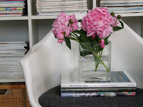
I take a lot of photos every day and I upload them onto my laptop 2 or 3 times a week, sometimes hundreds at a time.  Collectively these photos are a snap shot of where I've been, what I've been sourcing, what I've been working on, job site progress, what I find inspiring, things I love, and things that I find interesting and worth keeping on file for future reference.   Here's a small sampling of the latest images uploaded from my camera.  Starting with the photo above - freshly cut peonies from my garden, I'm surrounded by them as I type this and the scent is heavenly...... : )


The month of May marks the beginning of the outdoor antique season, I made a trip to the Aberfoyle market a couple of Sundays ago in search of a painted dresser and a pair of night tables (for 2 different clients).  I arrived late in the afternoon so I only had time for some quick browsing but was lucky enough to hit the jackpot.  It didn't take long to spot this dresser and I scooped it up instantly, it was a STEAL.

The dresser is for the 70's sidesplit I recently furnished for a single mom and her daughter, it'll go in the guest bedroom, pictured below...


Oh, the ones I left behind, sadly these beauties didn't come home with me,,,,I really really really wanted them, they had the most incredible blackened brown patina and they were solid.  I have no place for them in particular but still I didn't want to pass them up, especially when they were only $15 ea.!!  $15!!!  If it wasn't for the fact I had zero room, not even an inch of space left in my car that day, these would be safely at home in my basement right now. : (


Trendspotting,,,,,,I couldn't help but notice these butter urns or crockery pots everywhere at the market,,,I mean everywhere.   I also spotted these in the latest Pottery Barn catalogue so it seems the vendors are taking their cues from the home decor industry.  I love the simple utilitarian form of them, the typography  and their oversized scale.  Today I would put a big huge bunch of fresh cut pink peonies in one of these.


I'm in the early stages of working on some design concepts for a rooftop deck which hopefully will be built this summer.  I've been checking out what's available in ready made cushions so that we can mix these with some custom made.  This chaise from West Elm was particularly interesting to me as it reclined completely flat becoming a bench, which makes it doubly useful for entertaining....


A trip to DFO to scout out their in-stock outdoor fabric selection,,,I just pulled out the ones that caught my eye and started mixing.  I love this large graphic floral and this graphic geometric together, they both had a modern feel.  The colour is actually a beautiful very orange/red but seems to read more red in my photos.


This stripe worked well with the large floral above, but I think i would use it sparingly in a candy stripe piping detail or for the sides around a box cushion.


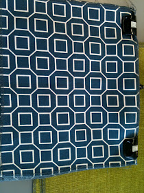
I wasn't looking for navy at all but loved this combo, especially with some nice crisp white piping!


I think I would have liked this more if the yellow was more vibrant.  I think the tourqoise print below would make this trio more dynamic.  For outdoor fabrics, I prefer to stay away from too much green because I like all the green to come from the grass, trees and plantings.


Think I would nix the solid green here for the yellow floral above.  All in all,,,not a hugely successful trip as I was looking for more prints with tourquoise and more modern graphics in general, but definitely some possibilities.


I was impressed with the distressed antique pewter finish on this Entry Set by Rona, part of the Rona Collection.


This striped runner at Home Depot had me thinking I needed to use this somewhere, and I wish they had more colour options.  How fun is this!


Trendspotting.......I took this photo simply because I'm seeing this buckle detail in many different places lately, on furniture, on vases,,,on handbags....... on pillows like this one at Pottery Barn.  Speaking of Pottery Barn....


Dear Pottery Barn:  Your lamp shades are always too small for your lamps.  I've mentioned this to sales associates many times who reply "the merchandising manual says that table lamps always get medium size shades".  I don't care - to my eye they look oddly disproportionate.


Dear Pottery Barn:  Last week when I was in the store to pick-up a bar stool that's been on back-order since January (yes, 5 months!), I noticed this sign beside the cash desk and was very excited.  I thought finally, you've been listening to all the complaining I've been doing and have actually brought your CDN prices more inline with your US pricing.  Then I noticed the fine print says to look for select products with a maple leaf to realize these savings.  Honestly, I looked around the entire store, twice, and didn't see a single item with the maple leaf??   Is this a trick?  Is my bar stool in yet.......


A lovely whimsical branch chandelier seen at Sheridan Nurseries....this needs a cottage, preferrably one with an all white board & batten interior.


All Photos:  Carol Reed