Saturday, February 23, 2013

Riverdale Reno: Progress


On a recent site visit for this project I was so pleased to see how all of the details of this renovation have come together.  Creating two new luxe bathrooms out of one large outdated one has been part of an extensive transformation process for this Victorian semi in Toronto.  You can read an overview of the design brief and view before and after floor plans of this second floor reno project here.   As I mentioned in that first post the design vision for the master ensuite space took a dramatic turn in direction from the initial concept meetings.  I had come up with a floor plan solution that my client approved in no time but deciding on finish materials was a much slower process and one that really pushed me to embrace some details and finishes that I wasn't entirely confident about.


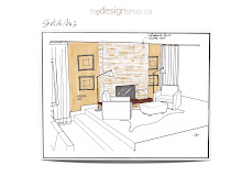
Bathroom concept design sketch by Carol Reed Interior Design.


From the beginning the homeowner had a very clear idea of all the features he wanted IN his bathroom however, he didn't have as clear a vision of what he wanted the space to *look* like when it came to colour of materials and finishes.  This sketch above was something I prepared for him to help him visualize the new space and this then really helped him pin point what he didn't want.  This was definitely the look he wanted in his Guest Bathroom, lots of white marble on the floors and walls with a walnut vanity.  But for the master,,,he immediately decided dark and and sexy was the direction he wanted to take, further to that, he wanted a dramatic ledgestone feature wall.  This is when as a designer,,,,you truly have to tune in to what your client wants and not be blinded by your personal preferences.  You need to always be open to new concepts and directions and then use your expertise to filter and edit, not dictate.  Clearly this room nudged me in a new direction but I thoroughly embraced the opportunity and I am completely thrilled with the results.  


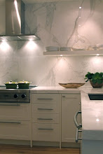
As you can see from these photos, this is quite a departure from the initial sketch.  The dark stone on the floor and the dark ledgestone on the tub wall is a striking contrast with the white marble used for the counter and tub deck and on the shower walls.  This photo above was taken just after the custom tv-in-mirror was installed.  The warm tones of the custom walnut slab tub panel and vanity is stunning against the grey.  One of the great features we kept from the old space was a skylite which floods the room with lots of natural daylight.  I think all the white marble, the mirror and the daylight beautifully balance all the dark grey. The homeowner and I are still on the hunt for the 'perfect' light fixture.


Even though there was a lot of different materials going on, including 4 different stone materials, I used them in a very monolithic way - each one of them used singularly and in an uninterrupted pattern.  The floor is a large rectangular tile laid in an alternating offset, the wall tiles are long narrow rectangles laid in a brick pattern in rows of alternating heights, the ledgestone is very thin long pieces of horizontal split face stone panels installed from wall to wall.  In designing this bathroom , there was a lot of consideration paid to mixing various patterns, mixing smooth with rough, light with dark, large with small.  In building it, there was an incredible amount of skill required in order to seamlessly integrate all of these different materials and details together.  Not for the faint of heart.


The master bedroom got a mini reno too.  New carpet, new trim work, new paint and an entire new wall of closets now on the left side of the bay window.


The guest bathroom was not quite as far along as the master ensuite.  On this day the custom walnut wood frame for the mirror was about to be installed.  We are also awaiting a pair of tall french windows that will be outfitted with polished chrome cremone hardware. : )


Here's an older progress pic of the guest bathroom shower under way.  Again, a departure for me with so many different tiles being used.  The mini cararra 'chiclets' on the floor are my favourite!  Outside the shower the bathroom floor is finished with extra large, slab like, cararra marble tiles.


The guest bedroom has seen a lot of changes too.  Starting with a new pair of french doors and a juliette balcony,,,new carpeting, trim work, paint and hardware.  Its a small space but its jamb packed with luxe details.  A new upholstered bed was the first of the new furniture to arrive.  This will be flanked with mirrored night tables and a pair of antique alabaster lamps.  We've got some gorgeous graphic fabric picked out for the draperies and hits of bright coral coloured prints for the bed. 

Its been a long process but this house is almost ready to welcome its first overnight guest, but I've forewarned my client that they just might never want to leave! ; )  


All photos by:   Carol Reed


Saturday, February 16, 2013

Style at Home: Luxe Retreat


What a surprise to flip thru the current issue of Style at Home and see a bathroom from one of my projects featured!  This is a bathroom I designed some time ago as part of an extensive reno of a 3 level condo owned by my then sister-in-law Kara.  I had such fun with the details in this guest bathroom, generally I'm not one for doing lots of various tiles in one room but in this case Kara fell in love with a collection of marble tile samples I had gathered up on a table and had to have them.  Her only request was that I use them all, but aside from that I had free reign to do whatever I wanted with the design.  I used a 3 x 6 honed calacatta marble as the starting point which was installed in a brick pattern in the shower and in a herringbone pattern on the floor.  Around the calacatta I created some classic hotel style border lines using marble mosaics on the floor and glass listellos in the shower.  The end result is a truly luxe looking space that I hope makes her guests feel extra special. 

I'm thrilled to see this little gem of a space on the pages of the March issue.  For the full bathroom story you can check out the March issue on Zinio.com or in print on newstands now. You can view more photos of Kara's condo previously published in Style at Home on their website here.


Style at Home


Wednesday, February 13, 2013

IDS 2013


I have to admit I was a bit under-whelmed at IDS this year and I think that had to do with the fact that most of the products exhibited were building materials (tiles, wood flooring, plumbing fixtures) and not as much furnishings and accessories - you know, all the *beautiful* stuff you associate with display and decor.  Because of this there wasn't as many interior environments on display nor where there any feature designer rooms to walk thru which I always enjoy viewing.  

My camera stayed in my pocket for the most part but there were a few things that caught my eye.  Starting with this chrome plated soaker tub (top photo) - its actually the same tub I've purchased for my own bathroom renovation but I went for the all white version (surprise!).  Oh I contemplated the shiny chrome finish for some time but in the end I decided that even as much as I do love the tub in this finish it wasn't entirely suited to the simple, pared down aesthetic I'm after. 


Once again my favorite exhibitor was Ikea.  This was an Ikea bathroom of enormous scale who's concept was derived from the warehouse lofts in Copenhagen.   What I truly loved about this space was that it exemplifies the philosophy of designing with line, form and scale and not decoration.  The pattern, colour and texture is all from the materials themselves in a monolithic applicaiton which is how I like to approach the spaces I design.  I find that with bathrooms in particular people try too hard and they're often just "over done" for my taste.   Too many types of tiles, too many inlays, too many patterns, borders, trendy colours.  If you have a great material to start with, that's enough on its own.  These wall tiles in a distressed metal finish are installed wall to wall and floor to ceiling in a simple grid pattern and the result is so very effective.  The uninterrupted wide plank flooring again is the same concept and the floating vanities and wall cabinets in simple wood slab form create a beautiful composition that's punctuated with a pair of extra large round mirrors.  (These mirrors have been a long time favorite of mine.)


  To give you some idea of scale - those mirrors are huge, see this photo with the camera man.   I wish I had a photo of the other side of the bathroom which features a freestanding copper slipper tub - stunning.


On the other side of the bathroom wall was this gorgeous Ikea kitchen.  Again, the scale was huge with its 20' high ceilings.  My favourite thing about it though was the accessories on the kitchen island, all those large vintage style country crocks and weigh scales.......and those topiaries.  


Once again there was a massive light installation above the island, the Hectar industrial pendant hung in multiples was dramatic.


The Earth Inc. exhibit was also another stunner this year.  At least year's show one of my client's walked thru their booth and was so taken with their work that she hired them to do an overhaul of her 70's bungalow backyard, the first phase was completed in the fall.   A few days after the IDS show this year, I had a meeting at the house and was blown away with the transformation of the back yard.  Work on the front yard begins in a few weeks.


This was one of the few interior settings on display and it was a beautiful space, by Cocoon.  I used to live and work in Oakville and first discovered their showroom years ago - it just keeps getting better and better.   I think the vibe of this space really resonates with a lot of people,  I know a lot of my clients would be drawn to it.  Its based on traditional elements with modern touches.  What I loved most about it is how colourful it is, yet its primarily white.  A great example of how a little bit of colour reads very prominent in what is otherwise a neutral space. 


The parties leading up to and around IDS have become the main attraction of the show, sadly I didn't make it to any of them because I flew in from Halifax mid week then headed out of town for site meetings.  I returned back to Toronto just in time to catch the show on Friday afternoon (and the snow storm).   


There was no industry party that could top my favourite event of the week - a dinner party with my best girlfriends (who are also all designers btw!).  I am soo lucky to have these amazing women in my life and there is nothing I covet more than when we get together around one of our dining tables.  They always blow me away with their incredible recipes and beautiful table settings, like this one above.  After I left the show on Friday, this is what was awaiting me when I finally arrived (after driving for hours in the snow) at my friends house,,,,not only does she always set the most inviting table with personal touches, she even included individual gifts for each of us (not shown in the photos) at our place settings. There's nothing that makes you feel more special than that.  

I definitely can say I learn more about the design biz chatting with these ladies around the dinner table than I could ever learn at a trade show.  This was the perfect way end a hectic week of design and was the highlight of my IDS day!  : )


All Photos by:   Carol Reed
Related Posts Plugin for WordPress, Blogger...