Wednesday, July 20, 2011

New Project: NYC Family Apartment


I can't even begin to describe how wonderful my newest client is and how excited I am to be designing her 'new' family home, a 4 bedroom, 4 bathroom apartment in the Upper East Side of Manhattan.  To say I'm 'excited' is an understatement actually,,,it is a privledge to have the opportunity to redesign a family home, its the ultimate for me - creating the partition layout, planning out the kitchen, designing the bathrooms,  determining how the spaces flow from one to the next, how the rooms relate to each other, how they'll be used and how the family will interact with each other and their guests.  Selecting all the materials and finishes, designing all the special details to reflect their personality and style is truly a joy for me and every moment, every step of the way I envision the family's day to day activities and even more so (!) I envision, down to the smallest detail, all the special time they will enjoy in their home with family and friends.  Enhancing the function of these mundane daily routines as well as all those special occassions informs every design solution and decision.

Although this is a first for me, designing a home located in NYC,,,the design process is really no different than any other.  The family requirements and needs are very much the same as any family and the space challenges are similar to those faced by anyone living in small urban homes.  Some might not call a 2200 sf apartment in NYC small,,,but for a family of 5, with no outdoor space, no basement, no garage and frequent out of town guests,,,,it can quiet easily feel small - every inch is precious.


The street view


What is unique about this project is that the project involves combining 3 individual small apartments into one large apartment suitable for a young family of 5.  Of course being a high rise building there are the usual concrete floors and ceilings to deal with and the typical awkwardly placed obstacles like columns and plumbing stacks, intercom panels and such that can't be moved, these are expected and come with the territory.  I've never met a column or a vertical chase that I can't work around, in fact I ENJOY the challenge, they demand creative solutions.  In this building what's even more of a challenge is their strict wet over wet regulations, meaning you must keep all plumbing fixtures located in existing wet zones (ie; kitchens or baths must be installed over and within the footprint of another bathroom or kitchen only).  This makes it a bit challenging to expand the size of a bathroom or kitchen,,,imagine the existing bathrooms and kitchens designed for small 1 bedroom apartments are the size of closets so they obviously don't fit the needs of a larger family home.   But even that,,,,even that challenge I'm confident can somehow ingeniously be solved.  What's MORE of a challenge than all of the above, is actually getting your proposed plans approved by the Building Management.

Its been over 4 months since the homeowners made their first drawing submission to the board for approval, via an Architect, (long before i was on board) and many versions, concessions and submissions later,,,,they haven't made much progress.  The board hasn't approved what's been proposed to date so I'll be attempting to rework the plans and come up with some solutions that hopefully will meet with their approval,,,and are still functional, you know for a family of five as opposed to 3 bachelors.

To get this project started I flew to NYC just a couple of weeks ago to meet my new client for the first time and see the apartments in person.  We discussed her vision for the space, her style preferences and all of her family requirements and we were completely on the same page - a great place to start!  I had a good visual of the space already as I had a set of plans and had already done some space planning, primarily I wanted to see the space to verify dimensions and document the existing elements I'd need to work around.   The apartments are in a 1960's building and all three of the units are in fairly original condition with the exception of one unit that has some 1980's upgrades.  Yikes.  Kudos to my clients for being able to see the potential in these 3 separate units.  Without a doubt the location was the main selling feature - and its stellar, situated in the mid 80's between Park Ave. and Madison.  Below are some pics I took of the space.


Windows are all along one side of the apartment(s) and this is the typical scenario.


The ceiling height is a nice 9' throughout most of the units.


One of 4 bathrooms, this is the most updated of them all.  Despite how 'trendy' blush tones and brass are right now, this unquestionably screams 80's.


There is one other bathroom just like this and a fourth (master ensuite) that will be created in what was once a kitchen.


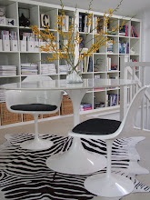
Bulkheads everywhere, this looks like a big closet until you open the doors.  This space under the bulkhead will actually become a desk in what will be the childrens play area.


This is one of three kitchens, and it will be completely removed.


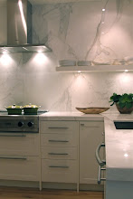
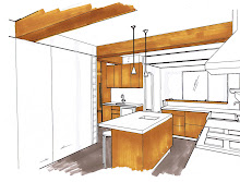
This existing kitchen will become the new kitchen, the intent is to open it up and expand it, however, the 'suggested' expansion plans are not going over so well with the Board.  : /


The biggest obstacle of all is this very large column which houses telephone cable and the electrical panel and it falls right smack dab in the middle of the proposed new kitchen.   Its not visible in the kitchen photo above, its on the direct left of the doorway.


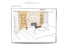
When I look at these photos I can't help but feel overwhelmed with excitement about what an enormous transformation this will be.   To take an outdated and depressed space and turn it into a beautiful home full of life and love is a definite thrill for me.  I can't wait to show you the plans and the "New Traditional" design direction we're headed in.

At this point we're awaiting another pending decision from the Board which will determine whether the Architects proposed solutions to expand the kitchen area and master ensuite area are a go (waterproof membrane and exhaust issues), if not, I've prepared several alternate layouts that we'll fire right back at them.  If none of those plans meet with their approval, I'll need a magic wand.   


All Photos:  Carol Reed

Wednesday, July 6, 2011

A Magazine Shoot: The Prep Work


Having your own home or one of your client projects shot for a magazine spread is something every designer hopes (dreams!) to experience, at least once, and last week I was fortunate to have had that experience!  In fact last week was kind of a momentous week for me all around, it started out with a last minute trip to NYC to meet a new client and start working on my very first project in the Big Apple (more about that later!) but which I had to cut short to get back to Toronto for a magazine shoot (really,,,,was this my life last week!!??) with only one day to prep in between.

For two days last week I was thrilled to be with the Style at Home team shooting the mid-town home of one of my clients.  The project was a full gut reno that I had designed in 2008/09 and the very last phase of the project, a completely redesigned rooftop deck had just been completed in the fall.  I initially found out about the shoot back in February but knew that it wouldn't take place until June for publication in a spring/summer 2012 issue.  I was thankful for the time this would give me to source all the final accessories for the outdoor space, although somehow all that time got away from me (?).   Construction of the deck finished up last October and literally within days it was packed up for the winter -  I hadn't even seen the finished area with the all furniture yet so needless to say I was anxious for Spring to arrive.   The top photo is a teeny tiny glimpse of one corner of the deck, taken about 3 weeks ago when I arrived with the first load of accessories.


These two photos are the extent of what I'm going to share right now because I really respect the effort the magazine editor's go thru to ensure they show spaces that haven't had a ton of exposure already.  There are some photos of this home on my website and I've also posted photos of it on the blog before but I've never posted pics of the entire home nor have I posted the various photos in context with each other.  I know Style at Home will do a beautiful job capturing the home as a whole and the personality of my client.  But you'll all have to wait for about 10 months for the full story and all the pics!

In preparation for the photo shoot, there wasn't a lot I needed to or wanted to do on the interior, aside from more fresh flowers - the home is camera ready just the way it is, a true reflection of the homeowner's personality and lifestyle.  With the exception of certain flowers and the extra special placement of vases and dishware,,,,,it was important to me that the home was photographed to reflect the way it really looks on any given day (well, before company arrives anyways).  I'm all about keep'n it real.  Nothing borrowed, nothing loaned, the homeowners own things in the expert hands of a Design Editor and professional photog is all you should need.  But that's not to say there wasn't some new purchases made - we had an entire brand new outdoor living space with cooking area, dining table, lounge space and indoor servery all in need of accessories and essentials.  Where to start!??


I'm crazy for succulents, their simple sculptural shapes have a modern appeal to me.  This was the kind of modern organic vibe I wanted to incorporate in the outdoor space, a few of these were a must.


With a colour pallette of saffron gold, white canvas and warm grey as our colour pallette, these purple cube planters with succulents were the first things I purchased.  Sadly,,,,3 weeks later when I arrived the evening before the shoot they were completely DEAD.  The no fail, maintenance free succulents had apparrantly drowned.....drowned.  The most disappointing part of all was I was unable to find replacements at the last minute so they didn't make it into the shoot.  Replacement are now on my 'to do' list.


I have an obsession for round mirrors, any size, any colour and in any space.  I love the geometric form they add to a room and how they compliment or balance otherwise typically square or rectilinear rooms.  I picked up more than one of these.....


The homeowners initial is K. I felt this was a sign we had to have this, I like that the painted metal was a bit distressed, I really was hoping to find something old to mix in with all the brand new.  After only a week or two outside it developed some lovely rusty spots.


I spotted these at HomeSense and had to have them.  They created quite a buzz in the check-out line, suddenly everyone wanted them (hilarious how that happens), but I had scooped them all.  They reminded me of some place settings I had just seen in NYC that I adored.  I picked up multiple pairs of 2's so there's a mix of colours, patterns and birds.  These would be layered with simple hand formed style dinnerware on a slab wood table and natural linen.


Anytime I came across flowers that I thought would be interesting in the spaces, I snapped a pic for reference. 


A tree stump table was the perfect finishing touch to the lounge area.  Just big enough for a couple of cocktail glasses and a small bowl of nuts.  I liked the blackened rustic quality of this paired with all the modern furniture on the deck.


More organic shapes, natural weathered wood vases.  I only bought one, wished I bought more....


A basket for throw blankets.  Even on the hottest days there can be a chill at night.  Woven natural texture is a great addition to any space indoors or out.


No matter how finished a space is, can you ever have enough throw pillows?  I couldn't resist this chevron print in saffron by Mitchell Gold (from Elte), I could imagine at least 4 different rooms this would work perfectly in.  I love to add a hit of geometric pattern, to me its like a neutral because they compliment almost any other pattern.  We loved it so much in numerous places, we're going back for at least one more.


A last minute search for a replacement floor lamp.  This had been on my 'to do' list for oh, about a year.  There's nothing like a photo shoot to motivate you into action.  With minutes to spare I found this tripod antique brass one at Shelter Furniture .  It was one of about 20 I had come across that afternoon, in a frenzy of Iphone pics emailed back and forth to the client this was her hands down favorite, she LOVED it.  Of course they were completely out of stock but thankfully they let me buy this one right off the floor.
Thanks again Darryl! : )  


I have a weakness for studio pottery, hand made porcelain.  Particularly this collection by MUD Australia of which I own a couple pieces already.  Their simple white, organic shapes are perfect for this home, I bought two, with the intent to keep one for myself.  She LOVED them both, I didn't get either one.  So I'll be heading back to Hollace Cluny for another.


Pretty food is accessories are essential for any photoshoot (or entertaining!).  The homeowner picked these up based on a list from the Editor extraordinaire.  While I'm loading a floor lamp in my car I get the phone call from the client who's in the produce department at Whole Foods "does she really want that many melons", "do you think she would prefer pink or yellow lemonade". YES many, and get BOTH.


An hour later we met up at Ave/Dav and bought armloads of flowers.


Mid-way thru day one, we all had lunch together on the main floor balcony.  The homeowner picked up the most delicious assortment of gourmet sandwiches, salad and baked treats, after we unpackaged it all and set it out on the table it looked so good, the team instantly decided to shoot it.  Which of course delayed the eating it of it :  /   It was a well needed boost to keep them going late into the evening.


Day two lunch was just as delicious (and just as pretty) but we barely had the energy to eat it let alone shoot it.  Day two started at 5:00 in the morning.


I'm so grateful to have such an amazing client who so graciously opened up her home and had 5 of us literally move in for 2 days, going thru her drawers and cupboards no less.  We joked it was like having house guests, and I have to tell you she was the consummate hostess.  Always making sure everyone had anything they needed and totally spoiling us with food and refreshments.  Even extending invitations to spend the night in lieu of the early morning start (I took her up on that).  When the crew all arrived at 5:00am, she had already been up since 4:15, remaking her bed, tidying the bathrooms (the bedrooms and bathrooms hadn't been shot yet), had a pot of fresh Starbucks coffee ready for all AND was ready for a portrait shot.   A couple hours later, only mid-morning, she made protein shakes for everyone before heading out to pickup lunch once again.  Over the course of both days she was in a few of the shots, which included several wardrobe changes and she looked gorgeous in each one.  All of this was above and beyond anything I would expect a homeowner to do.  

As much as photo shoots are vital to a Designer's portfolio, they do require a LOT of cooperation and coordination with our clients - its not easy and honestly not all homeowners are willing to participate especially for magazine shoots.   I've had a couple of clients in the recent past who turned down the request for an editorial shoot, much to my disappointment, but they deeply value their privacy and the sanctuary of their homes - I understand and respect that.  So this is why after last weeks experience, I'm forever grateful to clients who allow me to do this.


All Photos:   Carol Reed

Related Posts Plugin for WordPress, Blogger...